Wednesday, October 21, 2015

"After Picasso: 80 Contemporary Artists" at the Wexner Center for Contemporary Art

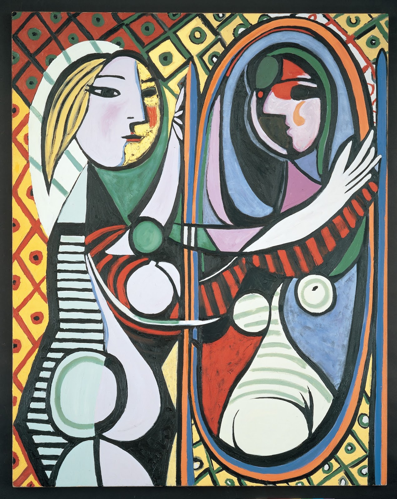
Mike Bidlo
Not Picasso (Girl Before a Mirror, 1932), 1986
Oil on canvas, 64.17 x 51.18 in. (163 x 130 cm)
Private Collection, Courtesy Galerie Bruno Bischofberger
I left After Picasso: 80 Contemporary Artists, the vast show at the Wexner Center of the Ohio State University, thinking that for such a big show I felt very few moments of joy. I know that Picasso makes pulses race, and the exhibition is predicated on this: Witness His artistic impact. The show is burdened by impact that is much, much less than Picasso's achievement. Alas, this academic location of influences, echoes, and salutes brings us work that barely stirs the blood—and it places interesting work in contexts where it appears lonely and small. Briefly, the show is thin on content touching primary human questions or emotions.

The occasion for After Picasso is the 25th anniversary of the Deichtorhallen Hamburg. Their celebration is this show: Huge artist and a theme that is more important in concept than the art that demonstrates it. Add loans from all over the globe and we've got an Event.

This show unsuccessfully tries to serve two audiences. While it may be a home run for academics, it fouls out as a show for a general, curious public. In its conscientious effort to conceive every possible overlap of "Picasso" and "influence," it wastes space and viewer patience on tedious appropriations of Picasso's work; on isolated figures or composition borrowed from Picasso; and on art that reacts to or riffs on Picasso icons or styles. We rarely see suggestions of how an artist's vision reached a plane inconceivable in a world untouched by Picasso. 
Cindy Sherman, Untitled 280, 1989-93.
Color print, 140x94x8cm. Courtesy of
Neda Young, New York.


Picasso's greatness is not an issue, so little is proven by the many demonstrations of his marks on artists who appropriate or borrow from his work. Except in an academic sense, we gain little appreciation of the borrowers as creators of art deeply interesting in itself. Our understanding of influence is even stretched by the fitting of some material to a curatorial narrative. Cindy Sherman's self-portraiture has for years displayed her interest in art history broadly cast. The Picasso inspiration for Untitled 280 speaks no more of a fascination with Picasso specifically than do her portraits using iconic images from a vast world of artists. 

Director of the Deichtorhallen Hamburg, Dirk Luckow, writes in the catalogue's preface (translated from German),
"The hypothesis of the exhibition is that the great influence that Picasso's art has today is because his work and his person cannot be separated…"


Galerie Leyendeker, Tenerife (T. Ü.)
1985, Silkscreen, 83,8 x 59,4 cm
© Estate of Martin Kippenberger,
 Galerie Gisela Capitain, Cologne

No doubt about Picasso's personal fame. But I'm all for separating the work and the person. I found that by devoting a section of the show to his celebrity, the curators only reinforced my sense that they were less interested in what art is and can do than in its trappings. Picasso's ego—like any artist's—rightfully resides in his work. This has to pertain for all artists. Unhappily, I fear, we find this to be true of his imitators and satirists as well.

The inspiration for a series of photographs by Martin Kippenberger was a photo of Picasso in his underwear, shown here on the poster for Kippenberger's show. In the show (no images available) Kippenberger himself poses in the role of Picasso, wearing similar drawers, at ease  around a nondescript interior. Kippenberger's show, for better or worse, satirizes himself and his subject simultaneously. 

It would be easy to replace Picasso with a photo of shirtless Vladimir Putin or Whitey Bulger on a poster like this, in just such a broad stance, positioned slightly above the viewer: Grandiose virile posturing didn't begin with Picasso. Only to the extent that such characteristics inhere in Picasso's artworks should the curators move this theme from catalogue to gallery. It's a footnote, extraneous; regrettable or fun, as you wish to understand it.


Khaled Hourani, Picasso in Palestine, 2011. Installation view, (IAAP) Ramallah.
Courtesy Khaled Hourani; Photo Khaled Jarar
When such poses are held by armed men protecting a work of art, then we are in a much more interesting and significant realm. I find this photo of a project that brought a Picasso to the West Bank much more moving than the many reiterations, imitations and reinterpretations of Guernica included in the show. Robert Longo was invited to do a new work for inclusion in the show, and his massive charcoal Guernica Redacted claims a significant position. Compared to Hourani's photos (of which this is one of several), one feels that Longo has, beyond the conceptual, no pulsing connection to war, torture, or even conflict.
Robert Longo, Guernica Redacted (After Picasso’s Guernica, 1937), 2014/2015
Charcoal on mounted paper, four panels, 111.4 x 248 in. (283 x 630 cm)

Courtesy Galerie Thaddaeus Ropac, Paris – Salzburg

© 2015 Robert Longo / Artists Rights Society (ARS), New York
Installation view at the Wexner Center, photo: Stephen Takacs

Rather than being stunted (or stunned) by Picasso's greatness, Hourani has been genuinely inspired by Picasso's art. What's more, he uses an apolitical Picasso painting to focus his anti-war message, to make it as localized and universal as art itself. The installation was a complex act of creativity that not only reacted to Picasso but built on and beyond him.


Folkert de Jong, Les Saltimbanques: Old Son "Jack T."Styrofoam, polyurethane foam, and pigment;
 
69.6 x 21.6 x 19.6 in. (176.86 x 54.94 x 49.86 cm)
 Private collection, New York.
Image courtesy of the Deichtorhallen Hamburg.


Folkert de Jong's sculpture, Les Saltimbanques: Old Son 'Jack T,'  is another of the show's highlights—a piece with a clear, acknowledged connection to Picasso but independent of  that for its vitality. It is launched by associations but unconstrained by them. The difference in dimensions—sculpture suggested by multiple figures in a painting (La famille de saltimbanques, 1905)— in itself liberates the piece from the presumed original. De Jong's artistry in his own medium creates a single figure that condenses the impact of several into one solid exemplar of debilitating isolation. Like Hourani, de Jong starts at Picasso and moves down his own road under his unique lights. 


The best works in the show, the ones that most clearly demonstrate Picasso's reach into the minds of artists who have come after, seem both by eye and by logic to be the ones in which Picasso's images do not appear. In the photo-collages of John Stezaker we have one of the very few opportunities in this massive show to encounter work by an artist who has so thoroughly digested Picasso that we as admiring viewers would, outside of this show, probably be surprised to have him pointed out in these pieces. In an exhibition with few surprises, Stezaker's work stands out, and it surely delivers the exhibition's best didactic moment. Appropriation, celebrity, and imitation aside, what have contemporary artists chosen to keep of Picasso? What of him has become unconscious/unavoidable by now?
John Stezaker
Marriage I, 2006
Collage
9.25 x 11.22 in. (23.5 x 28.5 cm)
Courtesy of the Saatchi Gallery, London

"Marriage 1" is composed by collaging two black and white photographs that neither match nor don't match. We may study the piece steadily for long periods; it will remain the same, yet we will never be sure of defining the subject (it/her/him), describing the spatial orientation of the image, or answering any "normal" question about identity based on the image.

The Cubist perspective is fluently and elegantly invoked in the photographs. The sense of comforting reality that pictures give us is more persistent than the Cubist disorientation. The eyes hold us intensely: How can we not know this person; how could it be that we are not intimately known by someone who can look into us so deeply? As long as the eyes provide a deep focus, we assume order in everything around them.Our eyes skip around anything odd, out of place, incongruous, queer…For better? For worse? Marriage 1, like marriage for many, is locked in and shifting. The technique, the way of seeing was new with Picasso and friends. The subject and its presentation via a realization introduced to the world over a century ago are brilliantly Stezaker's. It's fresh and new and deeply informed.

I don't envy the task of planning a season at Wexner or any similar contemporary art space on a university campus. To balance the claims of the academic artists and art historians with those of an informed public—including non-specialist university students, faculty, and staff—has to be a sensitive and difficult task. This time the pendulum swung too far in one direction, I think. 

Among the works included, many may be secondary or irrelevant to the main themes of the individual artists' oeuvres. But even so, what there is in After Picasso: 80 Contemporary Artists is clearly of genuine, legitimate interest for art historians and curators. But since the show brings with it gallery upon gallery of art far less interesting than what inspired it—art with messages diluted from its sources—to see it is to work hard for what few rewards of content there are. 

__________________________________________
My deepest thanks to Erik Pepple, Media and Public Relations Manager at the Wexner Center for the Arts, for his extended efforts in providing special request images for this article.

Tuesday, September 22, 2015

Calvin Ma's Homebodies, Outside Looking In

When I first saw the card for the Sherrie Gallerie's September show of Calvin Ma, I couldn't wait to see it. When I saw it, I wondered if I hadn't been a little hasty in my enthusiasm. Ma's  Animal Instincts, a show filled with strangely articulated human figures displayed in relation to non-domesticated animals, is very odd.

Both of my reactions, though—one to their silly gaiety; the other to their awkward mystery—seem to be equally important in appreciating this quirky, almost obsessively detailed work. Although "quirky" is inching toward its place as a term of critical approbation, I remain shy of it as an enduing aesthetic concept, or as one that will hold its appeal across the generations.
Calvin Ma, Look Ahead. Ceramic, glaze, stain. 12x5x7".
Courtesy, Sherrie Gallerie


Calvin Ma, detail, Look Ahead
The term "construction" seems better than "sculpture" to fit Ma's works, for they have the exaggerated joints and fittings that marionettes and stuffed toys have. They are figurative but more decorative and abstract than realistic. While the artist has invested infinite care in the manufacture of fine details, that care hasn't been spent creating illusions of visible reality. They may be, however, profoundly realistic, clear delineations of what the inner eye sees. 

Ma exploits the metaphor of eyes as windows. The eyes of many figures rest behind frames and sills, but we're still left to wonder why since the expression is so flat: There seems nothing to protect with an extra layer. If we try to invade the figure's privacy, there appears to be nothing of interest. Those shaded eyes seem to yield neither information nor expression. 

Calvin Ma, figure from Animal Instincts
But it's the inner eye that Ma is about, we can keep looking. On the sides of several figures' heads are more windows and in those we find hidden figures peering out at us obliquely. Their own secret heads are fully formed, and they glance out from positions of hiding.

These unexpected faces peering as it were from secret attics, hidden away where one is certainly not expecting to find them, remind us of the Anne Frank's, the fleeing American slaves, or the millions of others who, over the centuries have been stowed in airless garrets to avoid detection or being overtaken by persecutors.

The heads of Ma's people are in themselves houses: Ma calls them, accurately and poetically, "homebodies."
It's not a stretch to see the people at the side windows as the people trapped inside the artist's head—as those trapped in Everyman's head. Ma personally speaks to the issue of social anxiety and he relates the motivation for this body of work to his reality as a shy person who prefers his inner life to the company of others. He has found a phenomenally accurate and potent way to express a state of feeling. 
Calvin Ma, Stretched Thin. Ceramic, glaze, stain,14x6x9"
Courtesy of the Sherrie Gallerie


Ma's homebodies don't experience the world only through perception, through vision and thought. Several of the figures in the show have, like Stretched Thin, portals where we locate the heart and the guts, other places we all know our anxieties to manifest themselves as turmoil and pain.

The figures in this show are all paired with animals. Their connections are not easy. The people balance tenuously either because they are as awkward as such mechanically jointed people would be, or because there isn't much sympathy between the species. It could be, too, that animals are introverts. They want to be left alone.

Calvin Ma, Falling Behind, detail, fox's
belly below, human figure above.
The detail from "Falling Behind," a piece that shows a fox and a person both falling upside down, reveals a door on the fox's belly. Most of the animals have such openings, but they are posed in ways that obscure them. (Ma is meticulous enough to incorporate such details, even when they are unlikely to be seen.) These suggest, though, that the connection between the humans and the animals may not be in their relationships, but in the idea that all are feral in a primary way. Why does any creature  come out at all? Do society's rewards really live up to the promises made for them? Is our own company so poor or insulting?

Visually, I found this show to be a little tedious. More specifically, I found the extreme attention to detail, repeated so often and sincerely on material of the same size, colors, patterns, and concepts, came close to boring me.

But I think that what I found tedious has turned out to be one of the greatest appeals of Ma's work. With yet a week to go when I saw it, the show was within two works of having completely sold out despite the four-digit price tags. 

The similarities that I though bordered on the bland are probably part of the great appeal Ma's work has had for audiences and purchasers. The repetition of features, shapes, and colors may very well be explained simply by self-portraiture on Ma's part. Then it is simply a way to represent one thing that appears many times. 

Perhaps it's more likely, though, that the lack of dramatic distinction is part of the point. "We all live in our heads. We're top-heavy with anxious thought and views of the world slanted by the oblique views we take from hidden places. We are probably like most others, but fear makes us both big in imagination and small in fact; our senses of proportion are odd."
Calvin Ma, Falling Behind

Which brings me back to close with the "quirky" aspect of Ma's figures. Their look is definitely idiosyncratic. They have a sort of futuristic look from a retro position, which concerns me about possible satisfaction with a camp or short-lived aesthetic. Mitigating against this possible over reliance on "look," though, is Ma's commitment to craftsmanship and materials. 

Ma's workmanship is warmly disciplined: He spares no detail, no matter how many times he must repeat the same stroke on one piece, let alone over a large series. No one labors like this in the interest of a look or style or attitude. One does this for compulsion at the least and conviction at the best; to solve a problem or to unlock a secret; to exorcise pain or to make space for the admission of some discovery. 

Ma is going to travel his road at his own pace, it's clear. I for one can put up with any outcomes in the interest of honest process, full of time to admit what surprises slip in along the way.

Tuesday, September 1, 2015

Plenty of Time: Marc Ross at Work

Marc Ross, No Explanation Needed installed at Cultural Arts Center, August 2015
The Columbus Cultural Arts Center felt like the interior of a jewel box when I visited the show of Marc Ross's painting, which closed on the 29th of August. The space was perfect for the show of large-scale, luminous paintings dominated by single colors. Each had breathing room and glowing room, for Ross's painting so both, like living organisms.

What's the difference between a something alive and something that's not? That's a Sesame Street concept, isn't it, a fundamental distinction that we learn in our very early years? Paintings fall into the inanimate category, despite the metaphors any art writers or gallery-goers can fabricate. But Marc Ross's work does indeed invite a serious reconsideration of the space between animate and inanimate in art. 

Marc Ross, Memento #1, 62 x 84." Acrylic, pastel, colored pencil.
In the gallery talk that closed this show, No Explanation Needed, the artist confessed to me that he hates to give talks because he has so little to say. He was relieved of the necessity to hold forth by questions from his audience, which revealed a great deal. 

Marc Ross, Memento #1, Detail.
The most important thing Ross told us is that each of these works takes a very long time to complete, and that completion is marked simply and practically: It's done when he sees that he has nothing more to add. 

On our close inspection, it becomes clear how much he has accumulated to create deceptively simple works. In this detail of Memento #1, one sees the endless variety of vertical, superficial striations. We note that the line gouged across and into the painting reveals that the surface color sits atop a deep history—an archaeology—of decisions, of which we know only that Ross changed the colors many times. Only he knows what else has happened and what has been expunged on this surface over its long process of becoming what it is where he's decided it ends.

For Ross, the importance and the pleasure of painting are the process. He has a large studio in the home he shares with his wife. But even she is strictly banned when he is working, because his concentration is so intense. 
Marc Ross, Make Me That Happy, 68 x 60."

Yet when he tries to explain what he does in the studio, one would not be mistaken in describing the process as play. While his time is strictly guarded, he is not exactly focused—he doesn't know what will happen, and he has no strategy. The process is to see what can happen; to allow himself the time and the space and the mental blankness to be relaxed and receptive. 

Is this not the state of a child, who can make something out of nothing at any moment, generating great ideas as easily as a swallow flies, whose imagination is as vital an organ as his lungs? 

What this artist does is invisible to us because all those months he spends in the studio are in efforts that are painted over. His work is effaced constantly, and allowed to stand only once. If we consider the saw that our bodies continually replace themselves as cells die and slough away, Ross's paintings are self-renewing bodies, yet without any loss of material. They accrete their histories, growing heavier and thicker with each application of material. 

Marc Ross, Make Me That Happy, Detail
showing surface drawing
As we usually imagine artistic purpose, during his sequestration the artist will be concentrated on his subject or passion. This might be advancement of a dream, the resolution of a personal angst, or support for a social or political cause in the world. We are a little deflated to hear Ross tell us that he's not thinking about anything in particular while he works.

My point is that there is never any way to know what goes on in an artist's mind while s/he is working. "Big" thoughts or "ordinary" ones? Who is to judge? Ultimately, who cares? What Ross has put into these paintings that we can see and experience as viewers is time. 

Marc Ross is a contemplative artist, a type of artist for whom there cannot be enough respect. Knowing that we see only the final stages of a work made over months should slow our breathing and tell us to pause before any one of these works. A show like No Explanation Needed is in fact an embarrassment of riches—almost too much—for every painting calls to us, and every one should demand hours of contemplation.

The surfaces of these works are histories of what the artist has been experienced and buried; they are histories inscribed with organized—if unarticulated—conclusions based on experience. These outcomes, present on the surface, satisfy the artist who trusts that he needn't explain them or himself. We will take them up for what beauty, interest, silliness, or meaning we find or attribute when we explore them. The artist doesn't tell what's there; the artist doesn't tell us what he thought about: as Ross says, he may not even know. The important thing is that the lavish expenditure of time is inherent in the work, and it is now ours to contemplate.
Marc Ross, Epiphany, 72 x 41," acrylic, pastel, colored pencil.

These paintings are steeped in the hundreds of studio hours Ross spent looking at and interacting with these surfaces, making decisions both strategic and spontaneous about what he might do to them. Those decisions are eccentric as far as we know or care: whether he follows academic, industrial, or nursery school procedures doesn't matter to what we see except to the extent that he wishes to reveal them.

Ross's paintings document the value of time spent with oneself; of being free and choosing consciousness over obliviousness; of routine experimentation (with no promised outcomes) as sufficient for making private sense whether the cosmos provides it or not. They hint that beauty can arise—and glow—from months and months of uninspired, discretely accomplished efforts. We see how order and vision impose themselves quietly upon patient periods of testing and trial without capitalist ends. We consider that working for our own ends and understanding can create beauty and satisfaction.

The history of the artist's time, patience, and thoughts inscribed in this art work are presented very directly to us. If we will commit  to listening and looking, the communication is as immediate as conversation without the small talk—surprisingly familiar, and mentally and physically liberating. If we spend a little time, it will generate more for us. The time taken for observation creates in the observer much more than it takes, bringing us time and space and vistas forgotten, if not new.

Is artistic creativity always going to produce something novel, topical, or "meaningful?" Sometimes the artist gives us something as old as the earth and human nature, reminding us of our need for quiet, for fallow times, for large questions or contemplation of the inner landscape as opposed to the social one.

Ross paints in a questioning vein that stands out in a busy, egoistic world. His slow and quiet work is refreshingly full of deep life and conversation. Though No Explanation Needed is closed, look for more of Ross's work coming in the next few months at Ohio University's Chillicothe branch Bennett Hall Gallery (September through October); and in the Riffe Gallery's "Inaugural Juried Exhibition," November 2015 through January 10, 2016.


Marc Ross, No Explanation Needed installed at the Cultural Arts Center, summer 2015.


Photographs courtesy of Marc Ross

Saturday, August 22, 2015

Reflections on Criticism: Acts of Committed Imagination

Let's take a moment to review. Why do I write art criticism on the internet? 
Ann Starr, from Home Security, 2005,
ink on paper


Reviewing art unasked by a self-constituted audience could be taken as an egotistical overvaluing of my own opinions; the more so since I do this without being employed by a media outlet that might pay me minimally for a certain number of words that illustrate an image or two.  But anyone who is offended can simply ignore rather than challenge the ideas I propose. In a twenty-first century of multitudinous bloggers, the world is awash with opinions for readers to drink deeply or dabble in. There's no curriculum. And essentially, there's no competition.

I write these reviews because they organize for my own sake my reactions to art shows that I see. Writing forces me—forces anybody—to dig deeper. Writing is a certain path to discovery. And what is any art about if not discovery? 

In writing I try to imitate the artist's process of digging in, observing, and solving a sequence of related problems—materials, colors, structure, size, memory, attitude... When I reach a conclusion, it may not be the artist's conclusion, but it will hopefully follow similar logic. Or it will arise from contemplation of the same materials with the opportunities they offer. To write is to shadow; it brings me as close as I can get to the generation of the artworks without having been there in fact.

So, to write reviews—to write criticism—is to observe as closely and comprehensively as I can. To observe closely is an act of committed imagination. 

Readers will have noticed by now the way I have allowed the nouns "review" and "criticism" to assume the same space. "Criticism" usually carries the idea of evaluation more heavily than does "review," but both imply evaluation and analysis. 

Neither "review" nor "criticism" means synopsis or description without the addition of the writer's own analysis, evaluation, or insight. A reviewer or a critic has something to share with the audience beyond prose received from a press release and what observations will serve to prove that he/she did indeed visit the site of the show.

"Criticism" is often associated with academic study for whom the intended audience is scholarly or deeply informed. This is why I stick to the term "review." Criticism is popularly thought to be fault-finding and esoteric. There is enough witty, rhetorical criticism, too, that rips apart easy targets and constitutes its own sub-genre of writing to maintain general readers' leeriness of the term. Criticism is seen as a negative act that dismisses the content most people would be interested in. Criticism, as many understand it, focuses only on form, poetics, technique, tradition, and such aspects of art as non-specialist observers might consider secondary. 

While academic conversation is crucial for the advancement of knowledge, and while the work of academic intellectuals is to be respected, I wonder if its influence hasn't stunted the emergence of more practical criticism directed at a general, educated, and eager audience—those of us who visit museums and galleries for pleasure. Even the vocabularies of the premier art magazines are specialized, traceable back to the academy, not to standard English as it is popularly used.

"I don't know much about art, but I know what I like." It's a beginning, but it's not a place to remain. And I think such a statement implies a question about how to know more.

My job as a critic is to help that person go farther. It's a practical job, one rooted in non-specialist language (though not in watered-down language), and in modeling. 

I wish for my reviews to show the reader what I do when I look at a show and how I get my ideas about it. I hope to show what prompts me to make comparisons with other things I've experienced. The connection between experience and imagination will appear.

Ultimately, I hope that readers of my reviews—of all reviews—appreciate that good criticism can open doors beyond the simple recommendation that a particular show worth seeing. A good review—solid criticism, should give the viewer information that helps her/him see any show more deeply, with more searching questions and keener observations. No one is obliged to like any show, however warmly recommended. A substantial pleasure comes in the process of taking it in, considering how the artist must have made the work, how the curator put the show together, and how the whole piques our own feelings, memories, and imaginations. 

And, after all, how badly can you dislike something when you've invested yourself in genuine scrutiny of it? Liking and disliking aren't the goals we should set for ourselves in viewing art. How can we know what we like until we have invested ourselves in it? 

And how can we know who we are until we've invested ourselves in the work of observation of complex works in which others have invested their minds and their time? In learning how to consider art and to like widely in art, we become more fully human in the process. I write reviews as a practical matter, for those who would help along the way.


Ann Starr, Gouty Hand, 1998, pen and
marker on paper.

Thursday, August 20, 2015

Andrew Lidgus: "Duality" at the Sherrie Gallerie

Andrew Lidgus, whose work is showing through August 30 at the Sherrie Gallerie in Columbus, is both a pianist and a fine artist. This may be called a duality, but Lidgus integrates two aspects of an artistic self singularly well in works that themselves defy genre. Neither paintings nor sculptures nor collages, perhaps "assemblage," that generously comprehensive category, comes closest to describing them.
Andrew Lidgus, Points of View, paint, matte board, nails,
 25.5 x19.5" i

All the work in this show simultaneously communicates high spirits and reassuring stability. The assertive color clashes happily; the construction is impeccably disciplined. Lidgus shuns artists' materials, turning to cardboard, carpenters' nails, sandpaper, house paint and other common treasures. His combination of color choices, attentive workmanship, and biomorphic shapes all remind me of mid-twentieth-century art. This may account for an air of classicism I feel strongly in this beautiful work.

From a distance, it's easy to feel the music in a work like Points of View, in which the viewer can find a lyrical line of red dots underscored by a slightly dissonant, broad violet, flowing across the rhythmic beats of black and pink strokes. Green forms have the shape of a grand piano's convex and concave curve and cut.  

The closer one comes, though, the fuller and more distinct the sound, for this isn't just music on a score, but music in dimension, moving into time and space. Some of the red dots are the heads of carpenters' nails, the shadows of which add in every sense another dimension—overtones, a locked hand—to the now separate melodic line. It's a duet, a duality? 
Andrew Lidgus, detail, Points of View

One sees too, close up, that the entire surface of Point of View is in fact created of many stacked planes. It's a topography of heights and it is further complicated by being a topography of colors as well, since the paint doesn't follow the geography of the cut-outs. 

Points of View is a gorgeous, multifaceted work of visual art, one through which any viewer can travel for a long time again and again. But its delight can be multiplied greatly by considering it as an example of interarts, replete with musical content as well. It looks like complex, free music sounds. We can experience this in feeling, in a synthesis of vision and sound.

Lidgus shows a variety of "looks" in Duality, but all of it is strongly related by rhythm, order, and color. Whether he depends on paint with raised elements, whether he works in monotone bas-relief, or in a blend of the two, all fits together to give his body of work tremendous integrity.

Gallery owner Sherrie Hawk has used her excellent eye to highlight this signature fact about Lidgus's work. She has hung the show in a way that not only shows off the beauties of particular works, but which invites the viewer to see similarities that could be lost opportunities in a less sensitive (and educational) hanging.
Andrew Lidgus. In the Privacy of My Mind (left) and Midnight Sky (right).
 
 At first glance the two pieces above may appear dissimilar, since the one is painted and the other is all black, made of primarily woven strips of  matte board. Nevertheless, the proximity of these works feels natural and restful. What makes them work?

Perhaps it's the rounded form toward the top in each piece: The circle on the right and the half circle on the left. Each work is dominated by lines. Though In the Privacy of My Mind repeats the semi-circles, those forms are filled with vertical lines; the circles in Midnight Sky are composed of the grids that fill the work. In the latter work, it appears different that strong oblique lines cut across the surface of the grid, breaking up the simple grid. But the first surface of In the Privacy… is not straight at all, but is built from lines like reeds in the wind, bunched and waving and irregular. In other words, there are enough similarities in design elements and rhythms to relate the two works. Or, rather, to illustrate how Lidgus, whatever the particular piece he's working on, is working from the same intellectual and emotional space, experimenting with integrity from his own soul's stock of material, not working with this finger to the wind.
Andrew Lidgus, In the Privacy of My Mind, wood, paint,
25.5 x 31.5."
NB the three-dimensionality.

Most of the works in this show are built on various types of cardboard or matte board. Lidgus uses these both as his basic support and to raise surfaces, whether they be the minute topographical gradations that we see in Points of View or the semi-circles that dominate the surface on In the Privacy of My MInd. Sometimes he uses corrugated cardboard stripped of the paper layer that usually masks the ripples, so that he benefits from the texture of the paper waves. 

Curators (and purchasers) have to be concerned about the durability of "non-traditional" materials. The other side of the coin is the expressive, poetic aspects of those materials. I've already noted Lidgus's workmanship: He is precise in the use of his everyday materials. Cardboard is allowed its own merits in a dignified way I haven't granted before. I find myself admiring its color, which sometimes appears as gold against black; its hard appearance in one setting and softness in another; the effects possible with whole or partial stripping of the surface from corrugation; its sometimes strength and its aspect when it buckles. Lidgus uses cardboard with the seriousness of a model-maker, of a person who is planning, who is in mid-thought, who is conceiving as he works.

Andrew Lidgus, Conscious, detail. NB stripped
corrugated (with metal screen, nails, wire on
sandpaper)

This is my first exposure to Andrew Lidgus, and I find his work fascinating. His composition, colors, and sensibility are classical and hearken back to beautiful moments in Picasso and Matisse as well as to mid-century design. 

But it's his urge to extend mental and material space beyond the usual limits that shows his power. Lifting off to multiple planes without committing to sculpture; finding a way to bring the eye and the ear close together. For Lidgus, proximity isn't a failure to be one or the other, but a unique condition in itself. His works cannot be described or defined as fine art or music; as precious or rough, as sculpture or painting. They are none of these, and they challenge the discussion of art traditions on several levels. 

Duality? This is one concept Lidgus' work seems stoutly to refuse.


Andrew Lidgus, Birdman, matte board, wood, 25.5 x 31.5." How many colors does "black" represent?

Sunday, July 12, 2015

Linda Gall's "Old Wood & Ancient Haunts"

Linda Gall, Loose Wires, watercolor, 6 x 9," 2014. Courtesy
of Hammond Harkins Gallery
Linda Gall's watercolors showing at the Hammond Harkin Gallery in Bexley, Ohio can be described only by their own, eccentric presences. Old Wood & Ancient Haunts? I accede to her title because the show is decidedly narrative and so it deserves to be called something. But the narrative is up to you, the viewer. There's a lot of time-worn wood featured in it. Ancient haunts? Does that mean the sagging old farm and ranch buildings? I suppose it that's one way to look at it. But there is room to see a multitude of haunts in this work that seduces not only by its beauty, but by its vivid peculiarity.

"Loose Wires" is the simplest piece in this show, but it contains the essence of the fascination her work holds for me. The wires are loose, but they are not disconnected. It appears that the stakes are loose and it is the wires that hold them together. The posts are firmly planted and the pieces of what are probably broken wood between hang loose. (They remind me of clothes pins.) They dangle before/above/beneath…what? In this painting made from observation, there is no setting, no context. Gall shows us what, but "where" is defined only by the blank page. Out of this, she nonetheless convinces of contrasting stability of posts and instability of the web between—as if this were in the Real World. Could be. Maybe not.

As a watercolorist, Gall is self-taught. Perhaps this explains why her command of the medium is so thrilling: Nothing holds her back. Her range is considerable: The colors are a mix of brilliant and saturated with dull; her edges run the gamut from sharpest to wet and dissolving. An exciting  "painting without a net" quality brings every work alive—or, it allows the life of the work to seize you. These truly freehand paintings are done without any pencil plotting or guidelines. The daring delivery of paint adds to the thrill of her odd and ambiguous subjects.

Linda Gall, Troubadours, Watercolor, 17 x 36," 2014. Courtesy of Hammond Harkins Gallery.


Troubadours, above, is quintessential Gall. On an unpainted (empty?) sheet of paper, a utilitarian farm structure in disrepair sits athwart us and a Rococo figurine of a boy and a woman with a guitar faces us directly. The originals for the structures in Gall's work inhabit the landscape around her New Mexico home. They have been observed and we assume that the likenesses are genuine. 

Linda Gall, Annie O. Acrylic on panel, 20" x 24." 2014? Image courtesy
of Hammond Harkins Gallery
As here, Gall has populated many series of work over the years with selections from a wide assortment of china figurines. As a toddler will use any figure at hand, regardless of its look, to represent a character in his or her play fantasy, so these figurines seem to function for Gall. They hold places for imaginations; they represent whomever we want them to be, from whatever period and place we wish. They will stimulate viewers to their own story-making within the setting the painter has begun to make. 

In another essay about this show, I noticed that these represented china pieces were called "tiny figurines," as if they are equivalent to the things from which she modeled them. They are, of course, not tiny at all, unless we agree that the buildings are tiny too. Otherwise, the figures are as large as people in relation to the buildings that we take to be so real. Aren't both real realistically copied? It is up to us to reconcile this and to devise a world from these elements she's posited just as she has against a page with nothing else to refer to. Gall has messed with us, knowing how our expectations of scale will make us see what cannot be and take it to be reality.

The paintings are filled with implied anachronism, impossible placement of global elements, and wildly skewed scale. The pictures can be Toyland or even Christian creche tableaux where the figurines stand not so much for persons as for spiritual figures with significance enhanced by humble architecture. I'm intrigued by the figure in Annie O. with her innocence and Marian blue, waiting for something to happen in that stable...

Linda Gall, Wagon Train, acrylic on panel, 24" x 36." Image courtesy of Hammond Harkins Gallery.
Into these play settings, the hands of children or adults could obtrude from above to place and arrange elements of their choosing to tell the stories they wish. The Christmas story. Gunfight at O.K. Corral. Occupy Dodge City. The Duke and Duchess at University. In Wagon Train, above, it is impossible not to see Gall's toys as the children's wagon train rolls in naive placement across the foot of the painting, drawn by a kitty cat in an engine with a Santa figure waving from the canvas-clad "caboose." The collapsing building itself looks like a train, dragging its worn-out self along on a rusty wheel. The yellow sign warns automobile drivers of falling rocks. Is this the ultimate race with no winner? The foolish side of America's rush to the West and what it has finally done to people and landscape?


Linda Gall, Something of a Pile of Posts, watercolor, 6" x 9." Courtesy of Hammond
Harkins Gallery.
Gall delivers a lot through irony, which is created by juxtapositions. She is a master at the creation of gaps and pits and blanks for us to fall into, but in those places we find the significance of her work. She makes toys; she's a comedienne most of the time, drily delivering commentary on the stories that we will make once she's set us up.

I think this is why I prize so highly these tiny, simple watercolors with very little painted on them. Like Loose Wires at the top, Something of a Pile of Posts is divested of irony, drama, implication—of almost everything but gesture and the emotion that comes with it. A pile of posts. Clods, unfeeling, dumb. But here they have tendency, yearning, and, despite their weathered years, an aspiration or urge to grow. Gall loves narratives, and I guess there is one in a painting like this, but it is a concise one, and it is straight faced. The poignancy isn't disguised by the color and wit.

Saturday, June 13, 2015

Jack Whitten's Black Monoliths: Born in Bessemer

Jack Whitten, Black Monolith II: Homage to Ralph Ellison
The Invisible Man,
1994, Acrylic, molasses, copper, salt, coal,
ash, chocolate, onion, herbs, rust, eggshell, razor blade
on canvas, 58 x 52." Brooklyn Museum, William K.
Jacobs Fund 2014.65
Jack Whitten: Five Decades of Painting runs through August 2 at the Wexner Center for the Arts. The show displays fifty works by an artist of outrageous originality and dynamism. So driven by the need to experiment is this man that, were labels withheld, a gallery visitor might reasonably assume this to be a group show of six or seven abstract artists. 

While the show, organized by the Museum of Contemporary Art San Diego, refers to Whitten as a painter, I think this artist would much more precisely be called a fabricator rather than a painter through much of his career. One often sees this impulse in printmakers and sculptors, for whom innovation with processes and materials can be as important as the glimmer of the image down the road. Whitten works with acrylic paint, but he has rarely made works that would be universally identified as "paintings." He has used acrylic in its liquid form not only to carry pigment for making images, but also for its industrial properties: It is elastic; it can be layered and separated; it can be molded or cut; its colors can be blended or separated in sheets. Acrylic is plastic.

I think the direction of Whitten's artistic inquiry has to have been shaped by location. He was born in 1939 and grew up in Bessemer, Alabama, a close western suburb of Birmingham. Heavy industry dominates the whole region, which is known for ore mining, iron smelting, and the manufacture of railroad cars, including Pullman Standards. Bessemer's African-American population has always hovered around 75%. The labor for the city's vast industries was provided by integrated unions. Whitten's father was a coal miner; his mother was a seamstress. 

1950 map showing heavy industry in Birmingham, Alabama and suburbs. Bessemer would lie in the lower right area, approximately
eight miles from Birmingham.

Whitten's maturity and artistic career have been spent in New York, where he arrived in 1960
during the flowering of the Abstract Expressionist movement. This mid-century 
milieu is reflected in his work of the period. Whitten worked among the artists of the New York School, particularly with Willem DeKooning, but he apparently maintained an independence from them too, associating himself with other artists of color, and experimenting with his own ideas about abstraction.

Before New York, though, Whitten studied at Tuskegee Institute and then at Southern University in Baton Rouge, where he discovered his vocation for art. His move to New York City had as much to do with his despair over the South's intransigence during the movement for civil rights reform as with any intention to attend Cooper Union—which in fact he did. Entering the art school at 21 was Whitten's first experience as the lone black in a white environment.

Of the many bodies of work represented in Five Decades of Painting, I find myself most fascinated by works begun during the 1990's, the Black Monoliths that honor Whitten's African American heroes and friends. As in the Homage to Ralph Ellison above, each of these is a mosaic composed of thousands of colored tesserae. Each tile is formed from acrylic paint (and any additives). Since detail is difficult to interpret at such a reduced scale as in these pictures, I point out that the tiles don't contain image, only color.


 Jack Whitten, Black Monolith IV For Jacob Lawrence, 2001, acrylic on canvas, 96 x 96 in. (243.8 x 243.8cm). Courtesy the artist, Alexander Gray Associates, New York; Zeno X Gallery, Antwerp. ©2015 Jack Whitten/Artist Rights Society (ARS), New York. Photo by Philipp Scholz Rittermann. 

 Jack Whitten, Black Monolith III (For Barbara Jordan), 1998, acrylic collage on canvas, 
69 x 65 ½ in. (175.3 x 166.4cm). Mott-Warsh Collection, Flint, Michigan.
©2015 Jack Whitten/Artist Rights Society (ARS), New York. 
Photo by Philipp Scholz Rittermann. 

Whitten makes no claim that these are attempts at portraiture, though it's difficult not to attach the idea of likeness to them in at least a rough way. The homage to Ralph Ellison, above, takes the form of an anonymous silhouette, the sort we see when a journalist interviews a person whose identity must be protected in order to maintain their safety. In this work though, the silhouette is nevertheless, in layer upon layer of irony, "the only Black in the room." While he is anonymous because he is faceless, he is unmistakable against the unbroken wall of white and blue, the two colors that provide no prayer of invisibility or protective coloration for a Black man. The homage is to the courageous daily bravery of the visually conspicuous, for whom freedom from invisible individuality remains so tortuous and tragic. 

When I encountered Black Monolith IV For Jacob Lawrence—breathtaking at eight feet by eight feet, yet every tessera worthy of scrutiny when you're close to it—I first thought I had come upon a remarkable map of Manhattan, glimmering and demarcated against a dark world. But then, there is also a strong resemblance to a capped (not hooded) smoking silhouette out of a Philip Guston painting—that ambiguous, vaguely threatening, possibly explosive character. Only after that did I see the title referring to Lawrence. Maybe both of my thoughts have a home in this work?

Lawrence's subject was the common life of African Americans—not always a visually attractive subject, given the poor material and social conditions in which so many lived. The series of painting with which he is perhaps most identified is his The Migration of the Negro, which tells the story of rural Blacks moving to the industrial cities of the north. Lawrence lived in New York City most of his life, having spent his earliest years in New Jersey, and moving with this wife to Seattle when he was in his fifties.
Jacob Lawrence, The Migration of the Negro, Panel One, 1941. Posted
 in accordance with fair use principles on Wiki Art.

Maybe it is a map of Manhattan, white Manhattan with conspicuous dikes raised against a coal-black sea. As an homage to Lawrence, perhaps Whitten reflects bleakly on African-American migration to cities where they haven't ultimately been integrated or their lives bettered? Where they remain immigrants? The Gustonian, alienated smoker neither sees nor  responds. He doesn't wear a hood anymore, but his anonymous indifference testifies to his enduring hostility.

However one interprets the particulars, Black Monolith IV strikes me overall as a phenomenal commentary on immigration in the 21st century. It is certainly the most pressing issue of our time as Africans, Middle Easterners, and Central Americans—people of color—risk all to reach Europe and America, whose nations bravely fight the tide and erect walls of all sorts against them.

I love Whitten's Black Monolith III (For Barbara Jordan) if only because it's not monolithic. A monolith is not only massive, but it is coherent and unified—which this so conspicuously is not. Whitten has also altered the shape of his support, giving it "shoulders" and sloping its sides inward toward the bottom: like a memorial or gravestone? Like a figure? 

The disposition of black and white tiles, while interspersed, nevertheless tends to converge in the suggestion of a torso. This notion is strengthened by the column that rises at the center top, out of the picture like a neck, giving the image the sense of an x-ray. Is that big dark shape a massive heart? This body lacks clear edges, quite unlike the others in the Monolith series and, again, contrary to the definition of the word. Perhaps this suggests Jordan's aptitude for politics, that art of compromise, of dancing between black and white to move people together while respecting the rights of those on the edges? The name for monolithic politics is tyranny.

 Jack Whitten, Black Monolith, V Full Circle: For LeRoi Jones A.K.A. Amiri Baraka, 2014, acrylic on canvas, 84 x 63 in. (213.4 x 160cm). Collection of Sheldon Inwentash and Lynn Factor, Toronto. ©2015 Jack Whitten/Artist Rights Society (ARS), New York. Photo by Philipp Scholz Rittermann.
The experience of Full Circle: For LeRoi Jones A.K.A. Amiri Baraka is like looking at the Earth from a space ship, or through a telescope on the moon. The best part about it is that all the life of the universe is encapsulated on our planet, for there are no stars and no hint of any other life in a sky that is impenetrably black. It is a wonder that Whitten could manufacture so black a black as the space that surrounds this globe.

The globe, however, is infinity. By creating intensity at the center with lots of color and small elements, Witten draws the eye in ever deeper and we eagerly search beyond what we see. Though this caption provided identifies the materials here as "acrylic," it is a great jumble of collaged materials, not all of which are made of acrylic: There are lots of found materials as well, colorful, hard scraps of life.

In this there is almost no contrast between black and white. The edge is between blank black and black that is filled with color: with idea, life, and, above all, the representation of deep time. Here's an image of the history of the world in Baraka's color—all of his colors: the colors of thought, idea, travels, loves. This is also a mirror, it seems, for any viewer. You look at it less than you look into it. As you do, it's impossible not to want to find something, to see what you relate to, to pick out your place. In the other Monoliths, there are boundaries to consider and we are asked to deal with their significances for us. This one is different. The boundary is the ends of the earth and we cannot but fall in.

Viewing Whitten's Black Monoliths, I continue to be nagged by the memory of another artist from Bessemer, the wonderful self-taught artist, Thornton Dial. Dial was born in 1928 (Whitten in '39) and work in the fields before he moved to the city where he was a metal worker, in the Pullman factory particularly. Much of his art is sculpture made from re-purposed found materials, from tin cans to mattress springs. 

I think that there is a kinship between Whitten and Dial in that they share a deep central aesthetic of fabrication born in Black, industrial Bessemer. Dial was a manual laborer; Whitten was not. But I believe that Whitten's youth in a city that was all about manufacture, mining, and callous-producing labor affected his outlook as a visual artist. Five Decades of Fabrication?