Showing posts with label Riffe Gallery. Show all posts

Sunday, February 15, 2015

The Ohio Art Council Presents "A Century of Ohio Watercolor"

Clyde Singer (1908-1999), The Onlookers, 1937. Author photo.
I spent an enjoyable afternoon at the Ohio Arts Council's show, which opens their centenary year, "One Hundred Years of Ohio Watercolors." A survey of watercolorists from our mixed-use state, where rural and urban are equally dominant, the show defines place and conveys a sense of time's passage. Some of the artists are famous (Roy Lichtenstein, Jim Dine) and most merely—superb.

I emphasize that I had "an enjoyable afternoon." Is there any other kind to have in a watercolor show? This high-risk medium inspires artists who practice meticulous technique that exposes any error. But it's a medium that equally rewards spontaneity and confidence. Watercolor is often used for story-telling or to crystallize magical moments in nature, two beloved subjects.

The image of Clyde Singer's The Onlookers in one of several that I had to photograph through glass and glare because it isn't part of the official media package prepared by the Riffe Gallery. But it's worth a few stray spots to show such a charmer. The Onlookers seems to me a wonderful use of watercolor. The paint is applied with a loose hand so that we get a clear sense of the watery quality in the variations of color, which usefully imitate the play of light of the backs of the men's coats. Singer doesn't insist on fine details like facial features; the hint that the woman's attitude is slightly haughty suffices to complete the humorous story told by body positions. Instead of catcalling girls, the men are all occupied with something even more interesting: A construction site? Earth movers? It's a scene of the battle of the sexes, the civilizing impulse of women and the boyish instincts of men, all laid out in bright, loose brush strokes that convey broad attitudes, not obfuscatory details. The sense of the passing moment is keenly conveyed by this fluid medium.
Ralph Fanning (1889-1971), Yellow Tree in Landscape, 4 x 5,"
date unknown. Courtesy of the Riffe Gallery.

Ralph Fanning uses the wetness of his medium to blur the yellow and green in Yellow Tree in Landscape beyond the vaguest of shapes. He does not, however, dilute his colors: The blue mountains in the background offset the shock of brilliance formed by the tenacious leaves. The blurring quality of the medium gives this painting its life, which is in the color: summer green giving way to golden autumn, yielding to the bare limbs and depth of winter darkness in the background. The fields of strong color, punctuated with streaming and staccato strokes pack a powerful, universal message about passages.


Fred Fochtman (1959- ), Pear Study, 2014. Author photo.
I like the way that Fred Fochtman uses similarly undefined, layered strokes of color to create an impression of reality. Though Yellow Tree and Crockett's Pear Study are apparently dissimilar, neither conveys reality through the use of drawing techniques, but only by the use of layered color. 


Mark Russell (1880-1967), Orchids and Lalique,  30 x 24,"
1937. Courtesy of Riffe Gallery.
In Fochtman's painting, edges are simply where neutrality ends, interrupted by the pretend forms that his manipulation of daubed color create. While his pears look warmly real, how could we ever grasp them? They are invented by the layered application of color in blurred and damp gestures. These are frankly illusory, paint on paper. The artist has painted color, not pears. He's created art and a question about where reality comes from—whether we create it or whether copy it. 


A lot of the work in this show is more scenic or descriptive, comparable to the purposes of photography. One such piece is Mark Russell's timeless "beauty shot," Orchids and Lalique. Stunningly posed and simplified, it is what fashion photography would become: dramatic, elegant, and focused on the product set in a consumer fantasy. With meticulous sculpting by means of mastery over his paint and brushes, Russell removes the natural beauty of stemmed orchids from nature and drapes them over Lalique crystal amphora, the height of decorative refinement. The flowers are hyper-real relative to the background and even the brand-named support. The Deco style, simplified design supports the central figure, but that figure causes not a ripple in her perfectly balanced and well-arranged setting. Does attribution of the minimally-described vase to the famous glass studio of Lalique increase the pictorial impact of painting for those who know the status of the company? Russell has brought not only great discipline to the creation of visual beauty, but our associations with different artistic media and social responses.
Emerson Burkhart (1905-1969), Street Scene, 19 x 22, 1940. Courtesy of the Riffe Gallery.


Emerson Burkhart uses similarly descriptive techniques in his watercolor street scene that depicts a view of the "other" side of a viewer's imagined tracks. His image does not, however, leave a sky simple blue background of possibility to highlight the figure. Burkhart's painting is all about specificity, and he spares us no shingle, rubble, drainpipe or power pole. The one element that is not specified is the figure at the center of the composition: This is essentially a stick figure amid the accumulation of rubbish and decay. This pictorial strategy and Russell's are opposite, though they both use watercolor meticulously to describe scenes. Burkhart is the documentarian to Russell's fashion photographer.

Roy Lichtenstein (1923-1997), Sheriff,
author photo

I'm delighted that this history of watercolors includes abstract works. Fred Fochtman's fine pears, above, hit a sweet conceptual spot between abstraction and representation. A large-scale painting by Roy Lichtenstein (1923-1997) of an abstract figure, is a merry piece of work and uses watercolor on a surprisingly large scale and in an unusually brutish way. No subtleties of technique here, he goes straight for what transparency can do, creating gradations of just a couple of colors. He uses it as scrims that can subtle cover or uncover, as if he leaves us scratching the surfaces to understand. How many figures are in the picture (a sheriff? a horse?) Who's going what direction? He makes us wonder who's good and what's bad and, Do you know them by their reds, whites, or blues? The watercolor appears to be crudely swabbed on here, not brushed in the painstaking manner of most watercolorists . A cartoonish image appears to have been made by an artist with primitive skills. Lichtenstein upsets our expectations of the medium. 

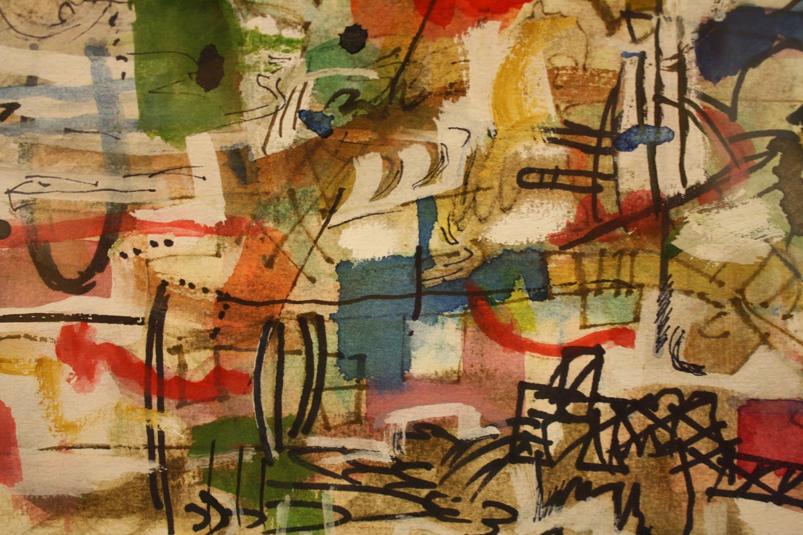
In other works artists use the transparency and the brilliance available in this medium to full effect, creating compositions of gemlike color and dynamic balance. Looking at Alan Crockett's Untitled (2007), one might be looking at a piece of translucent art glass. The medium's greatest beauties are on display, but as they can be only in the hands of a master. In this small but very busy, complex, and layered passage of his painting, Crockett has allowed no bleeding of color or line; each color is brilliant and distinct, each laid down as if he'd had the time a collage artist would have to consider every placement.  What a joyously confident display of technique and spontaneity!

Alan Crockett (1941- ), Untitled, detail. 2007. Author photo.

I'm sure this show is a treasure trove for art historians or critics interested in the development of the magical medium. For me, the delight is in the discoveries of artists I'll be looking for in the future, and of these and several other wonderful works.

Saturday, June 15, 2013

"Photography's Back to the Future"

Garie Waltzer, Tokyo: Hanayaski Amusement Park, 2008.
Printed with 
archival pigmented carbon inks on Hanemuhle photo rag paper.
Catherine Evans, the William and Sara Soter Curator of Photography at the Columbus Museum of Art, has curated a breathtaking show for the Ohio Arts Council at their Riffe Gallery in Columbus. Photography's Back to the Future presents bodies of work by ten exceptional artists who use their cameras to transport us past documentation of reality. In the images these ten bring us, microcosms and galaxies hitherto beyond our focus or dreams lie before us. It's a show that made me catch my breath over and over in surprise and wonder as I reacted to the beauty, mystery, and acuity of ten distinguished visions.

Every photographer in the show dazzles with striking image, unusual  technique, or stunning point of view, so let me name them all: Amanda Hope Cook and Dennison W. Griffith, both of Columbus; Lori Kella of Cleveland; Tracy Longley-Cook, Francis Schanberger, Janelle Young, and Christine Zuercher of Dayton; Rachel Girard Reisert and Jordan Tate of Cincinnati; and Garie Waltzer of Cleveland Heights.

Garie Waltzer, Eiffel Tower Plaza, 2005. Printed with archival
pigmented carbon inks on Hanemuhle photo rag paper
.
Four of my favorites demonstrate that however I wish that I understood the many different technical forms of photography, I am at least not blind to the beauties of the work that results from them. As in print-making and multi-media art, my experience would probably be enhanced by understanding each artist's techniques and innovations. Yet these ultimately matter to the extent that they serve the ends of the work and its essential communication about the human issues—which bring me to art in the first place.

I led this review with one of Garie Waltzer's entirely absorbing, deeply layered images from her Living Cities series. In each of the huge, black and white, perfectly-focused photographs, taken in cities around the world, Waltzer shoots from a position so neutral and narrative—all-seeing and inescapable—that we feel the satisfaction we find in a nineteenth-century novel. The camera is situated at a spot of high, distant authority that permits us to roam with freedom through the  minutely documented world. Seeing the world through her image is unquestionably better than being part of it, where we would be reduced to insignificant participation with an insignificant consciousness.
Garie Waltzer, Rio de Janeiro, Rocinha, 2010. Printed with archival pigmented carbon inks on Hanemuhle photo rag paper.

Waltzer captures the essence of the city's interlocking series of macro- and microcosms. Her lens composes and frames a whole world, even though the background mountains, the shadow, or the park fences tell us that it is merely a slice of a city's life. Yet within this microcosm, we see the defining architecture and infrastructure and we can watch the movement and the expressions of the people moving through it. The depth and clarity of focus is uncanny. In Rio, we can see all the way back to the houses against the mountainside; in Tokyo, we admire the planning that fashions from a tiny piece of ground a sufficient "Disneyland" for hundreds of pleasure-seekers. No individual's delight is left ambiguous: All the facts are laid bare in Waltzer's living cities, where all the scenes, so beautifully composed, are just as her camera finds them.

Janelle Young, from Atlas series, 2012. Silver gelatin print.
Janelle Young documents in her 2012 Atlas series living worlds as ambiguous as Waltzer's are defined. Her camera may be focused on views of Earth from Mars, or on dew drops through microscopes. The reality content of her work is merely the stage upon which the viewer's dreams emerge and play what roles they will. The allure of her work for me is that I find myself sometimes the principal inhabitant of her odd landscapes and at other times a distant surveyor of far-away, misty and mystical scenes—the sorts of places that suggest the challenges that determine destiny. A remarkable thing about the pictures, then, is that the images are so plastic in terms of interpretation, while being formally so stable.

Janelle Young, from Atlas series, 2012. Silver gelatin print.
In the photograph to the left, one can even compare the camera angle to those Waltzer chooses in her cityscapes. We feel that we are high above a world laid out below us. Is it a city whose airport we approach? Or the the foothills that will lead us from our mountaintop to the moors? Perhaps it is the dream of Death's distant horizon, with its edges curving in to embrace us; or the setting moon that leads us to from this vague life to a glowing final place? 

The image to the right can lead all sorts of sensibilities into meaningful narratives and reflections. Interpret this through, time, space, delight, fear, Nature, spirit, religion, philosophy, the creative urge: The potential narratives are, in Young's suggestive visual definition, as great in number as Waltzer's in their clarity. Yet, like Waltzer, Young's mastery of her medium is at the highest level. In neither of these images is there a moment out of place. Allowing one's eye to shuttle slowly across every area of the surface, we find nothing even close to being "out of focus." Young has carefully chosen the degree of edge for every episode of the print: This is tour de force work.

Lori Kella, Majestic Effort.
Landscape is also the territory of Lori Kella, who handcrafts vistas to photograph. Her constructions are in the vein of traditional museum dioramas, in which scenes are set as background on which model humans or wildlife display their habits or dramas. Her work disconcerts viewers new to it. Its colors are vivid and the effects she creates do not at first glance appear to be modeled by hand: Of course they are photographs of real places and events! It is only after puzzled scrutiny that we discover the artifice. We experience her work in waves, each bringing a new swell of delight and surprise.

What finally clues the viewer in to the artificiality of Kella's work is its literal shallowness. Compared to the vistas we've seen in the literal and metaphorical landscapes of Waltzer and Young, Kella gives us horizons cut off by clouds, creating narrow, cosseted worlds for us to experience and examine. Though she often generates snowy and aerial scenes, even these are warm because the implied grand scale is closed off by cloudy skyline, looming mountains, or by trees. 
Lori Kella, White Paper Mountains, 2011.
In White Paper Mountains, the mountains rise abruptly from an even plain; a few small, cumulus clouds are suspended from a faintly glittering "invisible" wire. The helicopter in Majestic Effort is crudely painted, and its blades are seen individually, not as the blur that would appear if they were rotating.

The notes to Kella's work in the show remind us that her work, though whimsical, is serious, having to do with preservation of landscape, and being artistically related to the work of Ansel Adams and other great American landscape artists. No doubt all of this is true, but it is definitely the whimsical that most affects me in her work, for it removes me to an age when the world could be literally modeled for train sets and doll houses, and when our youthful minds inhabited them fully. As my brothers' O-gauge train chugged down its track between its minor scenery of water tower, general store and a few flaky trees, it shoved every other possible reality from mind. 

Kella's photography proves that the imaginary can be as discernibly real as reality. Photography is traditionally the documentary medium. It witnesses, defines, and proves. In Kella's work, personal worlds, the worlds we dream about—or the secret, fantasy ones in which we in fact mentally operate daily—are validated and proven real by the fact-finding camera.  
Rachel Girard Reisert, Tropism #8, Toned cyanotype prints on Arches Platine paper, 55 3/4” x 21 1/4.”

Rachel Girard Reisert's handsome series, Tropism, is another highlight of this wonderful show. Each triptych features one or more trees in three parts, which the viewer cannot fail to associate. I find them impossible not to understand as gestural, every springing branch (even the severed one in Tropism #8) an invitation to and anticipation of life beyond.


A tropism, for those of us who have forgotten, is an organism's tendency to orient itself by growth on some external stimulus. Phototropism is the apparent tendency of plants to grow toward light (though the light actually damages the side closest to it, allowing the farther side to grow faster, thus bending the plant "toward" the light. Stay tuned.)


Reisert works close-up, giving us studies not only in gesture, but in surface as well. These tree are portraits in the manner of figure studies, such care Reisert takes lovingly to detail the particularity of each. In Tropism #8, I feel myself granted a privileged, intimate view of an ancient elder, whose folded, mottled, and stringy skin is the displayed history of his long life. The point of view, up the trunk, pays homage to the subject, whose complexity is expressed through three views that suggest his roundness of character and vision, on top of his longevity. Is the outward gesture the tropism? Is the gesture promoting or crippling the aging tree?
Rachel Girard Reisert, Tropism #9, Toned cyanotype prints on Arches Platine paper, 55 3/4” x 21 1/4.”
As we look up into the triptych of Tropism #9, we see the branches of the central, dead figure gesture on the right directly into blooming spring branches (perhaps photographed with infrared film? I'm not certain). On the left, an abundant vine graciously entwines with dead twigs. The clean spareness of these images, along with the lilting composition reaffirms the hopeful messages of dignity and renewal that Reisert finds in nature's life cycles and seasonal cycles both. 

Reisert's focus on age in nature is particularly interesting throughout this series of work, as longevity's values of durability, texture, grace, and generosity seem to be in general cultural disfavor at the moment. Reisert's exploration of time through these studies is not only visually beautiful, but excellent for the quiet pace her triptych technique imposes. She invites our not only our inspection, but our reflection as well.

Photography's Back to the Future will be open at the Riffe Center Gallery through July 7. I'm able to cover only a few of the wonders in it. I am embarrassed to use the term "must-see," so I'll just say that I wouldn't want to miss this show and hope my local readers will not.
_____________________________________

Photographs courtesy of the Riffe Gallery, Rachel Girard Reisert, and Garie Waltzer. 

Tuesday, August 14, 2012

Outside and Inside: A Look at Chad Sines


Chad Sines,  Spiderman, 2010
paint on wood, 36 x 24”
Courtesy of the Artist 
Showing through October 14 at the Ohio Art Council's Riffe Gallery in Columbus, Outside in Ohio, is an irresistible show of work by Ohio's untrained artists from the 19th century to the present moment. Mark Chepp, emeritus Director of the Springfield (Ohio) Museum of Art, curated the outstanding show. 


Elijah Pierce, Good Versus Evil, c. 1930s

wood, paint, cloth, 31.5 x 21.5”

Springfield Museum of Art

 William Hawkins, YMCA, 1981-2

paint, Formica, 39.5 x 29.5”

Springfield Museum of Art
 "Outsider" is a term that still puzzles many—"You mean, 'folk art?'" It's puzzling because it's necessarily come to include many kinds of art that used to boil down to folk art. These days it refers to all sorts of things related by only one fact: The creators of the works were never formally trained as artists. They did not benefit from going to art school, auditing courses, or formal apprenticeships to others. True, the painter William Hawkins knew Elijah Pierce; Levent Isik got to know William Hawkins. All three of these have immense reputations, are the subject of monographs and articles, and their works fetch top dollar. But these were "outsiders" who knew one another and learned from one another. Don't ask me why this is different from their working side by side in a studio at the Art Institute, one master observing and consulting with another, but there you have it. 

 Red Canyon Appaloosa, c. 1990s

carved, painted wood, 18.5 x 25.5”

Springfield Museum of Art, Gift of Barbara and
Art Vogel

Outsiders, then, comprise many genres—folk art, memory art, the art of the insane or art brut, traditional crafts, etc. etc. But it also incorporates people working consciously within the mainstream of contemporary art trends without what they themselves see as the advantages of learning aided by teachers familiar with available materials, techniques, and tools.
.

Chad Sines, Three-Toed Sloth, 2010

paint on wood, 24 x 24”

Courtesy of the Artist

Chad Sines is one in this latter group of people. His work in Outside in Ohio caught my eye at once: four paintings on different subjects that make an uncannily coherent show-within-a-show. Their palettes immediately relate them. Three of these are from 2010—Spiderman, Three-Toed Sloth, and Untitled (Elephants). Uncle Sam, the simplest, with red, white and black only, is from 2003, though it is thoughtfully hung directly above Three-Toed Sloth for an amusing comparison. The paintings are both 24 x 24 inches in size, and there is an ironic similarity of form and pose between the iconic embodiment of the United States and the blue-painted sloth. Uncle Sam lies splayed on his belly with his feet in the air; his face—his eyes and mouth especially—no more distinguished than the sloth's, his look as lidless and vacant. Each figure appears infantile, as a creature in a primary phase of development, figuring out how—or if—it will use its muscles. We know the sloth, of course, as the icon of an animal into which graceless indolence is programmed. But Uncle Sam? The figure of Might Makes Right? The image of national pride rocking like a tot on his tummy in what appears to be the get-up of a carnival barker is shocking: It's embarrassing but we can't help laughing behind our hands. 

 Chad Sines, Uncle Sam, 2003

paint on wood, 24 x 24”

Collection of Mark Chepp and Charlotte Gordon

Sines made these, as he continues to make all of his paintings, with materials abandoned at construction sites. Uncle Sam, a painting of no inconsiderable intrigue, consists of very little, but Sines' gift is for getting a lot from a little. He mixes colors only where he represents the character's hair, beard—and the fur on his boots? What's that about? Since when does Uncle Sam wear fur-topped boots? Santa Claus does, though...So through this simple device, Sines adds another level of idea to complicate the worlds of meaning into which we dip as we consider this work. It also makes conspicuous the absence of blue.


The photograph of the whole painting obscures another feature that's very evident in person, this being that the red paint is glossy, the white and black are matte, so there is the interest of surface contrast to spur our imaginations too. Uncle Sam in satin, fur, and a big bow tie? A figure from a minstrel show or burlesque? Does this suggest that his pose is that of a comic taking a prat fall?


Sines allows his paint to drip and blur; his brushwork is casual; he demonstrates no interest at all in finesse or technique—unless we understand him to be a smart painter who is deeply aware of folk and outsider art traditions and knows how to use them to convey what he's interested in doing. He invites us to assume that we are dealing with primitive or naive material by the way he presents Uncle Sam,  but the image is, if you look carefully, no more primitive than you allow your own thinking about it to be. I think he makes this point even in the way he signs and titles the painting in lettering of equal size and weight. Given the many ambiguities and curiosities in the presentation of the figure, must we accept that one or the other of those painted names describes the subject? Is it really more definitively Uncle Sam than Chad Sines?

Both Uncle Sam and Three-Toed Sloth live right on the surface. There's no reason to wonder what's going on underneath. In the painting of the sloth, in fact, the large, flat  gray area that surround the sloth works two ways: Because of a possible trunk at the bottom, it probably represents the tree the animal lives in. But because the paint is applied without any differentiation of shade or texture, it also appears to be an effacement of whatever lies behind—it's not a representation, but a block that prevents our seeing anything that might add depth to so emphatically two-dimensional a vision.
Chad Sines, Untitled, 2010
paint on masonite, 48 x 48”
Courtesy of the Artist

In 2010's Untitled and Spiderman, Sines gives us lots of action both on and beneath the surface. He still withholds the normal visual hints about spatial placement, though. Where we expect white to indicate closeness and black to create distance, the colors are simply design elements like the others in this composition. While he describes two (one-and-a-half?) elephants among the shapes here, it's an open question whether he had elephants at all in mind when he started, or whether they emerged and fueled a finishing idea: I think the latter is more likely. In this work we see Sines' interest in the painting process. He's left his history in thin layers that expose their predecessors, colors and dimension both. There are brush strokes still visible, and we can look into the chronology that allowed him to keep his few colors unmixed as he left time for them to dry—and for him to look and ponder—between application of  layers. This is basically a non-representational painting with an ironic commentary applied. What's the use of abstraction? seems to be a tongue-in-cheek question, the elephant in the room.

Spiderman is also spatially mysterious. This may be because the painting, composed around the large figure in an iconic, dynamic, descending pose, shows us a Spiderman whose reality appears to be the central question of the piece. Once again, as in Untitled, we can't count on the disposition of dark and light areas in certain quantities to give us our bearings. Where the greatest patch of pure white lies, in the lower right, it appears to recede: This is where Spiderman is supposed to be popping forward toward us, out of the mists of our need. That we perceive his forward motion is due to Sines' use of black outlining, which gives the figure definition and propels that right arm, the strong jaw, and bullet-shaped head forward—and away from the background. That would be the "real" Spiderman, but then he dissolves at what might be his strongest point, the fist, the point of the missile, which is a beautiful mess of mixed paints with lines and dots, perhaps not a representation of anything at all.


In fact, over most of the surface, the figure coalesces rather than presents itself in defined form. Those relatively few black lines have a disproportionate impact, once you get into the details and note that the left side of the form has only a blurry edge at best, and that the face, on close inspection, is really composed as much of our expectations of the icon as it is by the bare hints Sines has actually committed to paint. What's there is a series of attacks and effacements, splatters and revisions that convey just enough information for us to surmise, from everything given, that this is Spiderman's face.

That Chad Sines' wonderful paintings are in Outside in Ohio is an excellent example of the breadth and inclusiveness of the term "outsider." Outsider art that you'll see in a gallery or show, even at its most naive in appearance, is always great art: There would be no reason to care about any art that didn't compel us with its mutually supporting technical finesse and human insight.

Sines, though, is an interesting case in labeling. He's always wanted to be a painter, even from childhood, despite the unpromising visual and cultural environment in which he grew up. When he graduated from high school in Newark, Ohio, in 1993, he had been highly praised in his art classes, had work accepted and a prize awarded to him in the Governor's Show. He was admitted to art schools, but a DUI (drunk driving citation) and probation immediately after graduation impeded his plans. He married young, had two children, and worked two jobs to support his family and send his wife to college; but he managed to paint through it all, collecting scrap wood and paints from the construction sites he worked. He never made it himself to any sort of higher education until after divorce, when he enrolled at Ohio State. 

Sines had a student job working at the Wexner Center for the Arts, in the bookstore. He used the books as a library in slow times and increased his art literacy in contemporary art to overcome the minimal background he was aware of. Today he's finishing his degree in sculpture at the University of Kentucky. "I didn't want to study painting," he told me, "because I like what I'm doing. But I keep wanting to add to it. I know there are things I could be doing with other media. I really wanted welding and practical knowledge of fabricating. I want to build a bigger, better body of work."

Sines is indeed a very practical artist. He works hard with what he can get in the life circumstances he has. He's never lacked ambition or seriousness about either his work or the career he wants; he's comfortable saying out loud that his goal is to make it into the Whitney Biennial. His current portfolio is a Saatchi Online Profile, accessible by searching "Artist Chad Sines." 

I like the perspective Sines' trajectory gives me on my own, ongoing debate about the value of art school training. I'm a skeptic, but Sines makes a solid point for the practicality of going to learn processes and techniques it would be otherwise difficult or tedious to master. And it's certainly the place to learn how people negotiate the for-profit art world. Glancing through Sines' on-line portfolio (never the way to see work), I'll admit that I like the Riffe Gallery's Outsider Sines better. But Outsider Sines wasn't a student, and to be a student is to sort through a huge menu of possibilities and choices; of having before you the whole great world of errors to commit and having enough information to make them. Insider Sines, going this route, will take a while to educate himself, which is a process of making everything hyper-conscious. I hope he will regain eventually the ease of expression and depth of insight shown so convincingly by Outsider Sines.


Sunday, April 8, 2012

Columbus, Ohio, Where Outsiders Have a Home

Since the beginning of the year, the Ohio Arts Council has presented 100 Years of Art: Celebrating Columbus' Legacy at their Riffe Gallery downtown Columbus, opposite the Statehouse. The show closes on April 15, but I hope that even a late review will tantalize readers to consider the rich artistic heritage of our city, given ample attention in this show.

Columbus takes pride in being the home of George Bellows, Roman Johnson and Emerson Burkhart; in its associations with Roy Lichtenstein, Stanley Twardowicz, and ground-breaking ceramist and ceramic engineer, Arthur Baggs. 

Melissa Wolfe, Curator of American Art at the Columbus Museum of Art, who chose this show, recognizes that it's not only the famous artists, nor those successful in prized genres like landscape and portraiture that give us our rich legacy in the visual arts. At least as important in Columbus is our abundant and abiding heritage of folk and outsider artists. Wolfe has selected generously from the untrained masters in mounting this show. Their works have astonishing presence—they are visual magnets in the show. They as much as anything assure Columbus its pride of place in the national art history.


William Hawkins (1895 – 1990), The Iguana, 1978-81
Enamel on Masonite with glitter, 33 ½ x 51
Columbus Museum of Art, Ohio: Gift of the Estate of Michael W. Bletz in memory of “Mic”
2010.013
William Hawkins, above, is as famous among folk-art collectors as George Bellows is among fans of American realism. Barely educated, he was a truck driver and laborer and only painted  for the last twenty years of his life. His paintings of animals, prehistory, historical events and everyday life are full of a kind of manly grandeur and vitality. Wolfe's gallery notes quote his advice, "You have to do something wonderful, so people know who you are." Hawkins' work, whatever its size, is always big in feel. And wonderful. And unmistakable.

Grandpa Smoky Brown (1919 – 2005), Wizard of Oz, 1992
Mixed media on cardboard, 30 x 40
Private Collection
In Columbus, Smoky Brown's reputation is quite as elevated and secure as Hawkins' is. Another late starter, he gave himself over to painting when he moved to Columbus in 1976, at around sixty years old, where he entered a rehabilitation institution that helped him free himself from alcohol and drug addictions after years of struggle. He had always been involved in creative enterprises, but the last quarter of the twentieth century saw him unleash monumental creativity with anything he touched. Wizard of Oz, shown, is actually a 3-D work. The frame is rolled cardboard, and the supporting layer is too. The brilliantly-painted figures sit on top of a sheet of clear plastic or acrylic that bows out over the support, which is itself painted and  collaged upon. The foreground painted sheet is also covered with layers of translucent packing tape and has altered photographs of Brown and relatives taped to it. What came to Brown's hands became highly colored—even lurid—wildly imagined art, contemporary in feel. His work responds to popular culture with its twist of sci-fi, cartoon, and street characters.

Elijah Pierce (1892 – 1984),
Crucifixion, mid-1930s (reworked by artist in 1970s)
Carved and painted wood with glitter on wood panel, 47 ¾ x 30 ¾
Columbus Museum of Art, Ohio: Museum Purchase
1985.003.001
Columbus has been (and continues to be) the home of exceptional carvers. I have written previously about the great Elijah Pierce , and this show includes a masterwork—almost 4 feet by 3 feet—from the collection of the Columbus Museum of Art, Crucifixion. Most of the figures are bas-relief, cut out from the background, but the crucified figures, as one can see from the shadows in the image, are detached; they literally stand out. The magnificent work is arresting for its size, its high coloration, its contrast of hellish red and celestial blue, the two spheres overseen by the central figures of crucified Christ and, below his feet, the be-suited Devil with horns and pitchfork. The symmetrical composition and clarity of character and symbol mark Pierce's evident didactic intent. The work is a latter-day stained glass window, a scriptural narrative that both the educated and illiterate both can follow and take to heart.

Walter O. Mayo (1878 – 1970)
Ark of the Covenant, nd
Carved and painted wood, 20 ½ x 23 ¼
Columbus Museum of Art, Ohio: Promised Gift from the Family of Helen Cobb and
Walter L. Mayo, Sr.
An extremely elegant carver whose subjects, secular and spiritual, were realized in three dimensions, was Walter A. Mayo . Mayo came to Columbus from small town central Ohio. He was a mule driver before he was a truck driver and, like Dawkins and Brown, came to art later in life. His observational work captures not only detail but affect; it represents a world of happy rural normality. His spiritual work, like this Ark of the Covenant, shows that his imagination found unseen, spiritual worlds just as detailed as the everyday, but invested with passionate belief.  Wolfe's gallery notes report the thrilling fact that, "Mayo also carved a miniature, hand-lettered scroll listing the Ten Commandments that is placed within the Ark." 


Ralph Bell (1913 – 1995)
Untitled (Man with Red Hat and Dog), 1993
Acrylic on wood panel, 36 x 36 x 4 ¼
Campbell inventory #93DC
Private Collection [c/o Keny Galleries]
Art-making provided soul-saving releases for artists Ralph Bell and Mary Frances Merrill, both of whom suffered crippling disabilities. Bell was institutionalized as a child, unable to speak or write, to use his hands or arms. He was eventually diagnosed as having cerebral palsy. It wasn't until he was almost 70 that an art therapist contrived a mechanism he could place on his head to hold a paint brush. That's when he took up painting with exuberant gusto, producing works like Man with Red Hat and Dog. 


Mary Merrill (1920 – 1999), Calypso
Mixed media on linoleum, 11 ¼ x 9Private Collection
I wish I had a better image of the Mary Merrill selection in 100 Years of Art, for it is quite a disarming piece, a vivid image on a thin piece of curled-up, nondescript linoleum. Lined up like a mother duck and her ducklings, a woman has her hand lowered to gently guide her three similarly-dressed daughters before her. She carries her big load on her head; they carry tiny ones. All the figures are fashioned from little scraps of bright fabric. Calypso is created from almost nothing at all, yet minimal and humble as it is, it goes straight to the heart. Wolfe tells Merrill's as another story of an artist who started making art late in life, whose production seems to have been tied to years of agoraphobia. Confined to her house, she used anything she had at hand to work with, including according to Wolfe, "chewing gum, make up, jewelry, and coal nuggets." 

It's no coincidence, I think, that Hawkins, Brown, Mayo, Bell, and Merrill began making art late in their lives. Unlike academically trained artists, they seem to have come to art with lives full of experience and reflection, ready for some place to put it—exuberantly. Such explosions of color and invention. such confidence in instinct make their pieces in this show masterworks indeed. We are all lucky for Wolfe's insight in recognizing this art that comes directly from life unmediated by technique.

Between the world of fine art and outsider art lies another category on which Columbus can pride itself, cartoons. Ohio State educated Milton Caniff, and now houses his papers in its nonpareil Billy Ireland Cartoon Library and Museum. Terry and the Pirates and Steve Canyon kept many a youthful Sunday enthralling, and I am delighted that Wolfe included him in this show of Columbus greats. This panel of Terry and the Pirates from June of 1943 is huge (two sheets of paper, probably 4 feet high). To see it at this original size is to fully appreciate the cartoonist's mastery of black and white dramatic composition, and the integration of text into each panel, while he keeps each panel its own tense, charged, pod of energy. It's wonderful story-telling in spring-coiled visuals. 

Milton Caniff (1907 – 1988), Terry and the Pirates, June 20, 1943
Ink on paper, Billy Ireland Cartoon Library and Museum, OSU
CGA.WC.05.054
$3,000
Last but not least is James Thurber. The author of My Life and Hard Times, with its immortal stories ("The Night the Bed Fell," "University Days") about his youth in Columbus should be as well-known as his New Yorker cartoons. Thurber is represented in this show by two cartoons. I picked the one I did because I can assure you that the absurdity of This is George Busby is known to have caused more people to fall out of their chairs than any other work by Thurber. That's a fact. You could look it up.

"This is George Busby, darling, and he's in marvelous form!"
James Thurber (1894 – 1961)
This is George Busby, Darling and He’s in Marvellous Form
Ink on paper, 10 ½ x 8 ¼
Private Collection, courtesy of Keny Galleries
$7,500
 (If you can't make 100 Years of Art, works by many of these artists can be seen locally at the Columbus Museum of Art, the Lindsay Gallery, and the Keny Galleries.)