Showing posts with label watercolors. Show all posts

Sunday, July 12, 2015

Linda Gall's "Old Wood & Ancient Haunts"

Linda Gall, Loose Wires, watercolor, 6 x 9," 2014. Courtesy
of Hammond Harkins Gallery
Linda Gall's watercolors showing at the Hammond Harkin Gallery in Bexley, Ohio can be described only by their own, eccentric presences. Old Wood & Ancient Haunts? I accede to her title because the show is decidedly narrative and so it deserves to be called something. But the narrative is up to you, the viewer. There's a lot of time-worn wood featured in it. Ancient haunts? Does that mean the sagging old farm and ranch buildings? I suppose it that's one way to look at it. But there is room to see a multitude of haunts in this work that seduces not only by its beauty, but by its vivid peculiarity.

"Loose Wires" is the simplest piece in this show, but it contains the essence of the fascination her work holds for me. The wires are loose, but they are not disconnected. It appears that the stakes are loose and it is the wires that hold them together. The posts are firmly planted and the pieces of what are probably broken wood between hang loose. (They remind me of clothes pins.) They dangle before/above/beneath…what? In this painting made from observation, there is no setting, no context. Gall shows us what, but "where" is defined only by the blank page. Out of this, she nonetheless convinces of contrasting stability of posts and instability of the web between—as if this were in the Real World. Could be. Maybe not.

As a watercolorist, Gall is self-taught. Perhaps this explains why her command of the medium is so thrilling: Nothing holds her back. Her range is considerable: The colors are a mix of brilliant and saturated with dull; her edges run the gamut from sharpest to wet and dissolving. An exciting  "painting without a net" quality brings every work alive—or, it allows the life of the work to seize you. These truly freehand paintings are done without any pencil plotting or guidelines. The daring delivery of paint adds to the thrill of her odd and ambiguous subjects.

Linda Gall, Troubadours, Watercolor, 17 x 36," 2014. Courtesy of Hammond Harkins Gallery.


Troubadours, above, is quintessential Gall. On an unpainted (empty?) sheet of paper, a utilitarian farm structure in disrepair sits athwart us and a Rococo figurine of a boy and a woman with a guitar faces us directly. The originals for the structures in Gall's work inhabit the landscape around her New Mexico home. They have been observed and we assume that the likenesses are genuine. 

Linda Gall, Annie O. Acrylic on panel, 20" x 24." 2014? Image courtesy
of Hammond Harkins Gallery
As here, Gall has populated many series of work over the years with selections from a wide assortment of china figurines. As a toddler will use any figure at hand, regardless of its look, to represent a character in his or her play fantasy, so these figurines seem to function for Gall. They hold places for imaginations; they represent whomever we want them to be, from whatever period and place we wish. They will stimulate viewers to their own story-making within the setting the painter has begun to make. 

In another essay about this show, I noticed that these represented china pieces were called "tiny figurines," as if they are equivalent to the things from which she modeled them. They are, of course, not tiny at all, unless we agree that the buildings are tiny too. Otherwise, the figures are as large as people in relation to the buildings that we take to be so real. Aren't both real realistically copied? It is up to us to reconcile this and to devise a world from these elements she's posited just as she has against a page with nothing else to refer to. Gall has messed with us, knowing how our expectations of scale will make us see what cannot be and take it to be reality.

The paintings are filled with implied anachronism, impossible placement of global elements, and wildly skewed scale. The pictures can be Toyland or even Christian creche tableaux where the figurines stand not so much for persons as for spiritual figures with significance enhanced by humble architecture. I'm intrigued by the figure in Annie O. with her innocence and Marian blue, waiting for something to happen in that stable...

Linda Gall, Wagon Train, acrylic on panel, 24" x 36." Image courtesy of Hammond Harkins Gallery.
Into these play settings, the hands of children or adults could obtrude from above to place and arrange elements of their choosing to tell the stories they wish. The Christmas story. Gunfight at O.K. Corral. Occupy Dodge City. The Duke and Duchess at University. In Wagon Train, above, it is impossible not to see Gall's toys as the children's wagon train rolls in naive placement across the foot of the painting, drawn by a kitty cat in an engine with a Santa figure waving from the canvas-clad "caboose." The collapsing building itself looks like a train, dragging its worn-out self along on a rusty wheel. The yellow sign warns automobile drivers of falling rocks. Is this the ultimate race with no winner? The foolish side of America's rush to the West and what it has finally done to people and landscape?


Linda Gall, Something of a Pile of Posts, watercolor, 6" x 9." Courtesy of Hammond
Harkins Gallery.
Gall delivers a lot through irony, which is created by juxtapositions. She is a master at the creation of gaps and pits and blanks for us to fall into, but in those places we find the significance of her work. She makes toys; she's a comedienne most of the time, drily delivering commentary on the stories that we will make once she's set us up.

I think this is why I prize so highly these tiny, simple watercolors with very little painted on them. Like Loose Wires at the top, Something of a Pile of Posts is divested of irony, drama, implication—of almost everything but gesture and the emotion that comes with it. A pile of posts. Clods, unfeeling, dumb. But here they have tendency, yearning, and, despite their weathered years, an aspiration or urge to grow. Gall loves narratives, and I guess there is one in a painting like this, but it is a concise one, and it is straight faced. The poignancy isn't disguised by the color and wit.

Sunday, February 15, 2015

The Ohio Art Council Presents "A Century of Ohio Watercolor"

Clyde Singer (1908-1999), The Onlookers, 1937. Author photo.
I spent an enjoyable afternoon at the Ohio Arts Council's show, which opens their centenary year, "One Hundred Years of Ohio Watercolors." A survey of watercolorists from our mixed-use state, where rural and urban are equally dominant, the show defines place and conveys a sense of time's passage. Some of the artists are famous (Roy Lichtenstein, Jim Dine) and most merely—superb.

I emphasize that I had "an enjoyable afternoon." Is there any other kind to have in a watercolor show? This high-risk medium inspires artists who practice meticulous technique that exposes any error. But it's a medium that equally rewards spontaneity and confidence. Watercolor is often used for story-telling or to crystallize magical moments in nature, two beloved subjects.

The image of Clyde Singer's The Onlookers in one of several that I had to photograph through glass and glare because it isn't part of the official media package prepared by the Riffe Gallery. But it's worth a few stray spots to show such a charmer. The Onlookers seems to me a wonderful use of watercolor. The paint is applied with a loose hand so that we get a clear sense of the watery quality in the variations of color, which usefully imitate the play of light of the backs of the men's coats. Singer doesn't insist on fine details like facial features; the hint that the woman's attitude is slightly haughty suffices to complete the humorous story told by body positions. Instead of catcalling girls, the men are all occupied with something even more interesting: A construction site? Earth movers? It's a scene of the battle of the sexes, the civilizing impulse of women and the boyish instincts of men, all laid out in bright, loose brush strokes that convey broad attitudes, not obfuscatory details. The sense of the passing moment is keenly conveyed by this fluid medium.
Ralph Fanning (1889-1971), Yellow Tree in Landscape, 4 x 5,"
date unknown. Courtesy of the Riffe Gallery.

Ralph Fanning uses the wetness of his medium to blur the yellow and green in Yellow Tree in Landscape beyond the vaguest of shapes. He does not, however, dilute his colors: The blue mountains in the background offset the shock of brilliance formed by the tenacious leaves. The blurring quality of the medium gives this painting its life, which is in the color: summer green giving way to golden autumn, yielding to the bare limbs and depth of winter darkness in the background. The fields of strong color, punctuated with streaming and staccato strokes pack a powerful, universal message about passages.


Fred Fochtman (1959- ), Pear Study, 2014. Author photo.
I like the way that Fred Fochtman uses similarly undefined, layered strokes of color to create an impression of reality. Though Yellow Tree and Crockett's Pear Study are apparently dissimilar, neither conveys reality through the use of drawing techniques, but only by the use of layered color. 


Mark Russell (1880-1967), Orchids and Lalique,  30 x 24,"
1937. Courtesy of Riffe Gallery.
In Fochtman's painting, edges are simply where neutrality ends, interrupted by the pretend forms that his manipulation of daubed color create. While his pears look warmly real, how could we ever grasp them? They are invented by the layered application of color in blurred and damp gestures. These are frankly illusory, paint on paper. The artist has painted color, not pears. He's created art and a question about where reality comes from—whether we create it or whether copy it. 


A lot of the work in this show is more scenic or descriptive, comparable to the purposes of photography. One such piece is Mark Russell's timeless "beauty shot," Orchids and Lalique. Stunningly posed and simplified, it is what fashion photography would become: dramatic, elegant, and focused on the product set in a consumer fantasy. With meticulous sculpting by means of mastery over his paint and brushes, Russell removes the natural beauty of stemmed orchids from nature and drapes them over Lalique crystal amphora, the height of decorative refinement. The flowers are hyper-real relative to the background and even the brand-named support. The Deco style, simplified design supports the central figure, but that figure causes not a ripple in her perfectly balanced and well-arranged setting. Does attribution of the minimally-described vase to the famous glass studio of Lalique increase the pictorial impact of painting for those who know the status of the company? Russell has brought not only great discipline to the creation of visual beauty, but our associations with different artistic media and social responses.
Emerson Burkhart (1905-1969), Street Scene, 19 x 22, 1940. Courtesy of the Riffe Gallery.


Emerson Burkhart uses similarly descriptive techniques in his watercolor street scene that depicts a view of the "other" side of a viewer's imagined tracks. His image does not, however, leave a sky simple blue background of possibility to highlight the figure. Burkhart's painting is all about specificity, and he spares us no shingle, rubble, drainpipe or power pole. The one element that is not specified is the figure at the center of the composition: This is essentially a stick figure amid the accumulation of rubbish and decay. This pictorial strategy and Russell's are opposite, though they both use watercolor meticulously to describe scenes. Burkhart is the documentarian to Russell's fashion photographer.

Roy Lichtenstein (1923-1997), Sheriff,
author photo

I'm delighted that this history of watercolors includes abstract works. Fred Fochtman's fine pears, above, hit a sweet conceptual spot between abstraction and representation. A large-scale painting by Roy Lichtenstein (1923-1997) of an abstract figure, is a merry piece of work and uses watercolor on a surprisingly large scale and in an unusually brutish way. No subtleties of technique here, he goes straight for what transparency can do, creating gradations of just a couple of colors. He uses it as scrims that can subtle cover or uncover, as if he leaves us scratching the surfaces to understand. How many figures are in the picture (a sheriff? a horse?) Who's going what direction? He makes us wonder who's good and what's bad and, Do you know them by their reds, whites, or blues? The watercolor appears to be crudely swabbed on here, not brushed in the painstaking manner of most watercolorists . A cartoonish image appears to have been made by an artist with primitive skills. Lichtenstein upsets our expectations of the medium. 

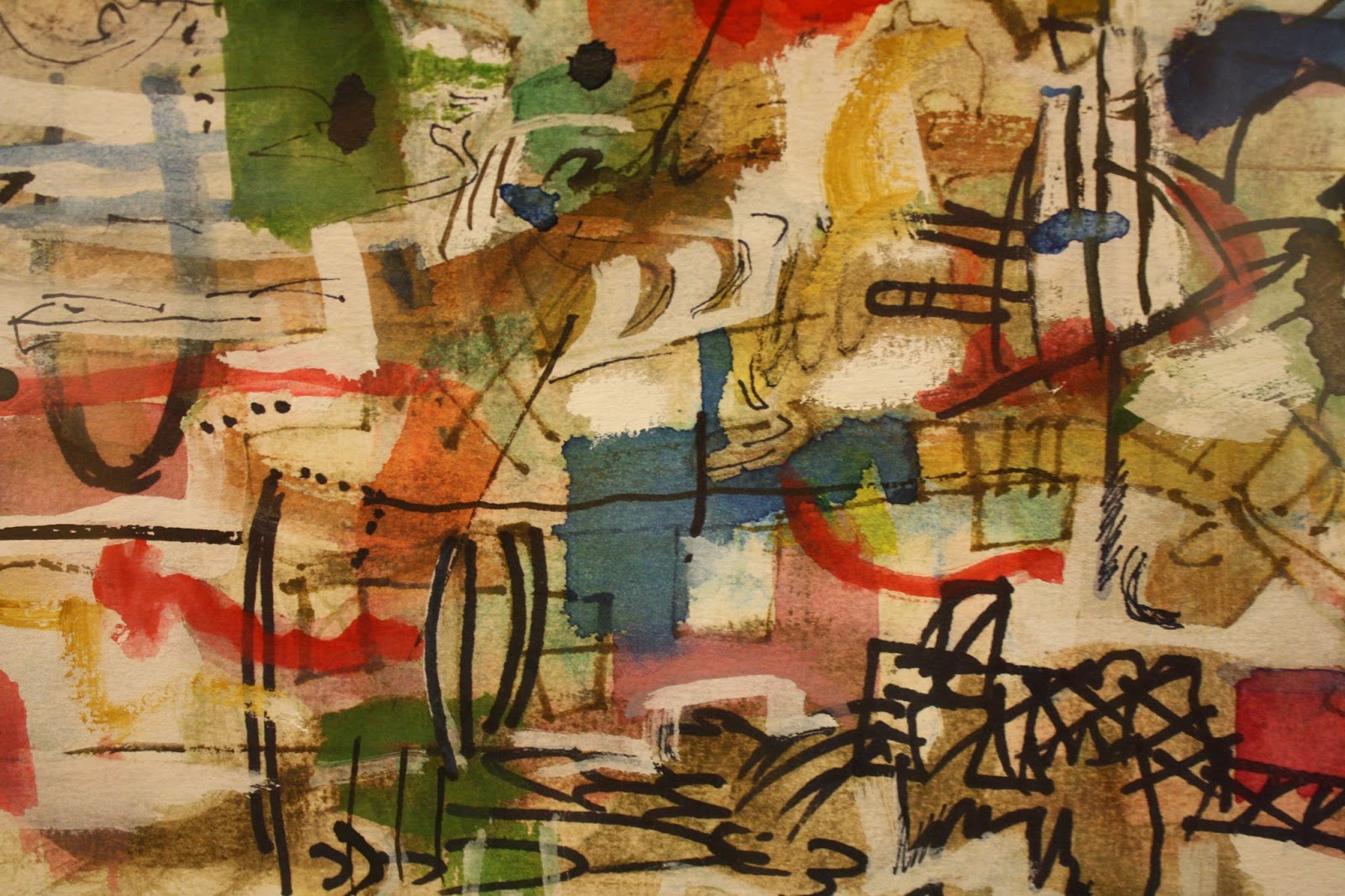
In other works artists use the transparency and the brilliance available in this medium to full effect, creating compositions of gemlike color and dynamic balance. Looking at Alan Crockett's Untitled (2007), one might be looking at a piece of translucent art glass. The medium's greatest beauties are on display, but as they can be only in the hands of a master. In this small but very busy, complex, and layered passage of his painting, Crockett has allowed no bleeding of color or line; each color is brilliant and distinct, each laid down as if he'd had the time a collage artist would have to consider every placement.  What a joyously confident display of technique and spontaneity!

Alan Crockett (1941- ), Untitled, detail. 2007. Author photo.

I'm sure this show is a treasure trove for art historians or critics interested in the development of the magical medium. For me, the delight is in the discoveries of artists I'll be looking for in the future, and of these and several other wonderful works.