Showing posts with label Wexner Center for the Arts. Show all posts

Saturday, June 13, 2015

Jack Whitten's Black Monoliths: Born in Bessemer

Jack Whitten, Black Monolith II: Homage to Ralph Ellison
The Invisible Man,
1994, Acrylic, molasses, copper, salt, coal,
ash, chocolate, onion, herbs, rust, eggshell, razor blade
on canvas, 58 x 52." Brooklyn Museum, William K.
Jacobs Fund 2014.65
Jack Whitten: Five Decades of Painting runs through August 2 at the Wexner Center for the Arts. The show displays fifty works by an artist of outrageous originality and dynamism. So driven by the need to experiment is this man that, were labels withheld, a gallery visitor might reasonably assume this to be a group show of six or seven abstract artists. 

While the show, organized by the Museum of Contemporary Art San Diego, refers to Whitten as a painter, I think this artist would much more precisely be called a fabricator rather than a painter through much of his career. One often sees this impulse in printmakers and sculptors, for whom innovation with processes and materials can be as important as the glimmer of the image down the road. Whitten works with acrylic paint, but he has rarely made works that would be universally identified as "paintings." He has used acrylic in its liquid form not only to carry pigment for making images, but also for its industrial properties: It is elastic; it can be layered and separated; it can be molded or cut; its colors can be blended or separated in sheets. Acrylic is plastic.

I think the direction of Whitten's artistic inquiry has to have been shaped by location. He was born in 1939 and grew up in Bessemer, Alabama, a close western suburb of Birmingham. Heavy industry dominates the whole region, which is known for ore mining, iron smelting, and the manufacture of railroad cars, including Pullman Standards. Bessemer's African-American population has always hovered around 75%. The labor for the city's vast industries was provided by integrated unions. Whitten's father was a coal miner; his mother was a seamstress. 

1950 map showing heavy industry in Birmingham, Alabama and suburbs. Bessemer would lie in the lower right area, approximately
eight miles from Birmingham.

Whitten's maturity and artistic career have been spent in New York, where he arrived in 1960
during the flowering of the Abstract Expressionist movement. This mid-century 
milieu is reflected in his work of the period. Whitten worked among the artists of the New York School, particularly with Willem DeKooning, but he apparently maintained an independence from them too, associating himself with other artists of color, and experimenting with his own ideas about abstraction.

Before New York, though, Whitten studied at Tuskegee Institute and then at Southern University in Baton Rouge, where he discovered his vocation for art. His move to New York City had as much to do with his despair over the South's intransigence during the movement for civil rights reform as with any intention to attend Cooper Union—which in fact he did. Entering the art school at 21 was Whitten's first experience as the lone black in a white environment.

Of the many bodies of work represented in Five Decades of Painting, I find myself most fascinated by works begun during the 1990's, the Black Monoliths that honor Whitten's African American heroes and friends. As in the Homage to Ralph Ellison above, each of these is a mosaic composed of thousands of colored tesserae. Each tile is formed from acrylic paint (and any additives). Since detail is difficult to interpret at such a reduced scale as in these pictures, I point out that the tiles don't contain image, only color.


 Jack Whitten, Black Monolith IV For Jacob Lawrence, 2001, acrylic on canvas, 96 x 96 in. (243.8 x 243.8cm). Courtesy the artist, Alexander Gray Associates, New York; Zeno X Gallery, Antwerp. ©2015 Jack Whitten/Artist Rights Society (ARS), New York. Photo by Philipp Scholz Rittermann. 

 Jack Whitten, Black Monolith III (For Barbara Jordan), 1998, acrylic collage on canvas, 
69 x 65 ½ in. (175.3 x 166.4cm). Mott-Warsh Collection, Flint, Michigan.
©2015 Jack Whitten/Artist Rights Society (ARS), New York. 
Photo by Philipp Scholz Rittermann. 

Whitten makes no claim that these are attempts at portraiture, though it's difficult not to attach the idea of likeness to them in at least a rough way. The homage to Ralph Ellison, above, takes the form of an anonymous silhouette, the sort we see when a journalist interviews a person whose identity must be protected in order to maintain their safety. In this work though, the silhouette is nevertheless, in layer upon layer of irony, "the only Black in the room." While he is anonymous because he is faceless, he is unmistakable against the unbroken wall of white and blue, the two colors that provide no prayer of invisibility or protective coloration for a Black man. The homage is to the courageous daily bravery of the visually conspicuous, for whom freedom from invisible individuality remains so tortuous and tragic. 

When I encountered Black Monolith IV For Jacob Lawrence—breathtaking at eight feet by eight feet, yet every tessera worthy of scrutiny when you're close to it—I first thought I had come upon a remarkable map of Manhattan, glimmering and demarcated against a dark world. But then, there is also a strong resemblance to a capped (not hooded) smoking silhouette out of a Philip Guston painting—that ambiguous, vaguely threatening, possibly explosive character. Only after that did I see the title referring to Lawrence. Maybe both of my thoughts have a home in this work?

Lawrence's subject was the common life of African Americans—not always a visually attractive subject, given the poor material and social conditions in which so many lived. The series of painting with which he is perhaps most identified is his The Migration of the Negro, which tells the story of rural Blacks moving to the industrial cities of the north. Lawrence lived in New York City most of his life, having spent his earliest years in New Jersey, and moving with this wife to Seattle when he was in his fifties.
Jacob Lawrence, The Migration of the Negro, Panel One, 1941. Posted
 in accordance with fair use principles on Wiki Art.

Maybe it is a map of Manhattan, white Manhattan with conspicuous dikes raised against a coal-black sea. As an homage to Lawrence, perhaps Whitten reflects bleakly on African-American migration to cities where they haven't ultimately been integrated or their lives bettered? Where they remain immigrants? The Gustonian, alienated smoker neither sees nor  responds. He doesn't wear a hood anymore, but his anonymous indifference testifies to his enduring hostility.

However one interprets the particulars, Black Monolith IV strikes me overall as a phenomenal commentary on immigration in the 21st century. It is certainly the most pressing issue of our time as Africans, Middle Easterners, and Central Americans—people of color—risk all to reach Europe and America, whose nations bravely fight the tide and erect walls of all sorts against them.

I love Whitten's Black Monolith III (For Barbara Jordan) if only because it's not monolithic. A monolith is not only massive, but it is coherent and unified—which this so conspicuously is not. Whitten has also altered the shape of his support, giving it "shoulders" and sloping its sides inward toward the bottom: like a memorial or gravestone? Like a figure? 

The disposition of black and white tiles, while interspersed, nevertheless tends to converge in the suggestion of a torso. This notion is strengthened by the column that rises at the center top, out of the picture like a neck, giving the image the sense of an x-ray. Is that big dark shape a massive heart? This body lacks clear edges, quite unlike the others in the Monolith series and, again, contrary to the definition of the word. Perhaps this suggests Jordan's aptitude for politics, that art of compromise, of dancing between black and white to move people together while respecting the rights of those on the edges? The name for monolithic politics is tyranny.

 Jack Whitten, Black Monolith, V Full Circle: For LeRoi Jones A.K.A. Amiri Baraka, 2014, acrylic on canvas, 84 x 63 in. (213.4 x 160cm). Collection of Sheldon Inwentash and Lynn Factor, Toronto. ©2015 Jack Whitten/Artist Rights Society (ARS), New York. Photo by Philipp Scholz Rittermann.
The experience of Full Circle: For LeRoi Jones A.K.A. Amiri Baraka is like looking at the Earth from a space ship, or through a telescope on the moon. The best part about it is that all the life of the universe is encapsulated on our planet, for there are no stars and no hint of any other life in a sky that is impenetrably black. It is a wonder that Whitten could manufacture so black a black as the space that surrounds this globe.

The globe, however, is infinity. By creating intensity at the center with lots of color and small elements, Witten draws the eye in ever deeper and we eagerly search beyond what we see. Though this caption provided identifies the materials here as "acrylic," it is a great jumble of collaged materials, not all of which are made of acrylic: There are lots of found materials as well, colorful, hard scraps of life.

In this there is almost no contrast between black and white. The edge is between blank black and black that is filled with color: with idea, life, and, above all, the representation of deep time. Here's an image of the history of the world in Baraka's color—all of his colors: the colors of thought, idea, travels, loves. This is also a mirror, it seems, for any viewer. You look at it less than you look into it. As you do, it's impossible not to want to find something, to see what you relate to, to pick out your place. In the other Monoliths, there are boundaries to consider and we are asked to deal with their significances for us. This one is different. The boundary is the ends of the earth and we cannot but fall in.

Viewing Whitten's Black Monoliths, I continue to be nagged by the memory of another artist from Bessemer, the wonderful self-taught artist, Thornton Dial. Dial was born in 1928 (Whitten in '39) and work in the fields before he moved to the city where he was a metal worker, in the Pullman factory particularly. Much of his art is sculpture made from re-purposed found materials, from tin cans to mattress springs. 

I think that there is a kinship between Whitten and Dial in that they share a deep central aesthetic of fabrication born in Black, industrial Bessemer. Dial was a manual laborer; Whitten was not. But I believe that Whitten's youth in a city that was all about manufacture, mining, and callous-producing labor affected his outlook as a visual artist. Five Decades of Fabrication?

Sunday, May 24, 2015

"Catherine Opie: Portraits and Landscapes" at the Wexner Center for the Arts

I think that Thomas Edison has already been installed to replace William Allen as an icon of Ohio in the Capitol's Statuary Hall. Had I only known that ours is Catherine Opie's home state, I'd have done something to see her enshrined instead next to James Garfield as the a representative of Ohio's glory. Move over, second-tier presidents, when we have artists of true stature and vision.


 Catherine Opie, Miranda, 2013. Pigment print, 33 x 25 in. ©Catherine Opie, image courtesy the artist
 and Regen Projects, Los Angeles 
Certainly Opie's photographs in Portraits and Landscapes, showing at the Wexner Center in Columbus until August 2, would be at home in the proudest marble and columned traditional setting. If we were in the 17th century galleries of a great European museum, surely our feelings would be much like the ones we experience as we move at considered pace through this show.

Each of Opie's sitters appears before a background of profound, impenetrable black. Whether we register that as a blankness or as infinite depth, the effect is in either case the same. It places the subject in a timeless  three-dimensional space entirely his or her own, unrelated to any other place or moment.

The effect is to sculpt the figure out of this medium of black. The light not only defines the subject's features, emphasizing some over others, but frees the form from the darkness as sculptures are said to free figures from great pieces of stone. So, through two galleries of portraits, each figure is captured at a second birth, born not of flesh, but of mind, effort, and imagination These are individuals sprung like Athena from Zeus's head, fully grown and mature. ( An interesting comparison can be made at http://www.modigliani-drawings.com/nude%20in%20profile.htm .)

In her portrait, Miranda wears a gown of almost Quakerish simplicity and understatement. Its claret color and her red hair mediate between blackness and the luminous skin and blue eyes that shine from her steady, resolute expression. Beauty can be a poisoned gift. Here, beauty is neither disguised nor avoided; its possessor can carry the weight with chin slightly lifted, directly returning the viewer's gaze. The image portrays the strength, stature, and balance of a flawlessly beautiful woman with nothing—not even her perfect face—to hide.

Miranda, a three-quarter standing portrait of a woman of noble bearing, is clearly related to a long tradition of Western portraiture, evident in any museum one cares to visit. While this particular woman captivates us with her seriousness and beauty, we also know that, individual, her photographer places her among a class of persons demanding our highest respect. The setting, the attention to details, the lighting all tell us so. Do we really need to know who she is? Here is a distinguished individual who is also a participant in the centuries-old tradition of women posed for posterity. She is one; she is another one.

When we visit museum galleries hung with grand and stirring portraits of Renaissance, Enlightenment, or nineteenth century royalty, clergy, poets, and concubines, how often do we know who those portrayed persons were, or what they accomplished in the world? Certainly not as often as we'd like. King George? Henry? And what number? Not a clue! Yet we interpret the images through our understanding, general knowledge, and imaginations via the art itself, through conventions and deviations from them; from our own reactions to images of luxury, eccentricity, and beauty. We react to the story the artist has told and we create the central figure to satisfy our use of the painting. Ahistorical? Anachronistic? Yes. Utterly commonplace? Yes again.

In fact, we do the same thing with contemporary portraits simply because we don't know everyone who is thought to be important to image-makers. Nor are we supposed to. In this series of portraits, Opie identifies her subjects by first names only. How they were posed appears to have been largely up to the artist, who received lovely testimonials from many of her subjects for the generous or enlightening experiences they had with her. As recounted in gallery notes, the artist Kara Walker remarked that before many scheduled portrait sessions, she has been less than at her best: "There are a handful of images by well-known artists out there of me at my darkest, lowest points. Cathy's manner and the resultant images show me feeling cool, collected, showing my muscles…I felt a rush of ownership or at least fellowship—that we were going to endeavor to correct this past."


Catherine Opie, Mary, 2013. Pigment print, 50 x 38.4. ©Catherine Opie.  Image courtesy the artist and Regen Projects, Los Angeles 

So, yes, Opie's subjects are eminent people, contemporary artists working in the avant garde of visual arts, literature, performance, and music. Even though many will be recognized by a relatively small audience, they are nonetheless constantly imaged. Miranda, above, is the filmmaker/performance artist/writer/actor Miranda July. If you haven't seen her before, just Google for her image: There are pages of them. It's a worthwhile exercise in understanding the difference between a picture and a portrait.

In the present day, pictures are everywhere by accident and by design. The tradition of grand portraits in which Opie places this series derives from times in which images of the great were rare and precious. A painted portrait of Voltaire would become the basis for engravings, which could be printed and disseminated at low cost. But the world was not saturated by an infinite flow of unique images of a single eminent person who was redecorated and whose personality was recast daily. There was a constancy about the central identities of intellectuals and artists.These portraits, in this form, reclaim that idea of constancy. 

To the extent that Opie's portraits help define and settle identities, she uses visual tradition as a structure upon which she arranges the ideas, works, and core identities of the individuals portrayed. The black background, the exquisitely controlled lighting, the dignity of the posing, the shapes of the portraits: These form the traditional framework that assure a place of honor. Within that framework, the individual is exactly as portrayed—nude or clothed; regal or workmanly; facing forward or back to us; looking into the distance, or daring us to return a gimlet gaze.

Catherine Opie, Idexa, 2012. Pigment print, 50 x 38.4. ©Catherine Opie.  Image courtesy the artist and Regen Projects, Los Angeles 

While Miranda's classicism provides studied definition to a woman whose image is ubiquitous and casually broadcast, in Mary and Idexa,  Opie uses conventions to bring the temperature of uncommon images down. Tradition soothes expectations and we are eased into accepting the differences in purpose and outlook revealed in these portraits. Formality does not stifle outrage, but it is a leveler; it brings discussion back to a home base.The women depicted here are not women with traditional self-awareness or lives. But who they are and who they wish to reveal are who we will see in the same dignified ways we would see queens and saints and famous lovers portrayed. 

These two portraits will hang comfortably in haughty halls centuries hence, among the late Maries and Georges and Voltaires; the images will command respect beyond our period and, like all historical images, will require the acts of research and imagination that we are asked to give to the past from our own present. The question cries out: Can we understand the genius of difference in our own time with the acceptance we grant to heroes of the past? Can we imaginatively condense the years it takes gradually to achieve understanding through the mediation of formal visual traditions?


 Catherine Opie, Untitled #5, 2012. Pigment print, 40 x 60 in. ©Catherine Opie, image courtesy the artist and Regen Projects, Los Angeles 

The Portraits in Opie's show are so intense, so detailed and personal that the curator, Bill Horrigan, made the interesting decision to divide the portraits into groups of three or four separated with single, large scale landscapes the artist's. Some of these, like the one above, I am sorry to feel obliged to call a landscape, as I think it is so very open to—so inviting of—free interpretation. But their use is fascinating, contrasting as they do with the entirely unfocused with portraits in which every detail is in sharp focus. Neither is realistic, of course. But the effort the portraits compel from the viewer, with a degree of focus that only incites us to come ever closer—sends one into the landscapes as if suddenly lifted out of stress and sent into cool reverie. It is both relaxing and disorienting, for there is no middle between the two photographic approaches. I like this arrangement better in the first floor gallery, which is larger than the narrow upstairs room. With lots of room to stand back and to take in a whole long wall, the effect of the combination is lovely and its meaning is clear. The closer one is to the works, upstairs, the harder the effectiveness of the contrast is to grasp.

If there is any problem with this show, it's that any single work in it could stand alone as a show in itself. It's an embarrassment of riches to be sure. The portraits are of a size and degree of detail that each is a map of the world, a voyage out far beyond anything you can notice at the outset. Every well-crafted detail is surrounded by a field of more and more subtle and revealing manipulations of Opie's medium. They are captivating and fulfilling—and absurd to present in miniature, in a blog. Don't miss a chance to see them.


Catherine Opie, Hamza, 2013. Pigment print, 33 x 25 in. 
©Catherine Opie, image courtesy the artist and Regen Projects,
 Los Angeles 


Monday, September 30, 2013

"Blues for Smoke" at the Wexner Center for the Arts

s
Roy DeCarava, Dancers, New York, 1956
Gelatin silver print, 14 x 11." Courtesy of the DeCarava
Archives.
Jaki Byard, Blues for Smoke, 1960,
album jacket.
I have written about travel before, but never in the guise of an art review. Blues for Smoke, out of the Los Angeles Museum of Contemporary Art, seems more like a city than an exhibition. The only elements it lacks are architecture and food. It has painting, photography, sculpture and installation. It has full-length movies, videos, documentaries, concert films, and sixty hours of The Shield. You can lean against the wall to hear whole albums of music by jazz and blues musicians (no seating, unfortunately, provided for 35 minutes of the namesake album, pianist Jaki Byard's 1960 Blues for Smoke). 

Blues for Smoke fills every inch of the Wexner Center. Headsets for music dangle ready for use in spaces better left as the passages they normally are; only the restrooms remain artlessly functional.

The outsized show reflects the excellent impulse of curator Bennett Simpson, assisted by artist Glenn Ligon, to provide as many lenses as possible on the cultural notion of the blues. And what would that notion—"the blues"—be? Refreshingly, no statement is made, no definition suggested. Only works of art are offered to us. What do we think? In or out? Do we think, "Spot on!" or "What's that doing here?" 


Beauford Delaney,Portrait of Charlie Parker, 1968.
 Oil on canvas, 28 3/4 x 23 1/2 in. 
Courtesy of Michael Rosenfeld Gallery, New York 
Still, Simpson clearly starts from the premise that the blues are a form of musical expression shaped by the impulse to make something out of the nothing of hardship. The blues has inspired nearly every art form and continues to color and shape American—and possibly foreign—culture(s).

But fundamentally, it's music, with which the show is loaded. There is less Leadbelly than Jaki Byard; less Big Mama Thornton than John Coltrane. In general, Simpson isn't as interested in the roots as in the shoots—in all the ways the blues inspire.

Blues for Smoke is heavy on jazz. Beauford Delaney portrayed Parker ("Bird") in 1968, thirteen years after the saxophonist's death at age thirty-five. Parker is not presented realistically, but through symbols. His skin is so black that it is like a rainbow; his costume is like an African prince's golden raiment. He doesn't hold an alto saxophone, but a hand-mirror decorated with musical notes: His reflection must be music itself—or the Bird that sits near his shoulder? Is the sparrow from a Kansas City sidewalk transformed into but a regal West African crow, gliding above Sahara sands?


Art Ensemble of Chicago, Record jacket for Art Ensemble of
Chicago with Fontella Bass,
1970, America Records.

(Image not in Blues for Smoke)
Beauford Delaney was active during the Harlem Renaissance but moved during the '50s to live in France. A gallery note tells that he did not in fact consider himself an expatriate, reasoning that one can only expatriate from a country that claims you in the first place. "One must belong before one may not belong. I belong here in Paris, I am able to realize myself here. I am no expatriate."

Without exploring anew the details of music imported with West African slaves and its shaping of the blues, Simpson gives significant attention to the free and improvised jazz of the 1960s and later made by musicians like the racially and historically conscious Art Ensemble of Chicago. The record jacket from a 1970 release (not included in the show) only hints at their connection to Africa, made in their performances not only through instrumentation—talking drums, floor drums, rattles, whistles and other percussion equipment; use of  Western instruments to produce non-Western sounds—but through exotic costume and staging. The group's motto was, "Great Black Music, Ancient to the Future."

The hour-long film, Art Ensemble of Chicago in Concert,1981 (Rhapsody Films, 2005) is one of the first events you'll encounter at Blues for Smoke. Placed as it is, this electrifying film makes it hard even to proceed any farther. AEC's sweating musicians play from electrifying, almost ecstatic inspiration. Lester Bowie, the trumpeter, dresses in a white lab coat, emphasizing the experimental nature of his work, but the others—I reveal what no note does: Malachi Favors, Joseph Jarman, Roscoe Mitchell, and Famoudou Don Moye—wear masks or face paint and garments in several African styles, adorned with cowrie shells and other jewelry. The color and richness of the pageantry provide an unforgettable display of racial dignity and pride. In their avant garde music it's difficult not to hear the links they make between improvisational jazz ("American classical music") and sources in African rhythms and sounds.

A fascinating documentary about powerhouse, avant-garde pianist Cecil Taylor demonstrates his daily aesthetic and cultural ties to Africa (Cecil Taylor: All the Notes, 2006. 72 minutes, Dir. Fred Barney Taylor; Maestro Media, 2009). Because the background of his life is so impregnated with Africana, one can't help but wonder about associations he may make between his racial and cultural background and his extraordinarily grounded approach to music-making. He works in a way that almost entirely eschews Western, academic notions of how music is put together, down even to the basics of scales, preferring to be led only by the ear and confidence in instinct. 


Arkestra, Barcelona, September 21, 2013. Photo, Suso Navarrete
(Image not in Blues for Smoke)
And another great avant garde musician from the '60s and '70s is Sun Ra, whose connection to an Egyptian-based mystical morality binds the music of his Arkestra to social betterment for Black youth. Blues for Smoke includes Ra's 1972 film, Space is the Place, (GRP AAIMPD249, 1993) with the plot of a conventional grade B urban action movie. White law enforcement officers try to keep Ra and the Arkestra (all in defining, exotic costume) from performing, and slick Black pimps exploit innocent Black girls. Thanks to powers that make Ra basically superhuman—harmonic progressions converted to energy—he saves all situations.

The blues? Are we still talking about the blues with all these costumed improvisers making appeals to different regions or fantasies of Africa? I was interested that Simpson insists on making them prominent, for it's not something that jumps out like the connection between the John Coltrane, Miles Davis, Thelonius Monk and the blues. The confident commitment of free improvisation, and the musicians' deeply felt relationship with a distant world—both are drenched in fundamental tensions. They yearn for a place and time long lost, yet they work to create a comparable world of dignity and beauty by framing their own rules; by replacing old assumptions with new. Among these avant garde Black musicians, the blues aren't only about the fatigue of suffering: From the downtrodden arises a Phoenix-like impulse to brilliance.  
David Hammons, Chasing the Blue Train, 1989. Mixed media, dimensions variable.
Collection S.M.A.K., Ghent, Belgium. Photo by Dirk Pauwels. 
 

A few works of visual art respond directly to music itself, not to musical figures. Roy DeCarava's black and white photos of dancers at a rent dance in a small kitchen (not shown) and, above, in a dance hall, beautifully reflect the deep mysterious movement of music on soul and body. In the kitchen-dancers' everyday dress, the sadness of eking out dream-space under the overhead light and next to the sink are tenderly acknowledged. In Dancers, the darkness that accompanies all freedom is surely the flip side of the blues.

David Hammons' installation, Chasing the Blue Train, is both funny, visually engaging, and beautiful in its arrangement of a select few, spare elements. Blue Train is the title of John Coltrane's ("Trane's") first album as a leader, recorded in 1957, so the title is a pun, as is the work itself, with a blue-painted HO-guage train chugging along beneath a tunnel of coal ("coal-train") on each loop. Among the landscape of piano lids the train traverses are boom boxes playing music of pianist Thelonius Monk, Coltrane's inspirational colleague, and of a trumpeter—probably Lee Morgan, who was on the Blue Train album (no gallery note reveals the personnel or music). 

The importance of Chasing the Blue Train for us is not so much in knowing details of the Coltrane-Monk association, as it is in Hammon's 1989 response to the legendary album. Hammons'  installation is minimal, cool, and amusing. Its light-heartedness is appealing. It's based on word-play; the music is a prop for the visual and the implied verbal. I think it's more a commentary on the culture built around jazz than about the music itself. Hammon reflects on the wish to be "on the train" of "With It," recognizing the scenery, knowing the station names, where to get on and off the cool-train.
Bob Thompson, Garden of Music, 1960. Oil on canvas, 79 1/2 x 143 in. Wadsworth Atheneum, Hartford, Connecticut
The Ella Gallup Sumner and Mary Catlin Sumner Collection. Courtesy of Michael Rosenfeld Gallery LLC, New York, NY. 
Bob Thompson's enormous painting, Garden of Music, celebrates great jazz innovators of his moment. Among the musicians in his Garden of Eden are free jazz saxophonist Ornette Coleman and musicians associated with him: trumpeter Don Cherry, Ed Blackwell literally on the drums, and Charlie Haden carrying the bass (line). To the extent that pattern, color, and visual rhythm can "make music," Thompson aims to do so. And what  truly excites me is that so immense  a canvas celebrates avant garde artists at the moment of their ascendence, when the future can still take their legacy to greatness or obscurity. It's not the same as making a portrait of Bird fifteen years after his death. Thompson is deeply in the middle of this scene. He was friends with Coleman and this musical circle in New York, though the painter and his wife expatriated to Spain. 


Melvin Edwards, Write When You Can, 1991.
 Welded steel, 13 x 10 1/2 x 8 in. Courtesy of 
the artist and Alexander Gray Associates 
Expats and Afro-centrists; people living where they never wanted to be, born into a world that didn't want them, or looking for a better place. So much of Blues for Smoke relates to location the will to move on and up—to the promise that a man who can choose his environment can change his lot. 

In general, I think that the two-dimensional works in this show are less interesting than the music, videos, and installations, and for this reason: The blues are a matter of movement, atmosphere, and ambiguous or unsettled states of being. These are best captured in transitory and dynamic art forms. Thompson's painting, and Delany's (above) pay tribute to blues figures, but there's a difference between demonstration or homage and being caught up an experience. Two-dimensional works throughout the show are secondary sources—representations—a step away from engagement. The blues are experience itself, involving time and space. 

Even a stationary, three-dimensional sculpture like this small relief work by Melvin Edwards fills space and time, psychologically and in terms time's expanse of possibilities. It implies past and future; its mood is as complex as the horror and strength of its form and materials. Write When You Can is a title packed with nuance, future, and possibilities. It signals departure, presumably from a dark place where this conglomerate of chain, gimlets, screws and fused steel will be left behind at "home." 

Does sorrow overwhelm us that this is where one has been, and that this will always be part some immigrant's life? What kind of congratulations do we give the person who leaves this? What will she say when she writes? How will she explain her new-found world to people fixed in the darkness of this one? Within the psychic space of Edwards' sculpture there is room for all these questions to exist and begin to play out in our imaginations.


Blues for Smoke includes 78 minutes of Richard Pryor Live in Concert, 1979 (directed by Jeff Margolis, HBO, 2006). If there were more than two headsets attached to the monitor, I suspect that Wexner could outright cancel the rest of the show. Blood runs through every laugh Pryor evokes. It's impossible to watch him without knowing that every joke you're doubling over about is a horrible truth. "Be happy," he says, "for any Nigger doing anything," and he probably cuts as close to the bone of the blues impulse as anyone can.


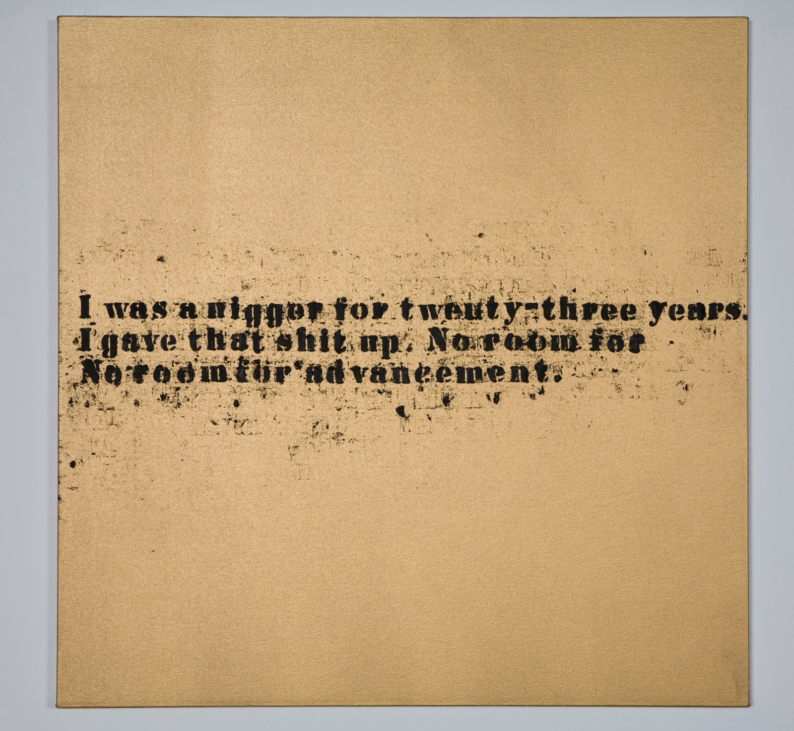
Glenn Ligon, No Room (Gold) #42, 2007. Oil and acrylic on canvas,
32 x 32 inches. Courtesy Regen Projects, Los Angeles.
© Glenn Ligon. Photo by Joshua White. 
Three canvases of Glenn Ligon's hang next to the monitor playing the Pryor video. Two have the text shown to the left: "I was a nigger for twenty-three years. I gave that shit up. No room for / No room for advancement." The other substitutes the word, "Negro" for "nigger." I was with a friend deeply-versed in Pryor, who assured me that this text is derived from Pryor', who is a great inspiration for Ligon too. 

These three paintings are from a much larger series with the same texts printed in greater or lesser degrees of clarity, surrounded by more or less smeared excess ink. It's a series painted of stuttering words that evenly divide a golden ground. Each canvas has, despite the sputtering and smears, an essential formal dignity. Yet despite the golden ground and the formal setting for the vernacular language, the canvas-to-canvas repetition never manages to get off the ground: There's no advancement. Nigger/Negro? How does one give that shit up? What's the relationship between statement and action? Between saying it on the stage, as comedy, and repeating it, in all seriousness, as text? Does anyone advance?

Such questions seem inevitably to lead either to constant expression of frustration and rage (Pryor, Ligon) or to movement (migration of the soul to real or imagined Africa, to Europe, to a hopefully less racist part of America). But movement away still leaves part behind. Zoe Leonard's  continuous installation/sculpture, 1961, is a poignant testimony to this idea of departure and personal history. Every suitcase added must represent more packed up from added experience—the difficulty of leaving the past behind, however painful it may have been. You can't shake the blues. You don't pack up in a pink suitcase and leave segregated America of 1961 behind as you click the latches.
Zoe Leonard, 1961, 2002- ongoing. Blue suitcases, dimensions variable.
Courtesy of the artist and Galerie Gisela Capitain, Cologne, Germany. Photo by Bill Jacobson. 
Leonard is a white woman in a show of mostly  Black artists. Simpson's piece suggests, however, just how far the influence of the blues penetrates through races, sexes, and nationalities. A splendid 14-minute, 2012 video by Wu Tsang, Mishima in Mexico, presents two young, English-speaking men of ambiguous sexuality who rent a hotel room in a Mexican city in order to finish a screen play of a book by Japanese novelist, Yuko Mishima. Moody, ambiguous, sliding between fiction and reality; character and role; and gender assignments, we watch it with questions from the surrounding blues environment. Japanese, Mexican, white, and transgendered: All these are categories that don't pop to mind with the term "the blues." Simpson invites us to see how far contemporary art can stretch the blues.


Stan Douglas, Hors-champs, 1992. Two-channel video installation with stereo 
sound 13:20 minutes. Courtesy of the artist and David Zwirner Gallery, New York.
Image courtesy of the artist and David Zwirner Gallery, New York, © Stan Douglas .
Blues for Smoke is a show of such grand scope, settled around so basic an issue—the  influence of the blues on contemporary artists and art forms—that it's impossible to come away unsatisfied. For any visitor there are beauties, surprises, brand-new satisfactions, and even old favorites to be found.

I was nevertheless very sorry to see that while Simpson gave much pride of place to music in a multi-media show, he did nothing to acknowledge musicians; he thought entirely like a visual arts curator, acknowledging only whom he assumed to be the Real Artists. 

One of the glories of Blues for Smoke is a 13-minute film, projected onto back-to-back screens. It records a performance of Spirits Rejoice by its composer, free-jazz saxophonist Albert Ayler and his ensemble. As the caption to the stills above reveal, all the credit goes to the film-maker, Stan Douglas. It requires very determined Internet searching on this work to eke out the name of any personnel on the performance beyond Ayler. Even though the trombonist is the great George Lewis (a MacArthur winner, even, in recent years), his name is never mentioned in the show or any materials connected to it. 

This is true of all the music films and videos. No names are given for the members of the Art Ensemble of Chicago, as eminent in music as any of the visual artists in this show. Ditto for the members of Sun Ra's colleagues, and the anonymous greats of music playing on the CD soundtrack for Hammon's Blue Train. Throughout the show, music is honored, but musicians—the most famous and groundbreaking—are anonymous. Or, in the case of the Stan Douglas film, what's celebrated is his film with his title, over the content of astounding music performed by genius musicians.

The confinement to visual (Art) standards in a multi-media show is curatorial oversight of a high order, suggesting that however prominently the music is showcased, it's all really just the blues. It's not embodied; it exists just in the air, an attitude, perhaps coming naturally to anonymous Black brethern, like all blues do. 

Can we advance a little here?

Sunday, July 28, 2013

Paul Sietsema at the Wexner Center for the Arts: Stop-Motion Drawings

The Ohio State University's Wexner Center for the Arts introduces its vast show of Paul Sietsema's recent work with this text:

"Paul Sietsema's multifacted practice explores the ambiguities of authorship and cultural production, the mutability of history, and the effects of representation and replication. Working is drawing, painting, sculpture, and film."
Paul Sietsema, Brush painting (green), 2012. Enamel on dyed canvas.
27 x 26.5. Courtesy of Terri and Michael Smooke. Photo by Ron Amstutz.

Sietsema's paintings, like this, are all two-dimensional and, despite the
limitations of photography, they (like this) are alive with color.

How true. Come on over. 

But you don't really have to be a graduate student or philosopher to be intrigued by and to enjoy the beauty in the work of an undoubtedly cerebral artist. 

The work in Paul Sietsema is all dated between 2007 and 2012, with the vast majority having been produced last year. The visitor to the show will understand that his 2012 production is an almost superhuman quantity measured both in large-scale completed works (I count twenty listed in the catalogue, which doesn't account for all) and in quantity of marks made. There are five sixteen-millimeter films, a sculpture, and many ink drawings and paintings in enamel on canvas. His work in every medium is haunting with its often ghostly, bare beauty; its perfection of trompe l'oeil techniques, and its improbable explorations of scale.

Sietsema is absorbed with the idea of mechanically-produced multiples, like photographs printed from negatives and screen-printing, even though every work in the show is elaborately, exquisitely unique. In many cases, Sietsema has made what are indeed large scale, "hand-made multiples" that are distinguishable only by small details. One such impressive "set of prints" is a series of four identical sail boa drawings, each picture 64.25 x 50.5," each drawn in ink to look like an old, black and white photograph on paper that's crumpled and warped with time—each aged in exactly the same way. These huge and phenomenally detailed drawings, Calendar boat 1, 2, 3, and 4, appear to be identical save for the numbers on their sails: 2010, 2011, 2012, and 2013. The entire series was produced in 2012.

Sietsema has made many large ink drawings with the subject of sailboats, all with appearances of photographs on worn, creased and torn paper. A particular favorite of mine on aesthetic grounds alone is a diptych, Boat Drawing, from 2012. The right panel (each is a large 51.15 x 67.75) depicts sailboats catching the wind on a grey day. The left is another ink drawing of: fog? sea foam? clouds? the last images in the mind of a dying person? The sheet depicts something or nothing, in softly gathered form. Presumably related to the sailboats, it could be above, below, or surrounding them. It could be what they are in, have come through, or are entering. As the image of the boats themselves captures one instant in time, as we like to think photography does, roiling foggy masses can be from any moment— from the beginning of time to its end—and all equally relevant. Yet any one of them would be 
"caught" in the same way.

These magnificent images—which I may not show you because no images of them are made available and photography that would represent them is not allowed—are, of course, not made in a way that captures an actual single moment in time. They are made to appear as if they do. At their large size one sees upon close inspection that their perfect level of verisimilitude is achieved through the extemely time-consuming process of penning thousand upon thousand of small marks in black and white inks. In fact, to examine the drawings close up is to experience drawing that satisfies on an entirely different level. The landscapes of tiny marks have their own rhythms, and the collections of shapes contain great variety, as if any six-inch square of the surface were carefully composed on its own.

Sietsema offers an interesting series of 45 x 53 Concession Drawings, all ink on paper and, again, all dated 2012. Each features, from ever closer range, the inscription on a tombstone, "Concession a perpetuite" which (with the accents this program denies me) means, "Released to the eternal." Each is drawn to give a nigh-perfect illusion of three weighty dimensions, as if the top layer of the granite stone had been effaced in a slab and framed. 

The first, in gallery display order, presents a complete, arched headstone with the inscription in crisp, freshly engraved state. The lettering is an 18th century form, with extended verticals and strong contrast between thin and thick elements. This suggests to the viewer a sense of the gravestone's antiquity.

In a gallery remote from the first, another Concession Drawing is found. The major difference is that this one brings the viewer closer. We no longer see the top of the stone. The inscription is closer to us and shows signs of wear: The engraved edges are less crisp. The edge of the stone has a large nick in it. 

By the time we find yet another, several galleries along, it is drawn on green-washed paper, and the perspective allows us to examine the inscription very closely—a good thing, because time has effaced the letters to rounded cups, lost to legibility. The face of the stone, even, is pocked, pitted, and broken. Yes, time is conceding even this memorial to the perpetuity of memory, even as we spend a couple of hours passing through Sietsema's show. (The granite memorial exists only in ink, of course, though our conclusions are about something far more solid.)
Each of the Concession Drawings "records" with photographic clarity time's depredations on 
physical reality. Yet each drawing hangs in a different gallery, in a different context, surrounded by a different body of work. We have no hard and fast reason, really, to concludethat they are supposed to depict the same headstone. 

It is entirely sufficient to gaze upon any one of these—as it is to examine and admire any single work in this big show—and reflect on its considerable aesthetic beauty and connections to the viewer's experience.

But should one find all three Concessions during a gallery visit, questions might well arise about their relationships to a single or to multiple objects. Are their references to objects of the world or of the mind? Clearly, even memory itself doesn't last eternally, even when we consign it to durable granite, or even to its illusion. Sietsema has nudged us into the in-between world, where the mind somehow merges both perception of the physical world with memory and agrees that we'll call the outcome "reality."
__________________________________________________________________


A catalogue—Paul Sietsema, Ann Bremner, editor—accompanies the show, ISBN 978-1-881390-51-0. The essays and the interview are scholarly and general readers will find them difficult, but worthwhile. The photographs provide an invaluable record of the show.

Paul Sietsema remains at the Wexner Center through August 4. It opens at the Museum of Contemporary Art, Chicago, on September 7.

Sunday, February 17, 2013

Documentary Rhetoric: "More American Photographs"

America of the Depression era remains vivid in historical memory thanks to the ambitious scope of President Roosevelt's Farm Security Administration's (FSA's) documentary photographic project; thanks to the passion of the men and women behind the cameras. 


Dorothea Lange, Family between Dallas and Austin, Texas, 1936,
 Inkjet Print, Courtesy the Library of Congress, Washington DC. 8" x 10."
2012 brought to the Columbus Museum of Art the stirring work of the 1930s New York Photo League documentarians, shown in The Radical Camera. Now, at the Wexner Center for the Arts, we have More American Photographs. This show reviews  famous FSA images that documented conditions among the "ill-housed, ill-clad, ill-nourished" across rural and small town America. The selection of photographs by Walker Evans, Gordon Parks, Dorothea Lange and their nine colleagues are displayed among the work of twelve contemporary photographers, who include Larry Clark, Catherine Opie, and Hank Willis Thomas. Today's twelve were charged in 2010 with their similar mission by Jens Hoffman, curator of the CCA Wattis Institute for Contemporary Art in San Francisco. 

In a document that leads into the show, dramatically headed, "To All Photographers: Assignment," Hoffman declares, "I would like to send you into America to take photographs.  


Larry Clark, Adam, Marfa, TX, 2011. 
Archival  inkjet print.Courtesy the artist 
and Luhring Augustine, New York.
 24 x 17.3."
"This is an invitation to go out into the city or the country and to survey this land with all its blessings and all its shortcomings. I have selected you from among your peers as I see in your work a curiosity and determination to get to the heart of your subject and evoke feelings that can be universally comprehended. I know that you can tell a story, make pictures that are genuine, and recognize the pertinent things in a particular situation, whether an element of geography or a human being. In your photographs, I perceive a sincere, passionate love of people and respect for people."

The guiding idea for More American Photographs was to reexamine the legacy of the FSA photography during America's deepest economic downturn since the Great Depression. Hoffman's Assignment is an invitation to documentation as an act of rhetoric as highly colored as propaganda. His slightly archaic syntax ("this land with all its blessings and all its shortcomings") would seem to mimic the historical body of FSA work itself, by now grown slightly sentimental. Contemporary artists do not speak of "blessings and shortcomings" when they engage with issues of economic and social conditions. 


Walker Evans, Floyd Burroughs, cotton sharecropper.
Hale County, Alabama, 1935 or 1936, 
Inkjet Print, Courtesy the Library of Congress, 
Washington DC. 10" x 8."
Displayed at the head of More American Photographs, alongside Hoffman’s mission statement, are directions prepared by Roy Stryker for the use of his photographers in the ‘30s. These lists are not rhetorical per se. But implicit in the guidelines is a rhetoric Stryker expects to appear in the images that respond to his prompts.

 "To: All photographers" provides Stryker's "General Notes for pictures needed for files." Under the category, SPRING he lists, "New-plowed earth (early-morning or late-afternoon). Show 'texture.' Get the feel of 'good earth' into the picture.'" In the category, HIGHWAY, Stryker requests, "Pictures which emphasize the fact that the American highway is very often a more attractive place that the places Americans live." He asks for shots of "Horse and buggy...Back view—country road." Stryker has clearly written the story; his photographers are asked to illustrate it convincingly.


Ben Shahn, One of the few remaining inhabitants of Zinc,
 Arkansas1935, Inkjet Print. Courtesy the Library of
 Congress, Washington DC 
Hoffman, however, doesn't suggest any details, let alone the narrative to his twenty-first century crew, despite his antiquated the tone, vocabulary, and syntax. 

The missions of Stryker and Hoffman, are as different as the results obtained though. The Depression era photographers   demonstrated in the selection of work presented here an unmistakable unity of purpose and means. Notably, all of the older work is black and white and presented in 8" x 10" format. There is a visual coherence on the simplest level that enables the viewer to enjoy the sense of traveling within a unified, well-defined world. 

While it's not hard to notice that the subjects and tactics of Ben Shahn (above) and John Vachon (below) are dissimilar, my eye accepts that they could have passed one another in the act of taking the pictures they did. They could have set eyes on the same things. I accept this in part because of the inner relationships created by the uniform presentation of the works.

John Vachon, National Association of Manufacturers sign, Dubuque, Iowa, 1940, Inkjet Print, Courtesy the Library of Congress, Washington DC.
The FSA photographs appear, too, to have devised their own consistent visual rhetoric. For instance, irony is almost never deployed by the contemporary photographers. John Vachon's photo of an indigent contemplating a billboard sponsored by the National Association of Manufacturers drips irony. In this show, as in The Radical Camera, optimistic consumer (and government) advertising of the '30s was often exploited to heighten the poignancy that turns documentary into social commentary. Simple techniques were commonly used too, to turn the poor into heroes or the disadvantaged into the brave. Photographers angling up into their faces from below their chins, or focus squarely on their deep, direct gazes.

Gordon Parks, Washington, D.C. Government charwoman
1942. Inkjet Print. Courtesy the Library of Congress, 
Washington DC

Farm Security Administration photographers certainly found empathy in themselves, but  they knew that they needed to produce it in their viewers. The images they produced were of the threshold of an America never before seen by most of its citizens. These were images of a foreign country that we needed not to fear but to comprehend and develop compassion for.

For today's photographers, the assignment, while superficially similar, arises in very different circumstances. For one thing, their Depression era forbears were entirely successful in exposing the existence of the hungry and ill-housed underbelly of America. Now, the poor and the victims of economic injustice have emerged in every quarter and every sphere of life. Poverty and its social consequences are ubiquitous. They have indeed become normal subjects for art—not only for journalism.

Of the FSA's original twelve photographers, most came from or remained in journalism, and many were connected for the short or long term with Life or Look magazines. Ben Shahn is remembered primarily as an artist—a painter and printmaker. Gordon Parks branched into filmmaking (he directed the original Shaft). Most of the others—John Vachon, Carl Mydans, Dorothea Lange, Esther Busbey—remained in photojournalism and are best known for that work.

The current work in More American Photography is all presented by the courtesy not of newspapers or magazines, but of artists and their galleries. These photographers are not journalists, but fine artists. That their subjects explore the territory of social realism or document economic circumstances does not detract from their central artistic concerns. 


William E. Jones, Restaurant, Canton, Ohio, 2011. Hand coated
 pigment print. Courtesy the artist and David Kordansky 
Gallery, Los Angeles. 9 x 13.5."

Neither did these artists have to buy bus tickets to go out on assignment. Their material tended to be close to home. William E. Jones examined the abandoned storefronts of his hometown, Canton, Ohio. Roe Ethridge returned to his parents' small town home of Belle Glade, Florida (where Marion Wolcott, one of the FSA photographers, shot for the Office of War Information in the 1940s). Catherine Opie documented her Los Angeles neighborhood. This story of familiarity is the norm. For all of these artists, poverty and hard times are personal. Neighborly. Struggle is not a foreign place to which one travels, but the place we live in or next to. 


Catherine Opie, Bravo (Plumbing), 2011. 15 x 20."
Cibachrome print, Courtesy the artist and Regen Projects, Los Angeles
And unlike journalists, fine artists don't report to editors. Artists define their own content and points of view; curators make stories from the images, not before they exist—hence the vagueness of Hoffman's rhetoric compared to Stryker's blunt specificity. 

As a result of the individual-driven interpretation of mission, one gets the show we have here, the result of a variety of very particular, personal visions unified by neither size, topic, nor format. All the new work is in color, and more of it has to do with the city; there was no farm agency calling attention to rural (or any other) settings. Let this be my observation and not a criticism. It's a point about the gulf between the missions and world of the Depression and the Recession.

Sharon Lockhart,Visalia Livestock Market, Visalia, California, 2011. 49.5 x 73.5"
Chromogenic print, Courtesy the artist and Blum & Poe, Los Angeles
In the contemporary photography there is little internal editorializing, for the common point of view is straight-ahead and four-square, with few arrangements to imply heroism, pathos, or drama. Light and shadow; richness of detail; large size, disposition of large forms; saturated color—formal aspects rather than composition of the subjects carry the emotional weight. These photographs require more subtle interpretation from the viewer, for the artists don't signal what we might feel merely by a lifted chin or the placement of a figure in relationship to a closed door or the vanishing point. 

Sharon Lockhart's Visalia Livestock Market is a remarkable work: Its great size virtually places the viewer in the space that is photographed in impressive detail. It's a photograph to spend hours and days in. It strikes me as a remarkable documentation of accreted personal and cultural time, which have conspired into this quiet moment. It's not a picture we take as expose or rhetorical stand.


Katy Grannan, Untitled, Bakersfield, CA, 2011.
Archival pigment prints, Courtesy the artist and 
Fraenkel Gallery, San Francisco
35.5 x26" 
I particularly admire works by Katy Grannan and Collier Schorr because each of their photographs suggests that an important part of the picture—and story—lies outside of the frame. In Grannan's dual portrait of the father and daughter, she employs the traditional, effective device of placing us below the pair, who are naturally ennobled by their position above us, gazing into space that we cannot see. The empty background suggests that they are looking into a great distance of time, of vision or experience. In this image I feel continuity with the goals and achievements of the FSA portraits. Poor people and hard times; grit and determination. It's a clear image in every sense, down to way the hair flying across her face imitates the effect of the wrinkles on his, and how the down on her arm contrasts with the rough texture and hair on his. I like it that there's a point of view suggested; no apologies for the rhetorical flourishes.

Schorr's portrait of a young cowboy is strengthened by its position in a context that offers an alternative reality. The young man is constrained and appears in black and white: He is limited, whatever his potential. Yet he looks like someone of an age to be both coming into his powers and questioning them at the same time. He looks up at us with a question: Is he allowed to assert his claim? His story is superimposed on a world in color, in which elderly black men stand isolated, fragmented, and bundled against the cold in ripped clothing, on vacant lots. 

What's the relationship between the emerging manhood of the white youth and the decrepit manhood of the old, black men? Schorr doesn't picture only the effect of poor conditions on an individual, but complicates the story by acknowledging how inescapably we are implicated in one another's success or failure, willingly or not.

Coliier Schorr, AMERICANS #1, 2011. 45 x 37.5."
Archival pigment ink prints, Courtesy the artist and 303 Gallery, New York

However we look at documentary photography, however, it's usually the case that one group is looking from the outside at another group and trying to present it through a lens—nobly, pathetically, with dignity—that doesn't require intimate knowledge of the subject. FSA photographers were given a script. Hoffman gave his photographers only their awareness of the historical oeuvre and his belief in their humane eyes and intentions.

I would like to see more documentary photography and film in which the subjects document themselves and so choose the attitudes and lenses through which we see them. Because opportunities for poor people (like the subjects here) to use the equipment of documentarians come only through the auspices of institutions like medicine, education, or social services, our chances of public engagement with their own points of view are few. 

I have great respect for institutions like Media Action, with the mission of enabling populations to produce their own images and voices. Media Action is currently conducting a project teaching film-making to people in Uganda. The videographers have worked before in small-town Alaska. Four films made by Alaskan schoolchildren about life in their native towns made their ways into the 2011 Anchorage International Film Festival. 

Documentary forms always bring doubt as well as information. But when we know that the photographers are from the community they are documenting, even what doubts they cause through their rhetoric will come as revelations about the subjects.
_____________________________________________________________________
The twelve photographers of the Roy Stryker's Farm Security Administration project, 1935, were: Ester Bubley, Marjory Collins, Jack Delano, Walker Evans, Dorothea Lange, Russell Lee, Carl Mydans, Gordon Parks, Arthur Rothstein, Ben Shahn, John Vachon, and Marion Post Wolcott.

The twelve photographers chosen in 2010 by Jens Hoffman are: Walead Beshty, Larry Clark, Roe Ethridge, Katy Grannan, William E. Jones, Sharon Lockhart, Catherine Opie, Martha Rosler, Collier Schorr, Stephen Shore, Alec Soth, and Hank Willis Thomas.

Visit the STARR REVIEW FACEBOOK page for a link to unusual color photographs done by the FSA photographers as part of their project.