Showing posts with label materials. Show all posts

Sunday, February 15, 2015

The Ohio Art Council Presents "A Century of Ohio Watercolor"

Clyde Singer (1908-1999), The Onlookers, 1937. Author photo.
I spent an enjoyable afternoon at the Ohio Arts Council's show, which opens their centenary year, "One Hundred Years of Ohio Watercolors." A survey of watercolorists from our mixed-use state, where rural and urban are equally dominant, the show defines place and conveys a sense of time's passage. Some of the artists are famous (Roy Lichtenstein, Jim Dine) and most merely—superb.

I emphasize that I had "an enjoyable afternoon." Is there any other kind to have in a watercolor show? This high-risk medium inspires artists who practice meticulous technique that exposes any error. But it's a medium that equally rewards spontaneity and confidence. Watercolor is often used for story-telling or to crystallize magical moments in nature, two beloved subjects.

The image of Clyde Singer's The Onlookers in one of several that I had to photograph through glass and glare because it isn't part of the official media package prepared by the Riffe Gallery. But it's worth a few stray spots to show such a charmer. The Onlookers seems to me a wonderful use of watercolor. The paint is applied with a loose hand so that we get a clear sense of the watery quality in the variations of color, which usefully imitate the play of light of the backs of the men's coats. Singer doesn't insist on fine details like facial features; the hint that the woman's attitude is slightly haughty suffices to complete the humorous story told by body positions. Instead of catcalling girls, the men are all occupied with something even more interesting: A construction site? Earth movers? It's a scene of the battle of the sexes, the civilizing impulse of women and the boyish instincts of men, all laid out in bright, loose brush strokes that convey broad attitudes, not obfuscatory details. The sense of the passing moment is keenly conveyed by this fluid medium.
Ralph Fanning (1889-1971), Yellow Tree in Landscape, 4 x 5,"
date unknown. Courtesy of the Riffe Gallery.

Ralph Fanning uses the wetness of his medium to blur the yellow and green in Yellow Tree in Landscape beyond the vaguest of shapes. He does not, however, dilute his colors: The blue mountains in the background offset the shock of brilliance formed by the tenacious leaves. The blurring quality of the medium gives this painting its life, which is in the color: summer green giving way to golden autumn, yielding to the bare limbs and depth of winter darkness in the background. The fields of strong color, punctuated with streaming and staccato strokes pack a powerful, universal message about passages.


Fred Fochtman (1959- ), Pear Study, 2014. Author photo.
I like the way that Fred Fochtman uses similarly undefined, layered strokes of color to create an impression of reality. Though Yellow Tree and Crockett's Pear Study are apparently dissimilar, neither conveys reality through the use of drawing techniques, but only by the use of layered color. 


Mark Russell (1880-1967), Orchids and Lalique,  30 x 24,"
1937. Courtesy of Riffe Gallery.
In Fochtman's painting, edges are simply where neutrality ends, interrupted by the pretend forms that his manipulation of daubed color create. While his pears look warmly real, how could we ever grasp them? They are invented by the layered application of color in blurred and damp gestures. These are frankly illusory, paint on paper. The artist has painted color, not pears. He's created art and a question about where reality comes from—whether we create it or whether copy it. 


A lot of the work in this show is more scenic or descriptive, comparable to the purposes of photography. One such piece is Mark Russell's timeless "beauty shot," Orchids and Lalique. Stunningly posed and simplified, it is what fashion photography would become: dramatic, elegant, and focused on the product set in a consumer fantasy. With meticulous sculpting by means of mastery over his paint and brushes, Russell removes the natural beauty of stemmed orchids from nature and drapes them over Lalique crystal amphora, the height of decorative refinement. The flowers are hyper-real relative to the background and even the brand-named support. The Deco style, simplified design supports the central figure, but that figure causes not a ripple in her perfectly balanced and well-arranged setting. Does attribution of the minimally-described vase to the famous glass studio of Lalique increase the pictorial impact of painting for those who know the status of the company? Russell has brought not only great discipline to the creation of visual beauty, but our associations with different artistic media and social responses.
Emerson Burkhart (1905-1969), Street Scene, 19 x 22, 1940. Courtesy of the Riffe Gallery.


Emerson Burkhart uses similarly descriptive techniques in his watercolor street scene that depicts a view of the "other" side of a viewer's imagined tracks. His image does not, however, leave a sky simple blue background of possibility to highlight the figure. Burkhart's painting is all about specificity, and he spares us no shingle, rubble, drainpipe or power pole. The one element that is not specified is the figure at the center of the composition: This is essentially a stick figure amid the accumulation of rubbish and decay. This pictorial strategy and Russell's are opposite, though they both use watercolor meticulously to describe scenes. Burkhart is the documentarian to Russell's fashion photographer.

Roy Lichtenstein (1923-1997), Sheriff,
author photo

I'm delighted that this history of watercolors includes abstract works. Fred Fochtman's fine pears, above, hit a sweet conceptual spot between abstraction and representation. A large-scale painting by Roy Lichtenstein (1923-1997) of an abstract figure, is a merry piece of work and uses watercolor on a surprisingly large scale and in an unusually brutish way. No subtleties of technique here, he goes straight for what transparency can do, creating gradations of just a couple of colors. He uses it as scrims that can subtle cover or uncover, as if he leaves us scratching the surfaces to understand. How many figures are in the picture (a sheriff? a horse?) Who's going what direction? He makes us wonder who's good and what's bad and, Do you know them by their reds, whites, or blues? The watercolor appears to be crudely swabbed on here, not brushed in the painstaking manner of most watercolorists . A cartoonish image appears to have been made by an artist with primitive skills. Lichtenstein upsets our expectations of the medium. 

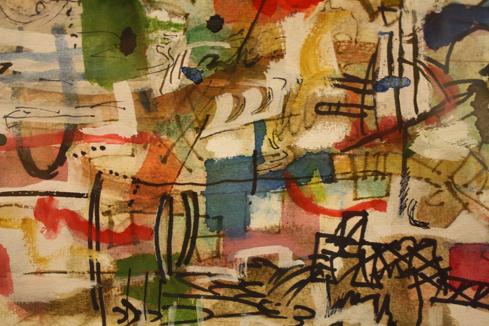
In other works artists use the transparency and the brilliance available in this medium to full effect, creating compositions of gemlike color and dynamic balance. Looking at Alan Crockett's Untitled (2007), one might be looking at a piece of translucent art glass. The medium's greatest beauties are on display, but as they can be only in the hands of a master. In this small but very busy, complex, and layered passage of his painting, Crockett has allowed no bleeding of color or line; each color is brilliant and distinct, each laid down as if he'd had the time a collage artist would have to consider every placement.  What a joyously confident display of technique and spontaneity!

Alan Crockett (1941- ), Untitled, detail. 2007. Author photo.

I'm sure this show is a treasure trove for art historians or critics interested in the development of the magical medium. For me, the delight is in the discoveries of artists I'll be looking for in the future, and of these and several other wonderful works.

Thursday, October 2, 2014

Diana Al-Hadid at Columbus College of Art and Design: Invitation

Diana Al-Hadid, Head in the Clouds, 2014. Polymer
gypsum, Fiberglass, steel, foam, wood, plaster, clay,
gold leaf, pigment. 130 x 56 x 50." Courtesy of the 

artist and Marianne Boesky Gallery. Author photo.
Somewhere between the holiest of holies and the lowliest of lowlys, Diana Al-Hadid's gold-leaf-embellished heaps of industrial materials aspire heavenwards. They soar through our offended sensibilities to reconstruct a lost sense of awe. The material from which they are fabricated acknowledges the chaotic ugliness against which a sense of glory struggles, so improbably, to emerge. 

Put more plainly: Al-Hadid would sometimes appear to be a construction worker run amok. She uses materials like steel rods, gypsum board, mylar, Fiberglass, and plaster to create works that can appear to be literally thrown together, then disintegrated by force or time. Her major pieces in this show might be construed as collections retrieved from scrap piles where a subdivision of McMansions is rising.

This wonderful show disappears from Columbus after the 11th of October, and I regret reviewing it only now, for it's a show that should be widely seen. It's a show for Everyman, exemplary of the reasons to see contemporary work. It's shocking; it's confounding. It is fun. It stimulates one's faculty of curiosity. Any simple observation about it is bound to be right and will lead to yet more fruitful questions and observations. People who think they don't like or understand contemporary art will find that there is nothing to fear in this ultimately accessible work. Why spend time at home with a crossword puzzle, with this show to keep eye and mind lively and acute?

Diana Al-Hadid, detail, Head in the Clouds,
2014.
Fontains Abbey, Yorkshire. Photo by
draGnet, on 
shothotspot.com/blog/6
I was drawn to Head in the Clouds, this droopy-winged, skeletal angel perched atop the most humble of pedestals (in fact, it sure looks like a particularly nasty, big, black mushroom to me). Certainly not a creature of the flesh, this celestial being seems to have failed the transformation to pure spirit. Or, it could be that it requires the gradual dissolution of the body to become angelic? Or, maybe angels have a lifespan too, and this one has seen better days? I suppose, given the title Al-Hadid has left us with, that the head in the clouds—and, indeed, the head retains its form—might signal a valuing of spirit over substance. 


However one wishes to interpret this sculpture, though, there is something awe-inspiring about it. The gold-leaf imparts an unquestionable sense of precious value despite its decrepit form, and the definition by multiple, slender vertical lines certainly suggests Gothic architecture—the upsurging shafts, piers, mullions, and pinnacles. The angel's body is like a deserted, derelict abbey, on which 18th century English authors built the gothic novel—or William Beckford built his own romantic monument to impossible verticality, Fonthill Abbey

And a sense of the Romantic resides in all of Al-Hadid's work in this show. It is grand in gesture and use of space. It is histrionic, theatrical, madly demonstrative. In the clarity of its contrasts and the extremes of its positions, it actively invites engagement and interpretation.


Diana Al-Hadid, Sun Beard, 2014. Polymer gypsum, Fiberglass, steel, plaster, gold leaf, pigment. 44x 96 x 6."
Collection of Dave and Nancy Gill. Author photograph.
Diana Al-Hadid, Sun Beard, detail
Another reason that Al-Hadid's work is riveting is that her own extraordinary level of engagement announces itself in every work. The artist's high levels of idea and self-awareness don't cancel an almost naive abandon with which she seems to attack her work. Sun Beard is an almost-two dimensional panel; the surface sits on a wooden frame, and the surface has the depth created by accumulated layers of heavy materials. On the top of it all, she has painted, in the upper left corner, a radiating sun in golden tones. Opposite, there's what I take to be the traditional image of North Wind, whose black "beard" is the blast of cold breath he blows. Here, the two elements appear forcefully to compete against a scrim of…icicles? rain? shadows in cosmic regions?

Diana Al-Hadid, Sun Beard, detail.
The painting supports the intensity of the conflict by its utter lack of finesse. The sun, in the first place, is placed where children often put it to shine down on the scene below. It's quartered, serving as stage-lights that insure the visibility of the normal scene below. She has painted it at high speed, without mixing colors, in big, sloppy strokes, as if she just wanted to get the job done: "There it is. Finished: The Sun. Next: The Wind." And then on the opposite side, the old man with the beard is devised in the same manner: simply placed, no mixing of colors, no time taken with the drawing. She's satisfied that we recognize him, and that's enough.

In Sun Beard, then, we see Al-Hadid doing something very different than she did with Head in the Clouds. The similarities of materials and signature appearance are obvious. But in this work she shows her consummate confidence. I like the revelation of this childlike aspect of her artistic persona. She will do what she wants to, needs to, feels immediately the urge to do. It suggests that sophistication is not what she's promoting, but vision.  

Diana Al-Hadid, Nolli's Orders, 2012. Steel, wood, polystyrene, plaster, polymer gypsum, Fiberglass, alumninum foil, silver leaf, paint.
122 x 264 x 288." Courtesy of the artist and Marianne Boesky Gallery. Author photo.

The jaw-dropping Nolli's Orders commands center stage in Al-Hadid's CCAD show. Solid cascades fall from level to level, as water in a great, natural field of slate—or as in it's opposite, a monumental, baroque fountain. The draperies that form a platform between the watery event and the "underground" structured, gothic galleries, are infused with pigments. These come across as sylvan, with pastel rose and leaf green dominating in soft, irregular patches against the white—as if this huge, theatrical structure sits on a mossy bank.

Theater it is, both set and drama. The audience provides the action in moving around and around, peering into, up and down at the amazing variety of perspectives and elements of the work.

 Nolli's Orders refers to a famous map of Rome made in 1748, made by the architect, Giambattista Nolli, so the title confirms the reference to Rome's grandeur, its monuments, and even to its partition, since Nolli's map was made to distinguish the different areas of the city. But Al-Hadid clearly doesn't want to leave anything unmixed. In the view to the left, one could be a spelunker deep inside a cave, entirely forgetful of the seeming abbey cloisters from which the whole form arises.

Yet across Al-Hadid's landscape are draped the naked forms of men in the lounging or curled poses familiar from classical sculpture. But Nolli's Orders does not rise to the climax of the Trevi Fountain's commanding figure, Ocean, before which the others are supine. The monument builds to anti-climax, in a joke about itself.

Those figures (hollow at the back, one finds) are also exceedingly disproportionate adding to the general feeling of screwy perspective and weirdly layered meanings.nate to the the layers they are draped across, adding to the general feeling of screwy perspective and weirdly layered meanings.

Are humans overwhelming the natural landscape? Are they causing the collapse of civilization? Their civilization, founded on the galleries of the Renaissance, has bloated and crumbled. Is it our task now to begin again redefine art and nature? Or, perhaps, to reintegrate them?

Al-Hadid's work, seeming at first so overwhelming, is at heart wide-open. Her world of reference is vast: The Church; art history, disappearance and resurrection (Head in the Clouds); nature and pagan folk tales (the North Wind in Sun Beard); classical antiquity and its heirs; deterioration in Nolli's Orders. And this is only half the show, loaded with more significant, unique works.

I love this show. It should be the whoop-it-up emblem for the slogan, Fear No Art. Diana Al-Hadid clearly works as hard as a construction worker, but with the fever of an artist whose mind is an explosion of ideas. This woman seems to be receptive to everything that has ever come her way, and is capable of putting any bit of experience or knowledge to use. The multiplicity of meanings we can derive from her work is bracing. The humor and poignancy; the ideas and materials brought from high and common culture alike—everything makes us wonder why we've been content with boxes when flow works so well. She strips the flesh off and lets the structure support the ideas; she lets her intentions fall into one another and sees what happens at the next level. Simply by observing her work, trying to follow the flow, we can't help but feel ourselves loosen and lighten up, to begin blending what used to be so clear, so captive.


Sunday, July 28, 2013

Paul Sietsema at the Wexner Center for the Arts: Stop-Motion Drawings

The Ohio State University's Wexner Center for the Arts introduces its vast show of Paul Sietsema's recent work with this text:

"Paul Sietsema's multifacted practice explores the ambiguities of authorship and cultural production, the mutability of history, and the effects of representation and replication. Working is drawing, painting, sculpture, and film."
Paul Sietsema, Brush painting (green), 2012. Enamel on dyed canvas.
27 x 26.5. Courtesy of Terri and Michael Smooke. Photo by Ron Amstutz.

Sietsema's paintings, like this, are all two-dimensional and, despite the
limitations of photography, they (like this) are alive with color.

How true. Come on over. 

But you don't really have to be a graduate student or philosopher to be intrigued by and to enjoy the beauty in the work of an undoubtedly cerebral artist. 

The work in Paul Sietsema is all dated between 2007 and 2012, with the vast majority having been produced last year. The visitor to the show will understand that his 2012 production is an almost superhuman quantity measured both in large-scale completed works (I count twenty listed in the catalogue, which doesn't account for all) and in quantity of marks made. There are five sixteen-millimeter films, a sculpture, and many ink drawings and paintings in enamel on canvas. His work in every medium is haunting with its often ghostly, bare beauty; its perfection of trompe l'oeil techniques, and its improbable explorations of scale.

Sietsema is absorbed with the idea of mechanically-produced multiples, like photographs printed from negatives and screen-printing, even though every work in the show is elaborately, exquisitely unique. In many cases, Sietsema has made what are indeed large scale, "hand-made multiples" that are distinguishable only by small details. One such impressive "set of prints" is a series of four identical sail boa drawings, each picture 64.25 x 50.5," each drawn in ink to look like an old, black and white photograph on paper that's crumpled and warped with time—each aged in exactly the same way. These huge and phenomenally detailed drawings, Calendar boat 1, 2, 3, and 4, appear to be identical save for the numbers on their sails: 2010, 2011, 2012, and 2013. The entire series was produced in 2012.

Sietsema has made many large ink drawings with the subject of sailboats, all with appearances of photographs on worn, creased and torn paper. A particular favorite of mine on aesthetic grounds alone is a diptych, Boat Drawing, from 2012. The right panel (each is a large 51.15 x 67.75) depicts sailboats catching the wind on a grey day. The left is another ink drawing of: fog? sea foam? clouds? the last images in the mind of a dying person? The sheet depicts something or nothing, in softly gathered form. Presumably related to the sailboats, it could be above, below, or surrounding them. It could be what they are in, have come through, or are entering. As the image of the boats themselves captures one instant in time, as we like to think photography does, roiling foggy masses can be from any moment— from the beginning of time to its end—and all equally relevant. Yet any one of them would be 
"caught" in the same way.

These magnificent images—which I may not show you because no images of them are made available and photography that would represent them is not allowed—are, of course, not made in a way that captures an actual single moment in time. They are made to appear as if they do. At their large size one sees upon close inspection that their perfect level of verisimilitude is achieved through the extemely time-consuming process of penning thousand upon thousand of small marks in black and white inks. In fact, to examine the drawings close up is to experience drawing that satisfies on an entirely different level. The landscapes of tiny marks have their own rhythms, and the collections of shapes contain great variety, as if any six-inch square of the surface were carefully composed on its own.

Sietsema offers an interesting series of 45 x 53 Concession Drawings, all ink on paper and, again, all dated 2012. Each features, from ever closer range, the inscription on a tombstone, "Concession a perpetuite" which (with the accents this program denies me) means, "Released to the eternal." Each is drawn to give a nigh-perfect illusion of three weighty dimensions, as if the top layer of the granite stone had been effaced in a slab and framed. 

The first, in gallery display order, presents a complete, arched headstone with the inscription in crisp, freshly engraved state. The lettering is an 18th century form, with extended verticals and strong contrast between thin and thick elements. This suggests to the viewer a sense of the gravestone's antiquity.

In a gallery remote from the first, another Concession Drawing is found. The major difference is that this one brings the viewer closer. We no longer see the top of the stone. The inscription is closer to us and shows signs of wear: The engraved edges are less crisp. The edge of the stone has a large nick in it. 

By the time we find yet another, several galleries along, it is drawn on green-washed paper, and the perspective allows us to examine the inscription very closely—a good thing, because time has effaced the letters to rounded cups, lost to legibility. The face of the stone, even, is pocked, pitted, and broken. Yes, time is conceding even this memorial to the perpetuity of memory, even as we spend a couple of hours passing through Sietsema's show. (The granite memorial exists only in ink, of course, though our conclusions are about something far more solid.)
Each of the Concession Drawings "records" with photographic clarity time's depredations on 
physical reality. Yet each drawing hangs in a different gallery, in a different context, surrounded by a different body of work. We have no hard and fast reason, really, to concludethat they are supposed to depict the same headstone. 

It is entirely sufficient to gaze upon any one of these—as it is to examine and admire any single work in this big show—and reflect on its considerable aesthetic beauty and connections to the viewer's experience.

But should one find all three Concessions during a gallery visit, questions might well arise about their relationships to a single or to multiple objects. Are their references to objects of the world or of the mind? Clearly, even memory itself doesn't last eternally, even when we consign it to durable granite, or even to its illusion. Sietsema has nudged us into the in-between world, where the mind somehow merges both perception of the physical world with memory and agrees that we'll call the outcome "reality."
__________________________________________________________________


A catalogue—Paul Sietsema, Ann Bremner, editor—accompanies the show, ISBN 978-1-881390-51-0. The essays and the interview are scholarly and general readers will find them difficult, but worthwhile. The photographs provide an invaluable record of the show.

Paul Sietsema remains at the Wexner Center through August 4. It opens at the Museum of Contemporary Art, Chicago, on September 7.

Monday, July 22, 2013

Of Phoenix Rising: Leonardo Drew at the Columbus College of Art and Design

By the time I left the show of sculpture and drawing by Leonardo Drew—just opened at the Canzani Gallery of Columbus College of Art and Design—I understood why its title is Exhumation. Going in, I didn't pay much attention to the title, for I was immediately taken up with the look of these mighty things—at once looming and harsh, suave and warm—that fill the gallery. 
Leonard Drew, detail from 155, 2012.
Wood. Author photo.


Nearly everything is brown and constructed of wood, and the forms—undulating, rocketing, rough and disciplined at once—sometimes sing out with beauty. But the closer you come to any piece, the more you understand that you spend your life shunning exactly the materials that Drew favors: decayed, splintered bits of wood, street detritus, scraps of filthy fabric, rusted shards of metal. And while there's no offal that I detected, my body instinctively reacted to the threat that I'd encounter it in just such collections of over-used, superannuated, abandoned, then salvaged junk.

But I have already misled you, for there is no junk here despite the fact that Drew's materials have been exhumed from urban shallow graves. Like an Enlightenment anatomist, a medieval alchemist, or a twenty-first century recycler, he's used his rude pickings for his own ingenious researches. His transformations, though, never alter the original materials. Every mark of history remains in every component in the work. Nothing is gussied up, painted over or hidden behind a decorative aesthetic curtain. If the phrase, "building on the past," has ever been given material form, it's in Drew's work.
Leonardo Drew, 14, 1990. Rust on wood. 103 x 83 x 1.25." Photo
courtesy of Sikkema Jenkins.

Rather than naming his works, Drew numbers them. The higher the number, the more recent the work. I like that this leaves entirely open the interpretation of any piece, which immediately brings the viewer back to square one: the materials and their arrangement. He has made what he can of them. Now we make what we can of the work. 

Drew deals in a wide variety of sizes. He presents in this show works as small as drawings of 24 x 24," and as large as a wall-consuming 156 x 216," which juts 72" forward. Yet every piece is constructed similarly, of many multiples of small components: sticks, fabric scraps, or, as in 14, rust and earth. His works are fascinating wholes that irresistibly pull us in to examine the beat up, burnt, and dirty microcosms they arise from.  
Leonardo Drew, 14, 1990. Rust on wood. Detail. Author photo.


A friend of mine once shared her poetic memory of looking out a high window in New York City down to a drilling site in the street below. She recounted how shocked and heartened she was by the sight of dirt—of earth—exposed by the sewer workers: She had forgotten that the city had anything to do with the natural world.

I'm reminded of that story by Drew's work. Number 14, a great, chocolatey slab composed of found wood with strips of rusting metal, manages despite its humble materials to communicate something vernal in its deep variegated dispersal of rich reddish browns. It doesn't make me ill-at-ease; it doesn't feel "city," despite the elements of its composition. Wood didn't come from the city, even if it became part of the artistic process there. The wood and its history are more ancient than whatever structures gave it up to Drew. Is it an accident that it appears to be a door? A threshold into the memories of another time and place, locked into the essence of the material?

Thatching. Ben W, Bell photo.

Leonardo Drew, 155, 2012. Wood. 55 x 58 x 61." (Left view).
Image courtesy of Sikkema Jenkins.

I was particularly interested in 155, a wall sculpture that called to my mind, above all else, a sense of place. Drew uses his charred, broken, and worn pieces of wood to create elegant forms and surfaces. These reminded me of walls made not from discarded, but from choice natural materials. I see the structures of terraced shale walls, of trimmed thatch; even of the wood pile and the forests that surround country homes with these features. The work suggests architecture in forested landscape. The precision with which Drew sees and handles surfaces create a unified environment of highly differentiated materials, comparable to woodland dwellings that seek to achieve the same goal of introducing the cultivated hand comfortably into a natural setting.
Forest House, A. Michael Flowers, Architect.
Leonardo Drew, 155, 2012. 55 x 58 x61."" (Right view).
Image courtesy of Siikkema Jenkins.

Leonardo Drew, 155, detail. Courtesy of
Sikkema Jenkins
Even without an 
interpretative fantasy like mine, the elegant contrasts of smooth, napped, and rough, ragged surfaces is fascinating. So is the way the improbable descending serpentine wall divides the work into two sections that also reflect each other, with refined and raw elements. The work is precarious; disciplined; dynamic, and stable all at once. And it is extremely beautiful, risen from the ashes and returned to the woods.

153 makes abundant use of the "thatching" technique to mysterious, poetic effect. The kind of surface contrasts he exploits in 155 are simpler and balder, and the shapes are  extraordinarily clean—as clean as a topiary garden recently trimmed. 

Drew's sculptures are apparently moved from place to place in units that local installers then reassemble. In 153, this practice is evident in the hard distinctions between the soft mounds and the cut-away edges that expose the grayed-out, grimy wood surfaces or "floors." They remind me too of the surfaces of anvils.

These surfaces had the effect on me of confusing my responses to the scale of the work. Standing apart and taking in the whole, I have the sense of seeing a topiary garden or exotic landscape marked by deep contrasts of hills and valleys. Yet when I'm close enough to encounter one of these surfaces, they have no aspect of illusion: They are just the size they are. They are literal and do not participate in any metaphorical or imaginary scheme.
Leonard Drew, 153, left angle. 2012. Wood, 50 x 71.5 x 28."
Photo courtesy of Sikkema Jenkins.

Complicating the question of scale yet again is the long comparative flat tongue that extends from the right side of 153. This is constructed of tiny scraps of wood insinuated into slots that run in parallel in horizontal lines like the buildings of different heights along avenues of a city seen from the air. Indeed, the similar scraps that ring the flat extension form a distant urban horizon.

Leonardo Drew, 153, "skyline and avenues,"
 detail. Author photo.
Again, I find myself discussing the work in terms of environments, which may or may not have occurred to Drew. But the larger point is that he creates poignant contrasts within highly unified compositions. He does this through brilliant manipulation of a single set of materials—materials that become elevated in the process. 

Exhumation includes a few of Drew's drawings. A drawing is, simply stated, a work of marks on paper. It's not made in multiples or by photographic process; it's unique. Few argue anymore that it has to be made of pencil, charcoal, or ink; but how far the definition stretches is a question raised on many occasions for marginal analysis. Like Drew's 137D.
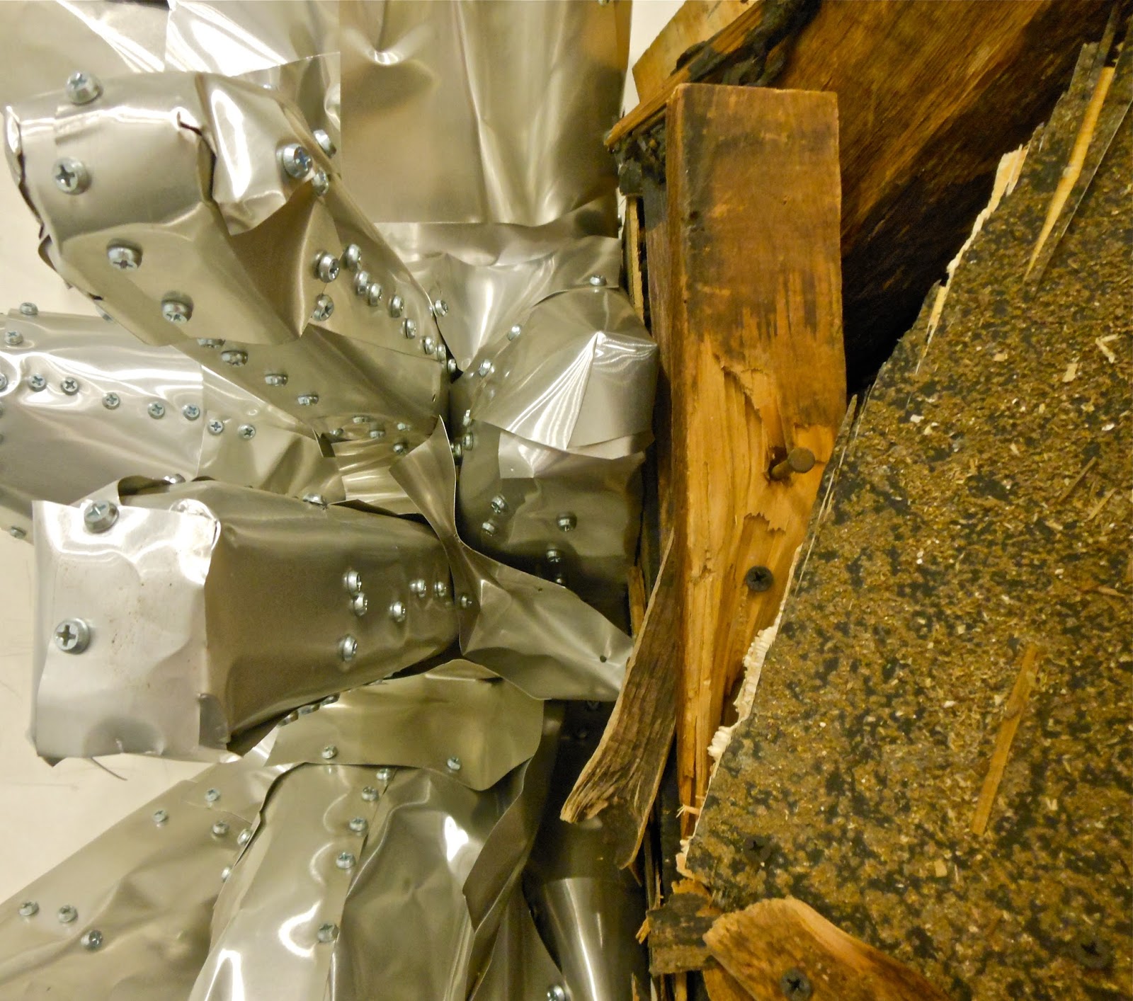
Leonardo Drew, 137D, 2012. Wood, aluminum, paint, and graphite on paper. 37.5 x 43 x 25.5." Courtesy of Sikkema Jenkins.


Leonardo Jenkins, 137D,  detail. Wood, aluminum , and graphite
on paper, 2012. Author photo.

It's paper mounted on wood, and it incorporates graphite marks as well as wood, aluminum, and paint. While the contrast of the the sheet metal next to the used scrap lumber is arresting at first glance, it only sets the stage for more and more poignant contrasts deeper within the work. If this is where the trash can overflows outside the promise of the future, it's an ironic story at the least. The aluminum side, with shapes very like those in 153, rather than looking suave, appears ill-constructed. It's sloppy construction is held together by far too  many screws, yet it still gapes imprecisely. On the wooden side, the junk wood resembles lightening bolts or an army of arrows and spears launched in vengeance—an uprising that will not be suppressed. The vitality seems not even to be "built into" the discarded and reclaimed wood: It's inherent. Drew constructs 137D to emphasize the life of the material itself, its vigor, durability—the spring in its soul. When one examines the wooden side close-up, one finds nothing like the conspicuous riveting that holds the pliable sheet metal together. Aside from a few rusty nails that came as part of some two-by-fours, there are no traces of the mechanisms that hold the wood in position. You know that it's joined by its own will and force.
   
155, 153, and 137D were all made in 2012 and share a similar aesthetic of elegance and power that arise not only despite the nature of the materials, but even because of it. In two much larger, earlier works, Drew handles his found materials in grittier ways—ways in which I feel no pull of the forest as I found even in 1990's wood and rust 14.

Leonardo Drew, 64, 1998. Fabric and metal with rust on wood. 120 x 240 x 6."
Image courtesy of Sikkema and Jenkins.
The immense, wall-sized 64  is composed of hundreds of small square boxes, each of which is stuffed or covered with bits of fabric, batting, threads, and scraps of lace and what might once have been quilts or rugs. As the full-scale photograph represents, from across the room, it appears like a huge, compartmentalized drawer for classification of small things. It's in your grandfather's workshop; in the dusty shop of an ancient someone selling sewing notions, trims and buttons. Unlike the dynamic works we've seen above, this piece actively casts off a sense of age. It's flatness is part of it and the fact that the material that protrudes from its surface is without suspense. It's filthy; it droops and hangs.  
                                               
To approach 64 and inspect it close-up is discouraging. It puts you in a place you really do not want to be. Nearly every small element potentially conceals something else and every instinct warns that the secrets hidden in this work are not the sort one wishes to know. Where every work we've seen so far is built around multiple juxtapositions (form, texture, scale, etc.), this one is continual infinite repetition. It is so tall and so wide that at no point standing close enough to examine its surface can one's field of vision even take in the edges.
Leonardo Drew, 64, 1998, detail. Fabric, metal, and
 rust on wood. Author photos.
64 is one work in Exhumation in which there is no projection, nor any beauty revealed in the raw materials. Because of the repetitious form and the insistent filling or screening of each box, the work becomes a warren, a slum, favela. Public housing? A prison? Concentration or refugee camp? It's the only work in the show in which the artist assumes the guise of power by implying that all the components of the work are disgusting. In no other work does the artist seem to assume the role of master, even ironically.

Leonardo Drew is a Black. Because of that fact, race has to be a factor in his work, as an immigrant's identity will always dominant his identity in an adopted home. Blacks have reasons to be ill at ease with concepts many of us don't even think to explore: history or future; our movement through the built and natural environments; the hazards of interpretation by others; possession of property; one's sense of personal worth.  

Through his selection of materials and the extraordinary, surprising ways he uses them, Drew deals with race metaphorically, I believe, in every project. That's the significance and sorrow of 64's bleakness and enormous scale.


Leonardo Drew, 133, 1998. Wood and mixed media. 144 x 158 x 2." Courtesy
of Sikkema Jenkins.
From ten years later comes 133, laid out in a manner similar to 64, but, lacking boxes. Only the contents remain. The boxes have dissolved to leave a freshly-painted white wall to which the street gleanings are directly secured. As in 64, we see nothing project, but neither is anything dangling or dirty. From a distance, the forms are all horizontal, like a linear language—Morse code's dots and dashes. It's a paragraph charged with meaning.

Although this piece is unlike everything else in  Exhumation for being an unconnected assemblage of materials, I find it exciting for the implication of legibility. Read it from left to right or right to left; start at the top or the bottom, and read into each mark the significance you bring to it. Still, it remains whole: The language is unified in its vocabulary. 

Leonardo Drew, 133, details, 2009. Author photos.


As in all Drew's work, the view gives substantially different impressions at a distance and close up. The elegant calligraphy composed into a measured, balanced composition from across the room appears as distantly spaced microcosms when examined close-up. Each element stands out for its own rough, used character. 

Nothing is more normal than white print or script upon a white page. In most cultures, and most certainly in ours, that is how textual language is transmitted. In this work, though, by an eminent Black artist, there's an invitation to think again about the nature of black words on the simple white background. In 133, each black mark, each word, is a workhorse. It is a mark filled with history and the power of experience. We tend to forget the language when we use words. We use words as if they are light and disposable, not as if they have carried loads and have histories.


Perhaps that's how history feels to Black people who helped build a white world where there's a tradition of their doing conspicuous yet overlooked work. Each dark element of this beautiful piece is both used, accomplished, and isolated in dignity. They make a pattern, like black pearls on a satin bed, seen for what they are. These are words read for their root meanings, not scanned over to get to the punch line.

 Leonardo Drew, 133, detail, 2009. Author photo.


Saturday, January 26, 2013

Ephemera and Endurance: Installation by Vivian Hyelim Kim

Vivian Hyelim Kim, Visual Diary, 2013, detail. Installed at Virginia Center for Creative Arts. Author photo.
During my current residency at the Virginia Center for Creative Arts, where I've been working on a book, I've been lucky to meet a working installation artist. I've never really understood the practice of ephemeral art—the "why" especially—so I've been delighted to learn from  Vivian Hyelim Kimwhose work has opened my eyes.


Kim's cutting worktable at VCCA.
I had looked at Kim's website and seen pictures of the magical work she's done with paper cut-outs, building installations from shapes she cuts at random from all kinds of paper, then arranges into beautiful fantasies of color, light, and, one feels, breath. In her studio I found traces of that work (she continues to cut, accumulating ever more of her structured shapes in plastic bags; she can never have enough when she needs them for the next project). 

But now Kim's up to something new. Pinned and taped with masking tape to the wall were all manner of weeds and seeds, the detritus and prizes of the forests, fields, and cow meadows that surround VCCA's bucolic campus. Each tiny arrangement of natural materials includes one man-made scrap: a cash-register tape, a tea bag, the folded corner of a page from an old book. The work is three-dimensional, tactile, and above all, ephemeral—doomed to swift decrepitude even as it is in the process of becoming.


Vivian Hyelim Kim, 1.17.13. (lichens and fungus) Installed at VCCA. Author photo.
Kim, who arrived at the colony just before the New Year, considers this work a visual diary, with a visual note marking each day of her stay in Virginia, which lasts through mid-February. She will continue composing her entries from native materials. When she moves on at the end of the month, to colonies in Minnesota and then Wyoming, this installation will be given away, abandoned, or consigned to the compost heap. 

As Kim moves from place to place, traveling westward, eventually to Korea, where her parents live, she is also keeping a daily photographic diary, but one unrelated to this work. Eventually she will compile her photos into a book, a book that records her relationship to the presence of beauty every day of the year.

I readily confess that my instinctive reaction was that this wall of pretty arrangements seemed tentative and slight. Why bother? What could give it significance? But those two questions should always be asked consciously, for they're useless as long as they remain rhetorical. Kim's installation provoked worthwhile insights about the nature of art-making both in the grand scheme, and at this moment of 2013.
Materials for use in installation, in Vivian Hyelim Kim's studio at VCCA;
First: For Kim, traveling unburdened by a large kit of artist's materials, she knows she will have to forage for the central elements of her work. Her studio, then, is not the exclusive realm of art-making, where she remains shut off with her equipment and ideas. She's been gleaning in the wild lands around the colony, looking for interesting materials with possibilities that she cannot always predict (Will it change color? Will it disintegrate?—Will it give her a rash?). 

These naturalizing trips are essentially opportunities for her to go outside and observe the landscape up close. She touches and visually examines matter that she's never seen before, even common leaves or twigs that we rarely pause to focus on. The installation materials are in themselves objects of beauty and wonder that invite her own investments of contemplative time. Though Kim will arrange them into a larger scheme, each element compels her attention as if it were itself an artwork. When she finally places all of them on the wall, each is removed from the nature's visual noise so its beauty and curiosity, now isolated, can be shared. 

I was struck that Kim does not gather materials in order to transform them into something else, as one uses charcoal or clay to make art. These materials are not modified at all, but only by arrangement become the art work. The point is enjoyment of the materials for their own aesthetic qualities.


Vivian Hyelim Kim, 1.18.13, 2013. Installation
at VCCA. Author photo.
Next, the process of collection has become a communal activity. Once her fellow artists and writers learned what she was doing here, Kim began receiving from all quarters gifts of materials that her colleagues thought beautiful, novel, and potentially useful for her piece. Thus, she had transferred the process of looking to everyone around her—the central purpose of the installation was accomplished before the installation could be said to exist in a material way at all. Everyone around her has become involved in examining the details of nature on their daily walks, slowing down to perceive what they had not taken time for before—or actively seeking out curious or exquisite to contribute to Kim's installation. 

I found this community effort beautifully simple, as when elementary school children bring to their teacher items gleaned in a nature walk. Everything is acknowledged as useful and special, as worth of study: in this case, as having the properties of art. Anyone who thinks about the project and then studies a leaf with renewed curiosity becomes part of the artwork, or begins thinking like an artist.

As the work grows more participatory, in what sense, I wondered, did Kim consider it a diary? In writing a diary, most people distinguish one day from another by noting events that stand out, like a birthday, a holiday, or the day on which an unexpected or longed-for event occurs. Nothing in the series so far would seem noteworthy in a way that invite particular memories. Nothing outstanding marks New Year's Day, for example.


Pinecone "blossom" in Kim's VCCA studio, January 2013.
The artist's point, of course, is continuity. Time can be measured in many ways, and one is to be where you are when you are, observing your environment and its beauties. This is not a diary that will recall events, happiness, or disappointment, but that one coexists with beauty every day of the year. The work is contemplative at its core. It is on the one hand grounded in the pleasure of immediacy and in the inevitability of decay. Even as the passage of days extends The physical presence of the artwork, its composite natural materials are dropping seeds and spores, growing brittle, flaking, or decomposing before our eyes. By the end of Kim's six-week residency, the entries of the first week will have slid farther into ruin than when they already were when installed. The palpability of physical failure, of dust-to-dust as an embodied theme, gives significance to this casually taped-up array of straggling weeds and crumbling fungi.


A final noteworthy point about Kim's ephemeral art, is that it avoids many of the expensive impediments to art making that plague young, creative people. The assumption that fine art is durable art is the backbone of a system of endless expense for people who too often have little money to invest in their careers. At the dinner table at VCCA or any art colony, one hears repeatedly about the dilemmas of artists who push their pennies between a room to live in and a studio across town. Add to these the costs of documentation, framing, showing, shipping, and storing work, and it's evident that there are good artists who cannot practice professionally for purely financial reasons.

Vivian Hyelim Kim is a peripatetic artist who travels very light, who thinks about the weight of her luggage and how to avoid airline fees. The power of observation, and her willingness to dissolve into the present are gifts that travel well and for free. 

When I wondered what Kim would consider the "whole" of such an installation as her visual diary, it finally occurred to me that she is the whole. Her own ability to stand in one place and imagine the past and the future in the beauty of the present moment—that is its unity. Dust to dust, beginning and end, yet focused with every thought and sensation in the excellent here.


Materials for use in installation, in Vivian Hyelim Kim's studio at VCCA; 
experimenting with bittersweet as a pigment.