Thursday, September 25, 2014

George Morrison's Horizons


Spirit Path, New Day, Red Rock Variation: Lake Superior Landscape, 1990, acrylic and pastel on paper, 22 1/2 x 30 1/8 in. Collection Minnesota Museum of American Art. Museum Purchase. 99.04.02.03. Courtesy, Minnesota Museum of American Art.

In late August I was lucky to see a show at Indianapolis's Eiteljorg Museum of Indians and Western Art. Modern Spirit: The Art of George Morrison is now in transit to the Heard Museum in Phoenix, where it opens on October 25. I had not before known of George Morrison and could only marvel how this could be. His work—painting, drawing, wood collage, wood sculpture, lithography—responds across a sixty-year career to the art movements of his time: regionalism, surrealism, cubism, and abstract expressionism. 


Morrison moved in the 40's from Minnesota, where he grew up and studied at the Minnesota School of Art, to New York City, where he attended the Art Students League. He was close with Franz Kline, and he moved in the circle of Kline, de Kooning, Motherwell, Joan Mitchell—the New York School. He was one of them and he showed with them. He had his first solo show in 1948. 

By 1970, when Morrison returned to his home state and a faculty appointment at the University of Minnesota, he had achieved considerable recognition in the forms of purchase prizes and awards. At the University, he was appointed to two faculties: studio art and American Indian studies. 

Morrison was a Chippewa from the Grand Portage Reservation, a fact that had had little presence in either the content, materials, or techniques of his work. In New York, his colleagues had been unaware of his ethnic background, which had not been a preoccupation for him. His interests and goals were the same as the other artists around him. He was not identified as an "Indian" artist until his return to Minnesota, where knowledge of his Chippewa identity created controversies about "who he was" as an artist. Despite his excellence and eminence as a modern artist, there were curators who declined to show him with other Native artists because his art didn't look like Indian art. Morrison was comfortable with his heritage; he was comfortable too with his cosmopolitan point of view.

As he aged, Morrison's Chippewa heritage took a more prominent place in his work. This resulted not from social pressure but from the natural process of his life journey and growing understanding of his own story. In the catalogue that shares the show's name, Modern Spirit: The Art of George Morrison by W. Jackson Rushing III and Kristin Makholm (University of Oklahoma Press, 2013), plates show many works that arise from or include this impulse. They are consonant, though, with his work as cubist, abstract expressionist, and master of materials in traditions that relate him to Picasso more than to traditional Navajo art. Indeed, he faced the prejudice that "Indian" art was usually expected to include the iconography of the southwest tribes. Morrison's work lacked suns. What kind of Indian art was that?

Untitled (Quarry Face), 1949, pencil, pastel, and ink on paper, 18 x 24 in. Minnesota Museum of American Art. Acquisition Fund Purchase. 94.01.11. Courtesy, Minnesota Museum of American Art.
Modern Spirit is alive with beautiful and sophisticated work, much from the collection of the Minnesota Museum of American Art. It's a great pity that Morrison seems, though, to be cramped into the position of regional and Native American artist. He is clearly of the world-class stature he enjoyed when he worked in New York. It's disconcerting to see that when he returned to teach and continue his distinguished work in Minnesota, he was cast as a regional and ethnic artist. The current show toured to New York in 2013, exhibited at the National Museum of the American Indian. Its other stops are (or have been) Fargo, Indianapolis (Museum of Indians and Western Art), Phoenix, and St. Paul at the Minnesota History Center. What about the Whitney? The Smithsonian? The Hunter Museum in Chattanooga? An American art museum? A modern art museum? Evidently the dilemma of identity-based interpretation remains unresolved. He is a major Native American artist and took pride in that. To the extent that ethnic identity ghettoizes his work, it's a loss for many who would appreciate Morrison in all his breadth and would appreciate equally the inclusion of Native American artists as "normal."

 A variety of themes and visual motifs run throughout Morrison's work, from earliest to late. I was particularly attracted to his use of the long landscape with implicit or explicit horizon line. This orientation fascinates me for all the things it can signify and can invoke in feeling. His spider-covered 1949 drawing, Quarry Face, above, is both landscape (distant) and suggests by its title a surface close enough to touch; the "spiders" reinforce this latter idea. 

The boxes created by horizontal and vertical lines, which might create the lapidary effect of a rock wall, seems to intensify the flow of the lines from left to right, where colors change at the borders. Each "box" both contains a truncated landscape view (defined by color) and extends it by line to connect with its neighbor. The several white circles with differently defined edges read like moons over different prospects. They further complicate not the landscape, but the multiplicity of stratified landscapes layered across the drawing. 

Is it landscape? It's length compared to height makes it technically so. It's an abstract drawing. Is it more? The connected sinuous line that directs itself upward from left to right in the top quadrant forms a horizon, cutting across the entire plane.

Untitled, 1978, lithograph, 30 x 44 1/2 in. Collection Minnesota Museum of American Art. Gift of Northwestern National Bank of Minneapolis. 79.42.14. Courtesy, Minnesota Museum of American Art.

Morrison's 1978 monochromatic lithograph shows some of the same features of the1949 color drawing. One of Morrison's techniques was to make large, long collages of wood. This is a print pulled from such a collage. Like the earlier drawing, there is the tension between close and far away: We might place our hands directly on this surface; perhaps it's a wall that blocks our movement. Or we might be observing an abstract, two-dimensional representation of a faraway space. Again, three-quarters of the way up, Morrison has placed a line that divides the image horizontally. It sits like a high horizon line, suggesting that we consider Above and Below as spaces with different significances.


Morning Storm, Red Rock Variation: Lake Superior Landscape, 1986, acrylic on canvas board, 6 x 11 in. Collection Minnesota Museum of American Art. Acquisition Fund Purchase.  87.17.2. Courtesy, Minnesota Museum of American Art.

Morrison's connection to the landscape of his childhood on the Lake Superior shoreline becomes literal in the horizontal paintings and pastels of his artistically fertile 70s. While the horizon where water and land, or water and sky meet are a constant subject, the energetic and fully engaged explorations of color, materials, and form are of no less interest than the spiritual content. In Morning Storm, Red Rock Variation, above, again he makes us debate about the represented space, giving this miniature, high-surfaced painting the feel of a colossal work. The blocks of color in the bottom section could, as in the others we've seen, be stones in a wall—tactile, immediate, and topped by an edge, until the merging ideas of edge and horizon soften into ambiguity.
Awakening, Time Edge Rising, Red Rock Variation: Lake Superior Landscape, 1990, acrylic and pastel on paper, 22 3/8 x 30 in. Collection Minnesota Museum of American Art. Museum Purchase. 99.04.02.01. Courtesy of Minnesota Museum of American Art.
Both Awakening, above, and Spirit Path, New Day, which opens this article, were accomplished when Morrison was 71, with another ten years ahead of him. These acrylic and pastel paintings are more impressionistic now than expressionistic. His distribution of color in patches seems to describe the experience of something real, something with stunning sensory impact. These colors are reminiscent of Monet, so there's that art historical connection.

Monet was an explorer of natural light: he did not invent colors, but worked to record what he saw. Using a similar palette, did Morrison do the same? Did he record what he saw at dawn on Lake Superior in different atmospheric conditions? I tend to doubt that that was all there was to it, for what it seems that Morrison recorded throughout his career-long, multi-media work in landscape form was always abstract. He seems not to have been interested in pictorial landscape. Rather, he appears to have been concerned with artistic form and with what one associates with it or embeds in the form. His later landscapes—the ones that are acknowledged as such—are visions really of water and sky, but of water that generates fire, of flaming spirit that unifies heaven and earth. The work is intensely visionary, and those visions may have their roots in the painter's ties to the earth of a Chippewa reservation on Lake Superior and to traditional cultural ideas of the ascendent soul and its powers.

It could be. Perhaps not. Morrison was a Native American and a phenomenal artist. These landscapes seem to be directly linked to places and inspiration from his Native heritage. Morrison was also an American artist of the New York School. His work is linked to significant strands of modern, Western art. In Modern Spirit we see the work of an artist who negotiated the scene—simultaneously present and far away—through his own integrative cultural experience: only his own.

Friday, September 19, 2014

Contemporary Artists Showcase Eastern Papers at the Morgan Conservatory

Yuko Kimura, Tiny Sample Book. Ca. life sized. What is paper for, if not for books. This on becomes an object of desire with its collection
of Eastern papers in a variety of sensuous textures, colors, and weaves.

Cleveland's Morgan Art of Papermaking Conservatory is a jewel in the city's civic crown. Renowned in the nation's papermaking community, the Morgan attracts the world's most illustrious and creative paper artists to its facilities, which house state-of-the art equipment and facilities for training in every traditional and experimental method of working with paper fibers.
In 2014, the Conservatory celebrates the opening of its unique Eastern Paper Studio, the nation's first. They already have the largest paper mulberry tree (kozo) grove in the country, and in 2010 installed the only American studio for the ancient art of Korean paper making (hanji). Now Morgan has the specialized, up-to-date equipment to support the ancient Eastern papermaking practices. Eastern papermaking differs from Western in that it derives from the nature of long fibers—kozo, gampi, abaca, hanji, and several others. The papers are thin, silky, alluring to hand and eye. Despite their sensuous qualities are unusually tough.Eastern Paper Studio was introduced to the public in a recent, sublime show of works by the finest of paper artists. The show displayed the wide variety in the properties of  the fibers, including works diaphanous and solid; works suggestive of painting, of ceramics, textiles, and biomorphic forms. Curated and hung for maximum variety and tantalizing juxtapositions, Mason Milani demonstrated his eye and the promise of an exceptional season. One of the show-stoppers for its size, color and variety of references is Julie McLaughlin's "Kimono as Art," above. The idea of paper garments as novelty fashion has been around for a long time. McLaughlin makes it clear that she is thinking in bigger and bolder terms. This piece must be at least seven feet tall. If it's comparable to anything, it's to Jim Dine's kimonos—but even that is a stretch. This is real, three-dimensional, and has all the qualities of rare textile with advantages that textile cannot present. This kimono was created from whole, "paper-thin" sheets of hand-made kozo papers that the artist dyed and decorated herself with paper pulp landscape.Books are demonstrated in this show not only by Kimura's tiny book, which indulges us in the beauty of materials, but in Melissa Jay Craig's "The Trouble with That Theory: Cliff Notes." Here, well-chosen materials support a cutting, satirical point. Her papers are made from Thai kozo bark lace, flax, kozo and milkweed sheets, and milkweed fiber with joomchi (A Korean method of making textured paper with water). Sagging covers and blanks that serve as positive space, support truncated pages that have...come unrooted? Been shredded? Craig's book may further suggest the disintegration of the book as an object of significance in the culture, perhaps eaten away by students' dependence on the speed of the Internet. This object is a great display of the creative possibilities Eastern papers, allowing the flexibility, strength, and variety of textures to allow the complex messages of this work.Julie Sirek too, is concerned with the idea of disappearance, which her Korean fibers, joomchi and hanji allow her to achieve. She makes a cloth-like paper that has the delicacy of a fabric worn to the point of a tissue, ready to disintegrate entirely. Sirek uses a full sized dress as symbol for the absent or disappearing woman; the dress is like an abandoned crustacean's shell. We don't have the sense that it has been outgrown, though, but that the inhabitant has been reduced—psychically or by violence. The sorrow is stated in the material, held together only by the lattice around its holes.Hanji, with which Sirek fashions a dress from spaces, in the hands of Aimee Lee serves as the basis for the Korean craft of jiseung, or paper weaving. Strips of this paper are woven into strands so present and strong that they are fashioned into functional baskets, water gourds, and sandals. Lee's hand is on her baskets from the harvest of the hanji fiber through its cooking and beating, its formation into cords, and its weaving to shape traditional forms. Each vessel is glazed with persimmon dye, giving it a shining, uniform surface that easily tricks the eye into thinking it a textured ceramic.Jill Powers is a sculptor who uses the strength of kozo bark fiber for casting. She is not a traditionalist. She intuits and responds to her own interpretation of the fiber's the feel. She has developed casting techniques that are all her own. Her concern in not only for the ultimate shape of the artwork, but also for the way that it highlights the kozo bark itself. Her works are porous, allowing light to penetrate them while exposing the nature of the long fibers. Both the material and the finished work are displayed. With a consciousness every artist in this show demonstrates, she is mindful that there would be no art without careful cultivation of the plant itself. Every paper work begins in the earth. Her sculpture of a hand cradling a bee that does not sting; her basket of flames that don't consume—these are powerful metaphors for a relationship of trust in powerful nature and willingness to use it without conquest.The use of the natural as benign background and foreground both is a technique used to beautiful effect in Velma Bolyard's hanging Rain Garden. This series of panels is a peace garden that beguiles and calms both from a distance and from close up, when its vines, leaves, and flowers come into focus. Her method is contact/eco printing on Awagami Gregory kozo paper. The material must be chosen carefully: The hangings are folded gently into panels that nevertheless fall naturally, and the paper holds the ink of the contact prints in a romantic, present/fading way. The integration of all the elements make it a particularly natural work in all senses.Chicago's Melissa Jay Craig integrates material, subject, and artifact in a series of works in cast paper and bark. These are based on microscopic views of plant roots and stems. These large, circular pieces could be folkloric rugs—gay, irregular, beguiling in their detailed simplicity: flaunting the qualities of the handmade. But her titles are scientific, referring to the biological aspects of nature that inspire the work. In botany she literally explores the intimate convergence of Art and Nature.
Each of the three from this series is not only visually distinctive, but has its own scientific reference. Mycellian Query, matted and beaten, refers to mycelia, the fibrous parts of fungus. Flat Anaphase, Amaranthine is outlined in the purplish color of amaranth. In the center, in the act of mitosis, chromosomes migrate to opposite ends of the cell. The richness of color and the central motif are easily suggest lapidary art, an antique brooch of geometrically arranged Highlands stones. Craig's Root/Basis provides an occasion for her to demonstrate yet another technique while sticking to her theme. This gem-like cutaway section of a root is cast of abaca and kozo. It's surface is formed from hundreds of distinct, raised cells. Not only its beauty, but the concept this brought home to me—of life's aggregation of the minute into the visible; of Craig's bringing so vividly to mind the life we neglect without curiosity—make this a masterwork on a variety of levels. It feels bad to review a show after it has closed. I can recommend that you purchase the informative and beautiful catalogue ($10 from the Morgan Conservatory ) and keep up with the work of these artists. Each is a major figure in the community of papermakers—in the community of sculptors and multimedia artists—and a treasure in the world of American art.
Bridget O'Malley, Pattern Recognition. Watermark in handmade kozo,
 with shadow on the wall. Detail of triptych.
Melissa Jay Craig, Mycellian Query, detail
Velma Bolyard, Rain Garden


Thursday, September 11, 2014

Leah Wong Cuts Loose in "360º"

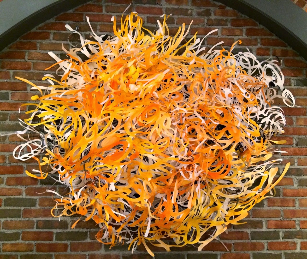
Leah Wong, 2014. Tyvek cutout wall hanging with
ink surface enhancement and shadows. Ca.
35 x 24"
It's been two years since Leah Wong's last show at the Sherrie Gallerie in Columbus. Now, compressed into twenty-four months, 360º demonstrates as much buckle-your-seat-belt, hold-on-to-your-hat, dynamic growth as we'd expect to see over an entire career. It's an adrenaline-powered, breakthrough show. I have a sense that what was latent in her 2012 show, Moving, burst imaginary walls of imagery and rectangular form to hit another stratum of energy. 

The swiftness of change is inspiring; the work itself is thrilling. Wong has presented herself as a painter in the two biannual shows I've seen, but now she shows paper cutting exclusively: small, three-dimensional cut paper tableaux in shadow boxes, and large cutout wall hangings with calligraphic ink drawing on their surfaces—the latter made from durable (and dustable) Tyvek, the same material used in home construction.


Leah Wong, 2014. Small shadow box with
paper cutouts.
Leah Wong, 2014. Small shadow box
with paper cutouts.
In the shadow boxes, Wong positions two or three pieces of cut paper in different planes to create subtle scenes that are heightened by shadow patterns. The fine detail of the cutouts and the shapes they create form vistas of unexpected power over the imagination. These are not pretty arts and crafts decorations for us to flit past. They create mystery and nuance from the density of interlocking forms, shadows cast, and the quiet palette of paper colors—white, black, and taupe.

In  dimensions both small and large, Wong's cutouts have the impetus and spontaneity of freehand drawing. The tendency for viewers of the larger works, especially, is to marvel over the painstaking labor of wielding the X-Acto knife for hour upon hour of precision cutting to produce lacy work on a great scale. And it should be no surprise that we wonder over levels of patience and skill that few of us possess.
Leah Wong, detail of Tyvek wall hanging. NB the
way the surface texture of the material itself has a
gestural quality that supports the energetic
movement of the cutout and calligraphic painting.

But the joy of Wong's work is that this controlled labor results in unfettered, dynamic gestures that zip through space. That the meticulous process results in such freedom and spontaneity in itself fills her work with life and significance. As Wong says in her artist's statement, "I explore the elements of volume, void, the gestures of hand on paper, light and shadow to transform and create new visual possibilities. The open-ended activity creates a conversation between lines and space." Not to mention, a conversation within the viewer, a push and pull of groundedness and yearning.

In the year past, Wong was invited to create two cut-out sculptures for a mall in Shanghai, where she also has a gallery. Workers built the armature, but Wong herself made each enormous piece by hand, the same way she makes every other piece—the shadow boxes and the wall hangings—with an X-Acto knife, cutting spaces with the material spread out across a work table so large that she has to stand on tip-toes to get a sense of how it's shaping up. 
Leah Wong, 2014. Installation in Shaghai, China shopping mall.

Point of comparison: Chinese antique
carved 
rosewood box show in
Ai Wei Wei's "According to What?"

Why paper cutting? In her exemplary artist's talk at the opening of 360º, Wong explained that this is a traditional Chinese craft practiced by children. Throughout her own childhood, Wong would relax after school by sitting and cutting paper. When she attended China Academy of Art in Hangzhou, her attention was drawn to the foreign, and she undertook oil painting, for which there is nothing comparable in China. After marrying an American, she entered the MFA program at Ohio University as a painter. Faced with every artist's challenge to "know who you are," she struggled, but would relax and reflect by retreating to her childhood pastime of paper and scissors. Perhaps, she discovered, this had something to do with who she was?


Such exuberance, energy, and expansive definition in this work—all driven by heart and a daring spirit. It's highly enjoyable work, but it is much more than pretty. The powerful lines spin the viewer beyond the works' edges, launching us with their momentum into our own explorations, inner or outer.

The "knowing who you are" struck me in another way as I considered the one aggressively three-dimensional work in 360º, "Autumn Sunset." 
Leah Wong, 2914. Installation, Autumn Sunset. Hand cut Tyvek.

 This made me think immediately of the almost ubiquitous Dale Chihuly glass sculptures
Night at the Chihuly Studio, Seattle, Washington. 
suspended over so many museum entry halls, grand galleries, and gardens.
 In form, color, beauty, and (even without illumination) radiance, there are obvious comparisons to be made.

The Chihuly works are made in industrial workshops. Many artisans craft the elements of these sculptures, which Chihuly then selects and gathers together as a decorator fashions a bouquet. Wong's work develops organically from her own hand and eye. Every element of the sculpture is handmade. The cloud gathers, the sun bursts from her mind and process. So even when she makes similar pieces, the gestures and the energy have to be generated anew, every single time. They are never prefabricated, but discovered as they arise from the artist's vitality.

Will Wong find the force to make these forever? Few artists stay with one process, unchanged by new impulses drawing them in new directions. Wong seems to have a phenomenal fund of stored electrical excitement to be transferred into this work. 

Saturday, August 2, 2014

Studio Visit: The Morgan Conservatory

Papers handmade at the Morgan Conservatory
In anticipation of my next post, I stopped by the Morgan Conservatory in Cleveland last week, wishing to get the lay of the land before I review their current show. Many years ago, I learned letterpress printing at the Annis Press in the Wellesley College Library, which has a well-known rare books department and a book arts program as well. Setting type by hand and printing on hand-made papers was stimulating to the senses and the intellect in a unified way I hadn't experienced before. Such a labor of strategy, technique, and imagination! 

My introduction to paper and printing was in the vernacular of fine printing—limited edition books, each copy of which is a work of art in itself, bound with expensive, elegant materials.

Fine printing: Bible page by Eric Gill, type designer,
typographer and illustrator

The constant tension is whether these books may even be handled let alone read, for even the most beloved texts are tantamount to art prints in such exalted forms. If Rembrandt made a book of many plates, would you be allowed to sit back and read it? It's status as fine art outweighs its content as material for your mind to wander over. Oily fingers must not touch.

When I became a fine artist myself, I made books by drawing and hand writing on whatever paper came to hand, insisting on the democracy of the book. 

The idea of book arts lives in a much more expanded world, though, than the exquisite sphere of fine printing in which I was lucky to learn the the traditions. It is with gratitude and joy that I've followed the career of Melissa Jay Craig , who so radically interprets the idea of the book—form and content—that it's a minor occupation in itself to follow her. She is showing in the exhibition that will be the topic of my next post.

I visited the Morgan Conservatory in Craig's hometown, expecting it to be rather like the Annis Press at Wellesley. My mind was filled with an image of a stately building with Ionic columns. A Morgan Library.


Ann Starr, 1999, "The Man Who Invented Genius," artist's
book. 12 of 23 pages, ink on note paper, 2 x 3"
I quickly recognized that it's not that Morgan. The building is functional, industrial, workmanly, backed up across vacant lots to the former May Company's warehouse. Founded in 2009, it is a 15,000-square-foot former machining plant.

The Morgan Conservatory doesn't contain any library of rare books. Rather, it preserves the practices of paper making, letterpress printing, and all the resources that encourage their advancement from antique into every conception of the future. There's no sense here of Don't-Touch, but of experimentation and growth amidst watery slops and the intoxicating scent of printer's ink.

I was invited to wander around and to investigate freely. People were working or pausing to eat a mid-day sandwich, and all happy to answer a question. This is a social sort of studio with few enclosed spaces, where people are happy to work collaboratively and, in fact, often need an extra hand. I'll try to show you what I saw in my meandering around this wonderful place. I hope it entices you to go, and to keep up with their active schedule of shows.
The neighborhood is light industrial mixed with working class homes; the interior of the Conservatory is industrial space subdivided into areas for gallery, administration, paper making, and printing. None is entirely blocked from any other; a sense of collegiality and cooperation prevails.

The exterior of the building has been incorporated as an important part of the paper making facility. It has a large, lovely garden planted mainly with kozo, the paper mulberry tree. They grow kozo to favor the desired stems, which are stripped of bark, its fibers eventually being softened and pulped to become the basis for various forms of Oriental papers. 


The Conservatory's kozo garden is being expanded with the launch of an Eastern Papers Studio. The garden isn't just a farm, though, but a wonderful sylvan experience in the city. Pots of hibiscus, marigolds, and short, red dahlias decorate the patio. Their brightness will linger on past the summer when their petals will be used to dye the studio's handmade papers.

A walkway into the garden's  meditative space is marked by an ancient-looking archway, surely the sacred survivor of fire in an important building. Or, perhaps it was part of a very old ceramics kiln. 

But no, I learned that this is a construction made entirely of paper, relinquished to the Morgan from a sister institution. Here it stands in the kozo garden all year, through everything the lake effect weather can hurl on it, enduring like the brick and stone that it is not. Ah, the book arts! Artists at the Morgan Conservatory see paper not necessarily as sheets.

Inside, there's an exciting sense of possibilities delivered by the openness: It's bright, high, decorated by new work, and very utilitarian. Works of paper art destined for "Contemporary Artists & Eastern Papers" are temporarily draped, hung, or laid out around the area like a casual abundance of precious materials, contrasting with the exposed pipes and beams of the working space. One feels invigorated by the sense that all energy expended here must be productive: There are no closets, no hidden spaces, nothing but loss of concentration to get between an artist and her work.


One is constantly reminded that individuals are part of a working community here. Interdependency is highlighted by safety reminders and notes about maintenance of shared facilities. 


paper on drying racks
moulds for making paper by the sheet
The paper making area is a wet world filled with mechanical beaters for pulping fibers, basins in which the fiber is lifted onto the screens of moulds to form sheets, and felts onto which they are laid out once formed. The room is full of drying racks on which individual sheets rest while the air circulates around them. It's a wonderful room of specialized equipment that most people never experience.

At the Morgan, while one can purchase by the sheet handmade papers made to specification not only of size, but of fiber content, much of the paper work taking place is not for printers, calligraphers, or bookbinders, but for sculptors or conceptual artists. They are not necessarily making papers that are sheer, even, and meant to take ink without bleeding. They may be more like industrial workers, making papers stout enough to hold shapes, not to crack, warp, or shrink.


A large and crowded area of the Morgan is devoted to letterpress printing. Letterpresses use "cold type," or type that is set by hand from metal punches, each with one letter of the alphabet, upper or lower case, in a particular font. The artist "sets" the type with metal or wooden spacers that secure the distances between each letter, word, and line of the text. All the text and spaces are made tight in a form that is inked. Paper is pressed against it to gain the impression. Depending on the age of the technology, the press may require manual re-inking with a roller between every impression, or it may be mechanically self-inking. 

Typesetting is painstaking. Texts are set from right to left. Once the job is done, the printer must disassemble the many tiny elements and return letters and spaces  correctly to their places in type drawers, "minding their p's and q's" (not to mention their b's and d's) so the next printer will not end up in a disheartening, dyslexic alphabet soup.
Typecases and printed broadsheets
The space of a letterpress always  smells pungently of ink and the solvent that washes it away. Fans are always on the keep the noxious fumes from collecting. In a period when this work is artisanal rather than industrial, there's no doubt that the odor is a kind of perfume, or an indulgence like absinthe, to be enjoyed in sips, in knowledge of what you're doing.
Sorted type for distribution
into drawers

Monday, July 28, 2014

Why Ask Why? Waiting Patiently with Marc Ross

Marc Ross, FISCAL HEART, 55 x 53," acrylic on canvas. 2013.
 There it is, above, as big as I can present it: Marc Ross's Fiscal Heart, recently shown among a large body of his paintings and drawings at the Art Access Gallery in Bexley, Ohio.

To tell the truth, it's only the pressure of my admiration for Ross's works that forces me to break silence and find words for it. His art is so far beyond the verbal that it tests all the ways I know of communicating about it. This photograph seems simply silly to anyone who has looked into the depth, saturated ripeness, and calm discipline of this painting. 

Smack a snapshot of the night sky on your ceiling and say, "There's the firmament." It's rather the same thing as trying to represent these works. Your body responds dumbly: You wish to move forward and into the event, to merge, or to respond in kind. With Ross's work, you want somehow to make a statement of equal measure from whatever materials could compel your mind as profoundly as paint, pencil, and watercolor do his.


Marc Ross, detail, Fiscal Heart. 2013.
Ross's paintings stop me in my tracks for the reason that they exert equal impulses to come closer and to move farther away. Every angle is the right one to view these. Every spot reveals yet another aspect of their uncanny force.

Stand across the room and you'll see in all of them that the center is luminous in comparison to a denser, darker surround of color. But in none of Ross's works do the dark, framing edges guide the eye, as a simple drama, into the "heart" of the image.


In fact, from a distance, the relationship between lighter center and denser border pulses slowly in and out. The light sometimes seems to emerge, then the darkness appears  to close in. 

The view from very close range is similarly surprising.The countless layers of colors and transparent mediums laid down, sanded away, revised and removed again achieve the illusion of a profound depth that the viewer could swoon and fall into. Yet lying on top are well-defined  ribbed lines of color—like girders on a skyscraper construction, high above the abyss. These forms are material, palpable, and detailed. From these shapes—as from the central criss-crossing of lines, we know that there is purpose here—enough to give us the confidence to find or to make meaning.


Marc Ross Sentiment, 2013
Marc Ross, SENTIMENT, 2013. Acrylic on canvas, 72 x 48."
I briefly met Ross at the Art Access opening, and we did indeed speak of great painters whose work is similarly difficult to represent because of the depth of its layering (like his) the subtlety of mark (like his) and the enormity of time's defining presence that inheres in the physical work—but never in its reproduction. Jules Olitski, Mark Rothko, Agnes Martin.

Ross's work imitates none of theirs, though.


Marc Ross, TRAIN OF NO IMAGE, #5. 23 X 15,"
mixed media on paper, 2013.
Work like isn't possible unless it comes directly from an individual's own mind-body collaboration. Making work so deep and, contemplative, and large, is laborious. Covering the surface evenly time after time; once committed to an action, repeating it for hours across an enormous surface: these require steadiness few can muster. Reversing a decision can be the work of days—if one can find the courage to make such a decision. Such labor consumes whole (not fractional) months, days, hours, minutes and seconds of—call it what you will: commitment, trance, physical labor, dedicated idleness… to stay, continue, and to realize the impulse that creates the painting and must run its course. 

The metaphor of child labor is nearly always a good one for art-making. In Ross's case, it is exceptionally apt because it highlights the aspect so many women know of having to wait, struggle, and bear the tension simultaneously with a process that will not be rushed, explained, or ever rationally understood. When it's over, there's a phenomenal, forever mysterious outcome. 

The kind of creativity that produces work like Ross's may remind us of others who have worked in such a vein, the Rothko's and Martin's. But, as anyone who has labored will agree, a long process requiring so much work and trust is by definition always  unique. Viewers who spend more than glancing time with the art instantly perceive the pure DNA.


Marc Ross, detail, drawing, TRAIN OF
NO IMAGE #7, 2014
As in the drawing, left, "Train of No Image #5," Ross's works have histories of discipline that are both on the surface and far below it. Grids with lines of varying densities, colors, and patterns occupy the centers of the paintings, and cover the entire surfaces of his print-like drawings. Using watercolors in several forms, colored pencils, graphite, the occasional paste, and various means of subtraction, he produces these mesmerizing images which, like the paintings, cycle through relationships of space, color, light and dark, presence and absence. Even one's perception of the materials used, however searchingly one observes, never settle on what only the artist can confirm.

I could write for pages and still feel that I've said nothing of any real significance about this artist and his work. Ultimately, Ross's work has to do with trust and patience; with reliance on the positive core of indecision and the way it makes you refuse haste. The more time you spend with any of this work, the more time you want with it. It gently pulls you into a place of contemplation or imagination. I find myself going back and being where I am, making up my lovely, saturated present from my buried and boxed past.

You have to see it to believe it.

Tuesday, April 29, 2014

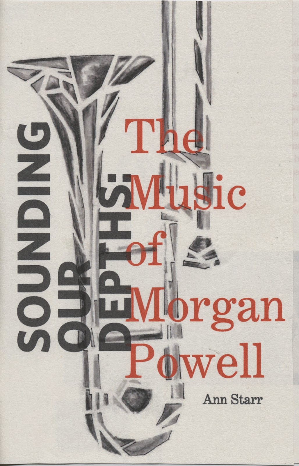
Sounding Our Depths: The Music of Morgan Powell. Order now.

Sounding Our Depths: The Music of Morgan Powell by Ann Starr has just been listed by Upper Hand Press.

Pre-orders are being taken immediately for the mid-August release of the 118-page book. A 72-minute compact disc of Powell's music accompanies the volume. Each track was selected for its immediate relevance to Starr's discussions. 

Powell is a composer whose unique oeuvre defies category, even within the world of contemporary music. His writing doesn't require technical musical background for the listener to participate in its depths and heart. The listener doesn't have to dig for lessons from past music appreciation classes to be guided by the sounds, pauses and paces of Powell's writing. It's a music that requires only ears, attention, and a listener's imagination. All Powell's music is performed by a circle of virtuosos who know the composer and his intentions well.


Powell understands the potency of his music, and that to comprehend it is to approach it like a child.