Tuesday, January 8, 2013

"Adolph Gottlieb: Sculptor," at the Akron Art Museum

Adolph Gottlieb: Sculptor, installation view, Karl and Bertl Arnstein Galleries,
Courtesy of the Akron Art Museum
Abstract Expressionism was a movement of painters, and Adolph Gottlieb was not the least of them. But I hadn't known that Gottlieb had also turned to sculpture late in his career (during the '60s and '70s) until I saw the handsome show that runs until February 17 at the Akron Art Museum. Organized by the Adolph and Esther Gottlieb Foundation, it presents Gottlieb's small sculptures, showing his cardboard maquettes through wooden templates to the finished steel objects composed of flat, painted shapes. The completed pieces are collections of circles, arrows, rectangles, arcs, and "bursts." The simple shapes are those one imagines a child would cut from construction paper. These shapes are well known from his paintings of the same period, but they give the sculptures a special air, suggestive of—but not the same as—the whimsicality of Calder and the brightness of Matisse cut-outs. They feel different from his paintings, in which shapes assume a weight of significance that seems lacking in the steel versions.

Abstract Expressionism notably thought big, and indeed the Gottlieb paintings that accompany these sculptures are reasonably large (Red or Blue, 1972, is 90 x 108 inches; Three Elements, 1964, is 96 x 48 inches). Although Gottlieb produced work for placement in landscape, the bulk of his sculpture was table-top sized. Presented here is work as large as Petaloid's 32.5 x 31.5 x 15 inches, the depth being on account of the base. (Petaloid, 1968 is featured in the foreground, above.) A lovely, chunky and otherwise articulate Untitled (not pictured), which lines up three shapes cut from wood and painted brown, is a mere 8.25 x 9.75 x 3.75 inches. Hardly heroic.

Adolph Gottlieb: Sculptor, installation view, Karl and Bertl Arnstein Galleries, 
Courtesy of the Akron Art Museum. NB, this is reverse view of image above:
Petaloid, 1968 is seen left, from opposite side. Foreground is Untitled, 1968,
which 
appears from opposite end in picture above, in the background, right.
In my review of David Smith: Cubes and Anarchy at the Wexner Center in spring 2012, I noted what had gone without remark, that the celebration of his cubes skipped over the fact that a good deal of his work explores planes rather than three-dimensional shapes. Gottlieb was apparently a friend of Smith's and an admirer: Gottlieb was certainly investigating some spatial questions that intrigued Smith as well, though Smith's flat works are, I think, more challenging. They tend to lead our eyes into negative spaces that continue his positive marks. Gottlieb's sculptures are more truncated in gesture, and I found their beauties to be more centered—more aggregated in the close relationship of positive shapes. Most of the shapes are slotted into flat rectangular bases that not only secure the upright forms, but serve as horizon lines or as definition of a world in which the visual event is collected. The base is, in fact, like a different, more open kind of organizing picture plane.

But of course sculpture's not a painting. The delight of this sheet metal sculpture is that its appearance, content, and significance are protean, shifting with every move the viewer makes. The flat shapes can disappear and reappear like characters in a drama: The eye loses them whenever one's position reduces them to line.

Adolph Gottlieb was born in 1903 and died in 1974. He began his studies at the Art Students' League in New York in 1919; 1968 was the year his retrospective filled both the Whitney and Guggenheim Museums. It was during the preparations for this career retrospective, when he was sixty-five, that he undertook sculpture, gleefully, for the first time, creating the work now seen in Akron.

Gottlieb and Mark Rothko, as part of a 1943 joint statement, said,"We favor simple expression of complex thought...We are for flat forms because they destroy illusion and reveal truth." Both men were "post-painterly" abstract expressionists, whose work was more distant and cool than theatrical. Gottlieb nevertheless considered his work, balanced and cerebral as it was, to be expressive: "I try, through colors, forms, and lines, to express intimate emotions." This thought applied to the sculptures no less than to his painting.

Adolph Gottlieb: Sculptor, installation view, Karl and Bertl Arnstein Galleries, Courtesy of the Akron Art Museum. Foreground, Arabesque, 1968,painted steel,
 26.75 x 38 x 12.25;" Painting, Red vs. Blue, 1972, acrylic on canvas, 90 x 108.
The generous documentation that the Gottlieb Foundation and Akron Art Museum provided as background suggest that the body of work in this show, "challenged the distinction between painting and sculpture," pointing to Gottlieb's continued use of long-perfected painting tools, such as touch, visual balance, and surface quality.

The photographs provided (individual photography was not permitted in this show) highlights the similarities between the design elements of Gottlieb's paintings and sculptures. In the view of Arabesque posed before Red vs. Blue, similarities are quite obvious in mirrored shapes, calligraphic strokes, and simplification of form and color. 

In both the sculpture and the painting, there is a tension between a sense of rest and the possibility of eminent take-off or propulsion—yet they feel very different nonetheless. Gottlieb may "challenge the distinction" between the two forms, but I think this photograph demonstrates that the challenge leaves the distinction standing firmly in place. I further think that it contravenes the notion that the sculptures might convey "intimate emotions" or "reveal truth" in a way comparable to the paintings.
Adolph Gottlieb: Sculptor, installation view, Karl and Bertl Arnstein Galleries, Courtesy of the Akron Art Museum.
Foreground,
 Two Arcs,1968, painted aluminum, 26 1/2 x 37 x 24 3/4." Painting: Three Elements, 1964, oil on linen, 96 x 48."
(Back, left, maquette for Two Arcs, cardboard with pencil notes.)


I think the big difference in what these two media offer Gottlieb lies in the nature of the way positive and negative space are defined by either. In the sculpture, Two Arcs, above, the shapes cut from steel, mounted in a stiff steel base, have crisp, clear edges. Their definition is absolute. The fact that the curves are not geometrically perfect is part of the interest of the piece, but the imperfection, like everything else, is perfectly stated. Likewise, though Gottlieb hand-painted the sculptures himself, I will offer only my word (since no close-up is available) that each painted element is uniformly coated with paint. Despite the occasional dried drip, there appears to have been no impulse to let serendipity have its day, or to attempt effects through variations in paint coverage. The simplicity is based in part on disciplined definition.

Such clear definition is important for this kind of sculpture because its components are visually very light and can disappear with a viewer's movement. The sculptural elements stand on their own, supported only by their inner relationship as seen from any particular angle. Their visual background—the room, the other artworks around it—can detract considerably if the installer is not sensitive to its positional delicacy.

Paintings composed with similar shapes and colors are altogether different because they are framed into permanent environments separated from the rest of the world by the colors and edges of their backgrounds. The backgrounds, in both of the paintings pictured above, contain smaller, colored environments against which shapes are set. So even while we are asked to understand these as "flat forms" and "flat surfaces," we instinctively know they are not. As soon as there is overlapping, we feel dimension. Moreover, on the large canvases, Gottlieb has not coated surfaces in the uniform way he covered his steel cut-outs. It's easier to see (on this scale, especially) in Three Elements than in Red vs. Blue, but layered paint on canvas allows (or begs) for shadows of past color applications and gestures to show through. The definition of the space inhabited by the shapes is largely given: There are four edges they relate to.

In Three Elements, Gottlieb uses edges crisp, fuzzy, and ragged for a variety of purposes: to impart definition to shapes; to invoke dissimilar emotional and intellectual responses in us. This powerful tool—the use of edge—isn't possible, working in sheet-metal. For reasons like this in the nature of materials, the sculptures don't have enough complex or nuanced elements to satisfy like Gottlieb's paintings do.

I'm sorry that I can't include any photographs of the maquettes for the sculptures, however, for these little painted cardboard trials in fact come very close to being comparable to the paintings in emotional effect. Several of these are pictured in the show's catalogue, Adolph Gottlieb: Sculptor, published by the Gottlieb Foundation (ISBN 978-0-9642065-2-6). The maquettes are, to my mind, more eloquent than the finished sculptures because they are so evidently simple, expressive of complex thought and intimate emotions. The cutting of cardboard with scissors doesn't produce exact products. Gottlieb wasn't exact or even decisive in painting them, so we see that painting history the final products lack. Cardboard isn't very strong, so some of the maquettes slump or list in a way that allows the emotion to show in the materials themselves. There is a wish—an aspiration—there is nuance in each maquette that the purity of the final, inflexible steel can't imitate. Those qualities of nuance, breathing room, or open potential exist inside of paint on canvas but around the steel cut-out sculpture. The maquettes, existing in a material world between the two, seem to participate in more of the soft virtues of painting.

I found Adolph Gottlieb: Sculptor to be a delight, especially because of the way the show allows the visitor access to the artist's process, presenting all the working stages of the sculptor's design process, and coordinating examples of Gottlieb's imagery in both media during the period. Good luck for Midwesterners: Akron will have the show until mid-February. After it closes there, it will open again in Ann Arbor this fall. The University of Michigan Museum of Art will have it from September 21, 2013 through January 5, 2014.


Thursday, January 3, 2013

There's Something Strange About "Simulacrum"

By simulacrum one can mean a simple representation: Mme. Tussaud's Wax Museum, for instance, presents simulacra of famous individuals. But a simulacrum can also be an inadequate or slight copy: "He said their house was a palace, but it was a mere simulacrum of anything palatial."
Tony Matelli, The Idiot, 2011.
Stainless steel, paint; 11 x 8 x 20." Courtesy of Leo Koenig, Inc.,
New York. Author photograph.

I loved the current show called Simulacrum at the Canzani Center Gallery of Columbus College of Art and Design. It's a big show with nothing that fails to grab the eye and intellect. In fact, that's its special delight—that all the ideas here are not merely illustrated by the physical objects: the objects embody the ideas. Of every work, the viewer has to ask in what sense this is a simulacrum, and of what original? Is there only one copy here? What does this work reflect or resist about the original or the world the original occupies? "No ideas but in things," William Carlos Williams wrote, and this show is the next step out from that idea. Then why copy a thing? Why even make the simulacrum? Who wants it?

At the show's entrance is this wonderful, provocative opener, Tony Matelli's The Idiot. It's a simulacrum of what, exactly? Certainly it's a perfect painted, stainless steel representation of an opened Coors beer container. But into that box has been ripped, or blasted—as if by a rifle at close range, when someone ran out of beer bottles to shoot?—three holes in the configuration of a face, with two eyes above a mouth. So the imitation box is itself a crude simulacrum of a face. At Halloween when I was child, a box or paper bag with holes served as a mask; so it's a simulacrum of a disguise or anonymity too. But the crudeness of the face, the rough punches, the indifference of the language (since the box is oriented on its side)—all this plus the mounting of the piece by itself like a hunting trophy on the white wall, certainly suggest that The Idiot is in fact named for its original. And maybe this is a simulacrum more significant than its original, a beer-swilling, aggressive, inarticulate man with a gun, a hunter taking trophies—or simulacra thereof.


Lee Stoetzel, Small Meal #2, 2007, detail (one of three elements).
Cypress, mahogany, hickory, and zebrawood. Dimensions
variable (under 6"). Courtesy of the artist and Mixed Greens,
New York. Author photograph.
Lee Stoetzel's Small Meal #2  has three parts, a cold drink cup with straw, a burger box, and this french fry cup, all obviously modeled on a McDonald's meal. On the one hand, unlabeled, they look like a design engineer's models, reminding us that considerable marketing art goes into the presentation of the most common and ephemeral material aspects of our world.  But on the other hand, these make us think too of timeless Harry Winston jewelry, when common everyday items—a shoe, an insect, a chair—can be the basis for a jewel-encrusted clasp, brooch, or hair ornament. Stoetzel's rendering with minute accuracy in precious woods—mahogany and zebrawood among them—mass-market burger and fries elevates the lazy and trashy to the precious dazzling. We take a deeper look, even if our notice begins in a joke. Is the simulacrum of McDonald's fries the simulacrum of Schiaparelli-like fashion whimsy?
Robert Gober, Bag of Doughnuts,
1989. Polyester resin, paper,
11 x 5 x 3.5," Private collection, NY
Robert Gober, Bag of Doughnuts, 1989. Interior.

Robert Gober also offers a simulacrum of food, but to a very different effect. His Bag of Doughnuts appears to be just that, in size and materials. The paper bag is a paper bag just the right size, and looking in, there are those fried cake donuts, yum yum. Gober has chosen to make his real white paper bag look as if it were just that by drawing in pencil the trademark "Union Camp" and the assurance, "Made in America." The treats inside, once their authenticity is called into question by Gober's have made the bag less authentic, plummet from appearing goodies we'd still like to dunk in coffee, to the repellent, dense, indigestible matter that they are. Gober's interest in materials seems focused on the subject of food itself, on the comparison between doughnuts as a dainty and as something that is barely food at all. There's a fine line, perhaps, between food and what we accept as edible.


Chris Bradley, Grease Face #3, 2012. Steel, aluminum, cast bronze, plastic strapping,
spray paint,oil paint, colored pencil. 24.25 x 22 x 2.5." Courtesy of
Shane Campbell Gallery, Chicago.


Simulacrum includes three empty, greasy pizza boxes doodled on in seeming idleness by Chris Bradley. All this is in a manner of speaking, of course, for this box isn't made of cardboard and grease, though the tacks are tacks. Bradley's work is the perfect replica of an empty pizza box, on which he has lavished materials and cunning to create realistic illusion. This (and its neighboring boxes) impressed me with awareness of the ignored lulls in life that may take up more time than the experiences we insist on attaching significance to. Bradley's torn "cardboard" edge resembles the result of restless fingers with no more pizza to pick up, which then resort to shredding its box. If the viewer reaches toward that edge, though, its chillingly clear that it's nothing like cardboard at all, but more akin to razor wire that could send you bleeding to the hospital with a mistaken move of the arm. It's lethal. The points of the corners are like edge tools. The face, idly made from the grease spots left after the good stuff is gone, feels sinister in its blankness—as if it refuses to be eradicated just because bellies are full. Life goes on after the meal is eaten, and there is considerable interest in that apparent idleness. We sit and play with the trash; we talk as our minds wander to our constant preoccupations, and our restlessness reveals what we don't discuss. What comes after the pizza party? Rubbish? Our genuine feeling and expression that preexist and linger after the pie has been ordered and swiftly consumed? The box looks back at us empty and blank much longer than it wasn full. Bradley's simulacrum represents a box; it represents our time and streams of consciousness.

Chris Hanson and Hendrika Sonnenberg,
Chandelier, 2006. Polystyrene, hot glue, painted
steel armature. 86 x 86 x 58." Collection of the
Artists Pension Trust, New York
The 2006 Chandelier by Chris Hanson and Hendrika Sonnenberg adds yet another twist to the idea of a simulacrum. Fashioned to make us think first of the extravagant swags and dangling crystals of  Rococo illumination, the artists undermine the larger design not only with industrial materials but by replacing candelabras with microphones. The swags are in fact dripping electrical lines that will hook the microphones to recording equipment. The "chandelier," rather than shedding light, bugs the room, spying on anyone within its monitoring range. This work not so much represents a chandelier as the obvious lies we gradually grow to accept. Have we grown so accepting of privacy invasion that we no longer recognize the concept? If imitation or representation are at the heart of Chandelier, it is with a sinister irony.


TAYLOR McKIMENS, Truck, 2005. Oil and acrylic paint on cardboard and paper,
98  x 54  x 48 inches. Collection Neuberger Museum of Art.
While the Hanson-Sonnenberg chandelier stretches the idea of "simulacrum" almost into the realm of synesthesia by laying "oversight" on top of "illumination," the Truck Taylor McKimens constructs pushes us even harder. Yes, it's a light cardboard simulacrum of a pickup truck, that emblem of rugged manhood advertised by images of tough working men with ripped muscles, driving through godforsaken places to get motors to the turbines or hay to the heifers. McKimens' pastel truck is a clunker with broken windows; tangles of unattached wires; a domestic potted plant where the monstrous payload should be, and "Sorry" across the bumper where we're expecting to see "Semper Fi." It is a satire, a pathetic pick-up in girly colors.


A cardboard truck is a simulacrum of a tough-guy steel truck, just as a beat-up truck is a faint imitation of a real, big, shiny pick-up. But the essence of this wonderful work is that its essential point is the premise of this and every art show: that to be making art at all is to be dealing in Plato's cave of shadowy copies. The most lively thing about McKimens' work is that it is so conspicuously drawn. The artist took up paper and paints—the traditional materials of drawing—and "made a truck." It's folded, to boot, but essentially it's the sort of thing little children do very young; it reflects that very simple impulse to record on paper the thing that's out there and to make it one's own. Certainly any representational art, and even art that claims to record emotional or psychological experience abstractly, explores the idea of simulacra.This and McKimens' other pieces in this show—including a drawn cardboard television, turned on—seem to me to make this point with a beautiful, innocent poignancy. His work lacks the edge, the satire, and irony that most of the show is premised on. By making art at all, one makes comparisons: It's not even a matter of attitude.

How much more basic can one get than drawing a simulacrum of a truck? It does seem to me that Mary Temple takes it one heady step further in her imitation of light and shadow.

MARY TEMPLE, Light Fragment, 2010. Acrylic paint on sheetrock,
acrylic gel, 
stain and urethane on hardwood. 30 x 36  inches. Courtesy of the artist and Mixed Greens, NY

Temple's delightfully named Light Fragment is surely one of the most convincing illusions in the show, and comes as a surprising lift amidst the mechanical, man-made, and trashy.  Many of the artists collected here deal with issues of comparative inherent and socially constructed value; with physical and psychological scale; with reconsiderations of beauty in the constructed, everyday world. Temple, like McKimens, draws what she sees, but brings a natural subject inside—where it, too, is an everyday occurrence. Any attempt to represent light is a simulacrum, but it also incorporates the subject itself. Painting and drawing are rooted in light and its properties. So, whether she imitates the fall of shadows through a window to create a simulacrum of shadows, or whether she uses her knowledge of light's properties to create a beguiling scene is either a fine question of philosophy—or it is utterly indifferent. What a satisfying work on the face of it.

Simulacrum is a much larger show than this review can begin to reflect. It closes on January 11; I recommend starting now to see its marvels. Curator Michael Goodson's achievement above all, I think, is in having chosen a topic that works in so many ways. The show is funny and thought-provoking. To anyone who maintains either casually or deeply their own inner conversation about what art may be, this show will heat up that discussion.

Saturday, December 29, 2012

Portland Japanese Garden and Lan Su Chinese Garden: Arts of Tranquillity

When it's forty-five degrees and raining outside, I'm sure to seek my pleasures indoors. Unless I'm in Portland, Oregon, that is. Recently visiting Portland in weather that would guarantee gloom elsewhere, I hardly wished to escape the rain and thereby miss the city's elfin palette of saturated greens; its blooming cyclamen and mysterious cypress trees spread over deep carpets of moss and lichens. My plans to visit the art museums went out the door with my umbrella and me. It may take me until spring to dry out in Columbus from the soakings I experienced in the Portland Japanese Garden and Lan Su Chinese Garden, but the memories are well worth any mortal mildew.
Neighborhood of Lan Su Chinese Garden. The Garden wall is the
low, white structure to the right, surrounded by trees.

Portland is a polyglot city. Its relationships to China and Japan are everywhere felt and nowhere as fluently articulated as in the traditional gardens. Both are renowned as the most authentic of their kind outside of their countries. The Portland Japanese Garden occupies five and a half acres on a high, piney hillside inside the City's spectacularly situated Washington Park. Lan Su Chinese Garden fills only one city block. It is surrounded by the tall buildings, traffic, and construction of the city, providing within its vine-covered walls an other-wordly peacefulness.


Parking lot entrance to Portland Japanese Garden. From here
it's a five-minute walk up a steep, forested hillside to the Garden. 
The Japanese Garden is a collection of gardens in five different styles, each of which invites a distinct way of contemplating nature—and the soul. On these grounds, free-standing architecture or sculpture feels like part of the garden, rather than like excuses for landscaping. The Chinese gardens too are many, but each defined as a "vista," or point of view with a specific, named purpose. Each is precisely integrated architecturally and thematically into the pavilioned home of a Ming Dynasty scholar-aristocrat.

There was a special peace as there was a certain romance about my visit to the Japanese garden. It poured rain for every minute of the over-two hours that I spent there. This landscape not only needs water, but it dresses up in moisture too, the milky white atmosphere offsetting the broad spectrum of greens. I came across several groundskeepers in the course of my solitary wanderings. They were removing every dead leaf, stem, and blossom to heighten the piquant effect of the garden's abundant life. 

The sense of occupying an enchanted zone was vivid for me: There appeared to be no fading, or decay; no loss or death there. The landscapes appeared both alive and permanent, conjuring serenity not only by the aesthetics of fine horticultural science and art, but also by the illusory banishment of temporality and of scale. In the view of the mounded bushes rising on the hillside across a pond, for instance, the blushes of color could suggest a scene from the spring in late December: While a plantsman would know the season precisely, it seems essentially unimportant for the enjoyment of the scene's beauty. And even more in person than in the photograph, one senses that the view could be of a far-away mountainside; of bonsai trees; or of the actual modest, human-scaled flora planted on a limited acreage. The mind can expand or contract to fill whatever space the scene suggests to the visitor.
Portland Japanese Garden, landscape across the Lower Pond

Each of the Japanese gardens provides unique pleasure. Because the fecundity of the Pacific Northwest environment captivates me, I especially enjoyed the large Natural Garden, in which native plants are not shaped, but grow naturally along the paths, the stream, and around the waterfall. The infrastructure is carefully prepared and dead leaves removed so that there is no view of decay. An elegant pagoda-style lantern provides a focal point from at least two places and underscores one of the particular beauties of this garden, the underlying comparison between artifice and nature. For even though it is the Natural Garden—especially in relation to the more stylized and symbolic gardens around it—one only need look up into the foggy hillside of towering pines surrounding to consider two competing concepts of "natural." Any garden, however natural, is a work of artifice; a Japanese garden is artifice on an extraordinary level. 
Natural Garden. Pagoda lantern, foreground;
waterfall, background.

Natural Garden, view of stream from stone
bridge.
We are reminded that we are in a New World landscape at every stop, not only in the Natural Garden. Another highlight is the Sand and Stone or Dry Garden, often called a "Zen Garden" for the association of this style with Zen Buddhist monasteries. The only elements are sand and rocks; the design is symbolic of islands or continents in the ocean, or of the cosmos itself. The enjoyment is contemplative; benches are provided those better prepared to endure the wet and cold than I was at the moment. Each rock in the garden has been chosen with great care for its intrinsic character, and placed with skill and art—in this case, it's easy to see how they all tend toward the towering focal point, as if they move toward it, worshipfully, obediently, or gravitationally.

Sand and Stone Garden
Detail, Sand and Stone Garden.


This is a place unrelieved by green, however, save by some bamboo and a few companion shrubs in the corners of the approach. Here the background of the native, wild, and untended landscape loom over what is surely one of gardening's most austere presentations. Despite the darkness of the day and the gray setting, I found myself still and focused on the great, upright rock. Its hunched, figurative form struck me as wise and strong. It exerted a force that made the smaller ones seem to respect and follow. Respect, fealty, and trust are awkward concepts for me, but in that setting they rested lightly, like the fog on the treetops.

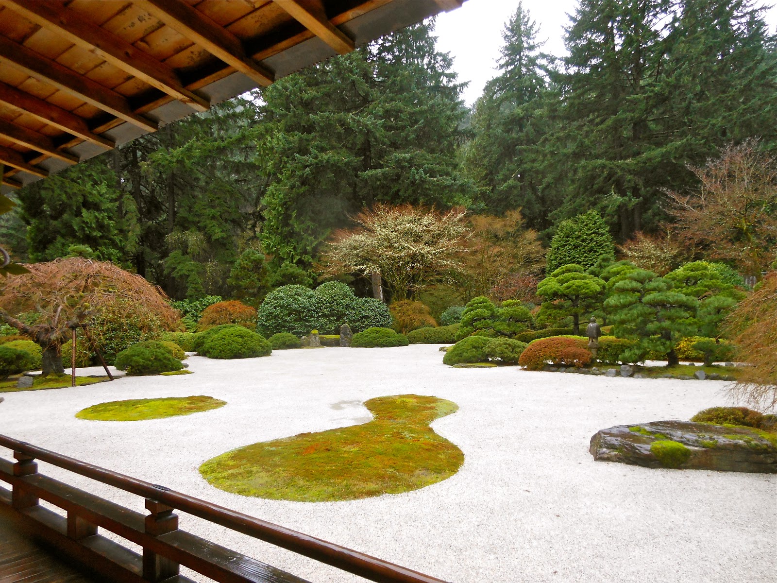
The Flat Garden is the vast, serene ornament outside the central pavilion, what would have been the dwelling on the Gardens' model estate. Where the "sand" of the Sand and Stone Garden is in fact small stones, it is indeed a sea of raked white sand in the Flat Garden, in the midst of which two islands arise. I learned later that the shapes of the islands are significant, the small one representing a round sake cup, and the large, irregular one a gourd vessel from which the sake would be poured: In effect, they symbolize pleasure and hospitality. 


The pavilion has a broad, covered porch extending from its paper sliding doors. On this one can stand or stroll to contemplate the beauties of the landscaped ocean. The far shores have many kinds of plants in many soothing groupings. Once more, the meticulously kept garden is surrounded by the flora of the Pacific Northwest's native terrain. One can also see in the distance several natural and man-made focal points situated among the peripheral plantings. 

Flat Garden, with cup and gourd islands.

Throughout the Japanese gardens, nature is interrupted by small, man-made ornaments. Modest as these lanterns, bridges, gates, and basins are, the stone and wood materials and the unambiguous presence of the man-made turn each one into an event—another form of focal point or place to pause in admiration or reflection. Indeed, one passes through these gardens almost literally conscious of every step, for the sequence of views is unending, yet never so dense that one tires. A walk through the grounds, even in a downpour, is like riding a paper boat down a gentle rivulet of peace and alert uncaring.


The Lan Su Chinese Garden downtown Portland offers the rainy-day visitor many more opportunities to enjoy the landscape from under a pavilion roof. This is because the gardens are much more closely integrated into the architecture and living space of the wealthy family who would have owned the 16th century property. The ultimate goal here is to integrate every element within the walls not only visual harmony, but by symbol and significance as well. 

Lan Su Chinese Garden, Courtyard of Tranquility.


The Courtyard of Tranquility, the entry point for the compound, is considered a garden, despite its comparative lack of botanical materials. The Lake Tai rock, like the many others in the Garden, was formed by the currents of a lake into which it was lowered for that purpose. It is to be viewed for pleasure as a mountain, from the bottom up. The stones are laid in the yin-yang pattern, representing the interconnectedness of the world; in the glazed pot is a small persimmon tree, that fruit being symbolic of good fortune. The triangles along the roofline of the house picture bats, symbolic of happiness (a homonym in Chinese) and prosperity. Is it plants, or the harmonious aggregation of meanings that make the garden—the vision of a blessed and beneficent place? 

Every non-botanical element of Lan Su was imported from China in 2000, along with the sixty-five artisans to assemble them. The stones on the courtyard floors; the panels of the buildings; the Lake Tai rocks are among the five hundred tons of imported materials. Plants, however, could not be imported, but everything in the Garden comes from Chinese stock found in the Pacific Northwest, in nurseries, or donated by individuals. Many large, mature trees came from the gardens of individuals, where they had thrived in some cases for over a hundred years.

Among the treasured plants at Lan Su are several penjing, similar to what we know through the Japanese as bonsai. Penjing, however, are intended not so much to be individual specimens as landscapes, sometimes decorated with tiny models of people and structures. These bear relationship to Chinese landscape painting and sometimes serve as models. 

In both the Japanese and Chinese gardens, the principle of compression is paramount, but at Lan Su, there is a prevailing sense that within the four walls and very little space, the effort is to create an entire universe apart; to build a paradise on a small earth rather than to provide a series of beautiful settings separated by distance for the traveler to rest in and pass through.

Of Lan Su's block, at least one-third is taken up by water, and a wide variety of opportunities are arranged for viewing the water from pavilions, porches, and bridges. The charming pavilion pictured here rests in the middle of a bridge and is named the Moon Locking Pavilion. It sits over the widest area of water and is intended as the spot for gazing at the moon's reflection in the water, ideally "locked in" by the pavilion's own shadow on a clear, still night. Like every other aspect of the garden, the observable beauty of the landscape and architecture are melded yet more tightly by the poetry of the conception.

The Scholar's Courtyard is based on poetic conception as well. This is as interior a space as it's possible to find within the compound, creating the seclusion and quiet the scholar desires. The stone paving leads the visitor across the courtyard between the alluring, round passages to the neighboring spaces, but its width and curve are also invitations to linger and enjoy the subtleties of the rocks and flora. 
The tall tree in the courtyard's corner is a plum, which has its own significance. The plum blossoms early and thus, as a harbinger of spring, is considered a symbol of endurance and hope, messages valued by the scholar. The paving pattern reinforces the symbolism of the tree. The plum blossom sits in an abstract, angular pattern with sharp edges, representing ice. The plum blossom on cracked ice is a traditional motif that induces the visitor to contemplate the determination of the blossom to flower despite the harshness of winter's end.

In the Japanese Garden, I felt little concern about the particular symbolism of any one plant or scene. At Lan Su, I was among a group under the care of a Chinese-American guide whose Chinese acculturation more than any docent training led me into a deeper acquaintance with the details of the place than I could have achieved on my own. On the other hand, I didn't linger where I would have liked to, and  though I was enriched by certain kinds of knowledge, I miss the dreams of my own first pass-through. On the other hand, I am waiting for a guide and history of the Japanese Garden to arrive in the mail. 

It seems that I cannot have too much information, nor too many first experiences. Gardens are perfect for this mind set, being the ever-changing, always renewing form of art.

Persimmon tree at Lan Su Chinese Garden.

All photography by the author.

Friday, December 14, 2012

Islamic Art at Indianapolis: "Beauty and Belief"

Tile panel. Polychrome painted under transparent glaze. TURKEY (Iznik), 16th century.
63.4 cm x 26.4 cm x 5.5 cm deep.
The University of Pennsylvania Museum of Archaeology and Anthropology.
The subtitle for Beauty and Belief, showing through January 13, 2013 at the Indianapolis Museum of Art, is Crossing Bridges to the Arts of Islamic Culture. When I crossed that bridge, I left everything  behind for a truly enveloping experience. I was transported through eyes and understanding into a worldview of transcendent beauty in which every detail is an element of patterns both visible (Dhahir) and invisible or spiritual (Batin), all interconnected forever, through time past and to come. 

The art collected in this spectacular show by its curator, Dr. Sabiha Al Khemir, illustrates the vast spread of the Ummah—the traditional Islamic community. Al Khemir's point of the unity of expression is made through the inclusion of work not only from the Middle East and North Africa. An orienting graphic that greets the visitor is a huge map of the eastern hemisphere, marking regions and cities that are centers of Islamic culture. I was impressed to see this vast range laid out visually: It extends from Toledo and Valencia to Venice to Mogadishu; Aden to Ankara, Tashkent and New Delhi, to eastern China and south to Kuala Lumpur.
Qur'an Manuscript, Volume 16. Ink and color on burnished cream paper
with brown morocco binding. CHINA, 18th century. 22.2 x 29.2 x 2.5 cm.
Private collection

Beauty and Belief emphasizes visual consonance across socio-economic levels as well. It presents work from royal households—items of breathtaking craftsmanship made from precious materials. But there are just as many artifacts put to daily use from common homes, ceramics particularly.

The breadth and unity of Islamic culture is further illustrated by the variety of materials and processes in which one finds similar motifs. The show includes ceramics, textiles, many metals worked in forms as dainty as incense burners and as grand as doors; ivory; paper; wood; glass; and photographs of architecture. Across all media we see decorations based in endlessly elaborated calligraphy; flora and fauna; geometric patterns; and all of these nestled in patterns that blend elements in indistinguishable unity.


Incense Burner. Cast brass, pierced, engraved, and inlaid
with silver. SYRIA (Damascus), 15th century.
Diameter 13.4 cm. The British Museum, London.
A big surprise that flies in the face of long-accepted belief about Islamic art, is that the figure in fact appears regularly in Islamic art. Al Khemir demonstrates convincingly that though it is sacrilegious to introduce images into the mosque, people and animals are routinely and abundantly portrayed in all other sorts of art, both representational and fantastical. 

Art-making is always an act of devotion in Islam: The artist's actions and the results of his labor are suffused with spirituality. The tiniest mark is invested with the holy since, "God is the ultimate beholder." This does not mean that every decorated item assumes religious or sacred function—only the contents of the mosque have that—but it means that the spirit is omnipresent in a way the believers are conscious of and accustomed to. Moreover, a bowl decorated with an elaborate calligraphic expression like, "Great is his majesty," relates to the entire material universe of those words both written and on the breath of individuals who repeat them.

Tawhid is the Islamic idea of oneness with god—that everything comes from god and goes back to him, in a cycle. God passes through artist in the very acts that they dedicate to him. Every thing they make, then, and each detail of its decoration, has its own meaning but also has meaning congruent with the universal. Every piece of art is significant in itself and has significance greater than itself, as a drop in the eternal confluence of god's spirit. The Islamic worldview is thus charged with meaning in a way foreign to most Westerners, for whom most details of the material world are indifferent or negligible.

Detail proceeds infinitely in Islamic art. The incense burner, for instance is only 13.4 cm (about 5.15 inches), yet it contains a world of repeated, interlocking design. The patterns are a combination of abstract flowers and leaves intertwined with geometric elements knotted among one another: stars with many blunted points, circles and ellipses in clusters, and so on. Such combinations of patterns and design elements are familiar in the West as they were copied into Renaissance design. 
Three Finials, each with a Name of God. Steel, incised and overlaid in gold and backed with silver.
IRAN, probably early 18th century. 20.5 cm x 12 cm. x 0.3 cm. Private collection. Photo © Peter Savage, Visible Time, London


Tile with Twelve-pointed Star. Ceramic mosaic with
polychrome glaze. IRAN (Isfahan), 15th century.
Diameter, 62.23 cm. Seattle Art Museum,
Eugene Fuller Memorial Collection.
The detail of these 8-inch high finials (probably from a grille in a mosque) is dazzling; they are from a set of ninety-nine, each bearing one of the ninety-nine names of god. Close inspection shows that not only the calligraphy differs between them; the floral background designs are, while similar, different enough to make me wonder if they were intentionally variant, or the accident of work by many hands. The finials themselves form a greater pattern, for the negative space between them mirrors, top to bottom, the shape of the objects themselves.

The mosaic tile illustrates on a much more complicated level the use of positive and negative shapes along with interwoven natural and geometric designs. Within the twelve points, the artist has created a golden square composed of four soft triangles meeting in a star. The gold star sits at right angles to its turquoise twin, which makes us aware of the turquoise floral "pillows"—soft rectangles—formed behind the gold frame. At the points of the turquoise star rest white, lotus-like flowers with strong triangular centers. The elements of the gold border are also joined by tri-partite gold elements. The integration of the mathematical with the illusions created by the use of positive and negative space and of color juxtapositions—and all within a design so flowing, natural, and elegant—seems to me an exemplary  expression of the Islamic aesthetic. Note, as well, how much occurs within a single tile that can be fit into a larger design: Just like its many patterns, the tile itself is related to many possible patterns that can extend forever beyond its borders.


Bowl with a Hare. Incised, white slipped and painted pottery, Aghkand type.
Northwest IRAN or the CAUCASUS, 12th-13th century. 11.5 cm high,
30 cm. diameter. The British Museum, London. ©The Trustees of the British Museum.
The combination of natural and geometric patterns takes on a new complexion when it becomes part of a picture with the introduction of an animal or a person. The colors of the bowl with a lively, leaping, ears-lifted hare, and the freshness of the drawing soften the symmetry to promote a sense of the scenic: a rabbit gambols across earth and verdure. There's a informality here that doesn't pertain to the tile, above, because the forms are not as precisely placed or outlined. Moreover, the alert, moving animal appears uninterested in the disposition of the environment: He is confident, it seems, of the world's beauty and order, the world the artist reflects as a devotion to a god who loves beauty. Al Khemir grounds us with a quote from the Prophet Muhammed, that "God is beautiful and loves beauty." Here is a hare who artlessly assumes beauty.
Griffin. Cast bronze with engraved decoration. SPAIN  (possibly
Cordoba), 11th century. 107 x 32 x 82 cm.
Opera della Primaziale Pisana, Pisa (copy in exhibition).


Figurative and pictorial art goes in many directions, though. Beauty and Belief assures us that fantastical animals in the form of figurines are not uncommon in Islamic art. Belief in an invisible world leaves plenty of latitude for such. Where Greco-Roman tradition tends to cast creatures with the qualities of several animals as monsters, in Islamic tradition they tend to be guardian figures. A griffin—combined eagle and lion—long topped the cathedral in Pisa, Italy. When the building was restored, the figure was lowered and inspected, only then discovered to be covered with Arabic writing. 


Another form of fantastical animal in Islamic art is the composite, an animal whose mass is composed of the forms of other animals, all fitted together to take the shape of the one. In a picture like the one shown, the exterior (pictured) animal proceeds in the scene as if it were  just like any normal animal of its species, allowing the viewer to speculate about not only the reality status of the story, but of the creature within the story's borders. Such composite drawings are apparently thought to be in a class unto themselves and more metaphysical in spirit than representations like the happy hare or the beneficent griffin, suggesting the ideas of transiency and ultimate unity, or the unity of the invisible spiritual world. 
Composite Elephant and Other Creatures. Opaque watercolor and gold on paper. NORTHERN INDIA, circa 1600.
15.88 x 22.23 cm. The San Diego Museum of Art, Edwin Binney 3rd Collection.
Interior composed of animals including bear, tigers, rabbits, fish, deer,peacock, leopard, oxen, antelope, boar, snakes, and a man.


Though I arrive at it last, calligraphic quotations form the the Qur'an and the Hadith (the reports of the Prophet Muhammad's deeds and sayings) are ubiquitous in Islamic art. Calligraphy not only presents holy texts but becomes, in itself, as aesthetic object. Calligraphy is the most noble art, the domain of the most scholarly and cultured persons. Styles of writing abound. Calligraphers succeed one another for generations in families as priests would, for calligraphy is seen as a particular form of devotion. Practitioners never identify their work, so selflessly do they dedicate it to god.
Bowl with Kufic Characters. Earthenware
with white slip and glaze. PERSIA (Nishapur),
9th-10th century. 9.8 x 26 cm. Seattle Art
Museum, Eugene Fuller Memorial Collection.
Photo: Paul Macapia.

Beauty and Belief astounds with its abundant examples of the written word; but then, it is clearly impossible to exhibit Islamic art without doing so. In a catalogue essay, Dr. Al Khemir reminds us that through the Qur'an, god manifested himself in the language of Arabic; all Muslims, regardless of their spoken language, learn to read Arabic. "In Islamic culture," she writes, "even a piece of paper with Arabic written on it becomes sacred and treading upon it is disapproved of." It stands to follow that scribes of Arabic are  honored, and that exquisite calligraphy would be the most highly valued art.

As with all manifestations of Islamic art, calligraphy is presented in every form and situation from the simple and common to the most elaborate and precious. The white earthenware bowl with a few black characters as border is enormously elegant in its design; it pleases the contemporary eye with the proportions of the calligraphy and and the overall relationship of black to white, enhanced by tracings of red. One need not recognize script at all to admire the bold, dynamic design.

Where the beauty of the calligraphy on a common bowl might be executed in relatively little time, many forms of calligraphy were painstaking in relation to the value thought to inhere in the message written. The gilded inscription within the fine net of a horse chestnut leaf says, "The best people are those who do good for other people," and reads from bottom to top. This painstaking art form preserved important cultural saying for the Sufi sect. The catalogue explains the technique, which involved stenciling the text and covering it with wax before laying the leaf  on top, soaked in chemicals that ate away nearly everything but the vein structure, to reveal the writing. The writing was further outlined with piercing to remove still more of the leaf surface. The fineness of the leaf's filigree enhances the bold lines of the calligraphy, enhancing the stature of the words both as marks and as message.


Natural Leaf with Calligraphy, Thuluth script. Horse chestnut leaf. TURKEY, 19th  century. 20.x 8.9 cm. Private collection, USA.


Even in an exhibition with very little that that fails to inspire excitement, wonder, or delight; to illuminate a culture that's been nothing but obscure to me; there are still two or three works that stop my heart with their beauty, with the purity of the artist's passionate expression, or with their power to grab and shake me. This sheet of calligraphy is one of these, a 19th century collection of sayings that refer to the Prophet's cousin and son-in-law. Written on black paper, each saying appears in a different color, and the whole is enhanced with gold paint.

Riqu' Script Referring to 'Ali Ibn Abi Talib. Possibly transcribed by
Zayn al-"Abidin al-Isfahani in 1802. Multi-colored text on black paper with gold flecks.
IRAN, 19th century. 15.7 x 18.5 cm. Wellcome Library, London.


With no knowledge of Arabic, and no natural inclination to think in religious terms, I find myself moving through this "backwards," if the goal is to understand it as Islamic art. Simply as an artistic document to experience, I am swept away by its beauty and brilliance. I love the balance and the layering of the color panels: It runs the gamut from deepest dark colors to bright white yet without graduated, marginal changes. The color juxtapositions have to be considered as events in themselves, yet in the context of the whole sheet, they create not only a surface pattern of stripes and boxes but they also create a sense of changing depths. For me, this has the feel of a replete forest or garden maintained in manicured condition, in perpetual bloom. The calligraphic strokes are so expressive of floral forms, of stems, leaves, and vines, that were I to propose words for this image, they would be erotic, following the flowing marks and the rich, warm depth of palette. 

I would hardly be the first, though, to align sacred text with the erotic —see the poetry of the Old Testament Bible. But I think I find this artwork especially appealing because of this. While so much of the work in this show shows the minutely detailed in larger patterns that can combine forever—as I think one senses happening here—there is often a geometric logic controlling the work. Through the evident formality of this sheet I feel an erupting passion: The layout is short of symmetrical, the colors are not symmetrically designed—there's an overall urgency of movement that seems to arise from a more urgent motive. If God beholds everything, and loves beauty, don't some things catch his eye more than others? Does his heart skip a beat every now and then? I imagine he'd have to pause and catch his breath for a celestial moment here.

This extremely significant show was spearheaded by the Brigham Young University Art Museum, along with the Indianapolis Art Museum, the Newark (New Jersey) Museum, and the Portland (Oregon) Museum. 

At any time of the world, Beauty and Belief would be a welcome, timely, and deeply instructive show. It would be easy to moralize that its value is particularly great in this, our era of extended war between the United States and militant Islamic terrorists. But Beauty and Belief is a show about enduring culture and vision. No war waged on any premise touches on either.