Saturday, February 2, 2013

"Mark Rothko: The Decisive Decade" at the Columbus Museum of Art


Untitled (man and two women in a pastoral setting), c. 1940
oil and graphite on canvas, 28.5 x 36."
National Gallery of Art, Washington, Gift of The Mark Rothko Foundation, Inc., 1986.43.53
© 1998 Kate Rothko Prizel & Christopher Rothko / Arts Rights Society (ARS), New York

A fine museum exhibition tells a coherent story, and Mark Rothko: The Decisive Decade, 1940-1950, currently at the Columbus Museum of Art, does just that. In four luminous galleries, the show moves the viewer through the stunning transformations of Rothko's work from recognizable figuration in traditional settings through surrealism, figurative abstraction, and into the large, juxtaposed bands and boxes of color by which he is today almost exclusively known. All of this in only ten years. 


Mark Rothko, Sacrificial Moment, 1945. Oil on canvas, 38.5 x 28.".
National Gallery of Art, Washington, Gift of The Mark Rothko Foundation, Inc., 1986.43.74
© 1998 Kate Rothko Prizel & Christopher Rothko / Arts Rights Society (ARS), New York


It will come as a big surprise to many to find that Mark Rothko did not emerge full-blown as we know him. It's like finding for the first time a photograph of one's father as a teenager: We can hardly believe he preexisted his bearded, pipe-smoking adulthood. 

But in Rothko's case, had he settled at any one of the brief stages he explored during this decade through which he hurtled, he would nonetheless be considered a master of modern painting. Moving through the show, there was not a single work before which I was not transfixed. So while the narrative of the relationship of all these experiments to his conclusive manner of painting is entirely convincing, still, I felt no sense of inevitability. His mastery and his originality would have been sufficient to enshrine him as a genius at any point from 1943 on. Yes, the show successfully tells the story of development. But he could have stopped at any point along the way and satisfied the world.

The painting shown above, Sacrificial Moment, illustrates a stage in the dissolution of Rothko's figuration. Vertically, there are three sections: a knife on the left, the sacrificial victim in the middle, and a figure (the performer of the sacrifice, presumably) on the right. He featured three figures in most of his early figurative compositions—see the 1940 painting at the top of this article—in various whole and disassembled forms. Nearly all of the paintings in this exhibition show that Rothko placed his figures or shapes against three horizontal bands of color, "prefiguring" if you will—"investigating" if you won't—the significance of color blocks built up through layers  of glazing (addition in multiple, thin, translucent layers that add richness and luminescence). In the 1947 Untitled painting, the figures have become spots of black lined up against now-broken patches of color (still horizontally disposed), newly highlighted in themselves, no longer serving as "background."


Mark Rothko, Untitled, 1947, Oil on canvas, 38.5 x 36."
National Gallery of Art, Washington, Gift of The Mark Rothko Foundation, Inc., 
1986.43.14. © 1998 Kate Rothko Prizel & Christopher Rothko / 
Arts Rights Society (ARS), New York
Christopher Rothko, the artist's son, who has been deeply involved with this show, remarks in an opening statement that in terms of the 1940's, his father "enters figurative, ends abstract." Another way to put this, I think, is to see Rothko's tendency over the decade to refine his vision by unifying two sorts of reality that are usually designated by terms that appear to exclude one another, like "figurative" or "realistic" as opposed to "abstract" or "abstract expressive." In paintings from the early years of the 1940's, like Sacrificial Moment or Untitled from 1945 (below), abstracted figures appear spatially in front of three bands of color. 

To my eye, those bands provide in such paintings the "realistic" element against which abstracted figures are contrasted. By realistic, I mean that our visual tradition reads horizontal lines as "landscape." Three horizontal sections naturally read as foreground, middle distance, and background or deep space; or they can represent land and sky as observed from the water; or similarly, sea and sky as seen from land: The point is the landscape alignment is a grounding in psychological reality before which the reality of dreamy, re-imagined, or felt experience appears. The one is grounded and unthinkingly accepted because it's both perceived and acculturated. The other one is formed by emotion and fantasy—the creating and interpreting vision of one's inner eye.


Mark Rothko  Untitled, 1945/46. Oil and tempera on canvas.
34.5 x 43.5." National Gallery of Art, Washington, 
Gift of The Mark Rothko Foundation, Inc.,
 1986.43.75 © 1998 Kate Rothko Prizel & Christopher Rothko /
 Arts Rights Society (ARS), New York
I think it's his placement of two notions of reality next to one another on equal footing that allows the merging of the two into work like the untitled 1947 painting and the blossom- or cloud-like 1948 painting (also untitled), with its bright primary colors between an umbrage of deep reddish brown, over a  brilliant shingle of whites and pinks. It could be said that here, figuration disappears into pure abstraction. Rather, I see it as consolidation. Rothko is not contrasting perceived reality with imaginative or emotional reality. Now the shapes and colors join to express experienced emotion. This is both emotion we call "feeling," grounded in perception and  sensation; and also the idealized emotion found in aspiration, fervor, or desire.

In addition to shape and color, Rothko is now very conscious of edge. Lacking in geometrical definition as the shapes are, each one inhabits its own space. Though edges are rarely crisp, each shape's definition is clear—as clear as its color, no matter how simple or subtle. What overlapping there is tends to be transparent. 
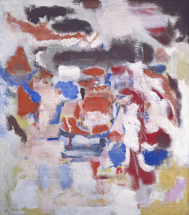

Mark Rothko, Untitled, 1948. Oil on canvas, 53 x 47."
National Gallery of Art, Washington, Gift of The Mark Rothko Foundation, Inc., 1986.43.4
© 1998 Kate Rothko Prizel & Christopher Rothko / Arts Rights Society (ARS), New York


The quality of the shapes; their visual emergence or retreat; their relationships to their immediate environments and to the whole—all become more important in separation.  Rothko's glazed, almost holy colors, carry deep emotion, but so do their positional relationships.
In the gallery materials, Rothko is quoted as having written in a letter, late in the decade, "I'm interested only in expressing human emotions—tragedy, ecstasy, doom. And if you, as you say, are moved only by their color relationship, then you miss the point."

Rothko and spiritual kinsman Adolph Gottlieb—perhaps  Jules Olitsky as well—are counted among the Abstract Expressionists, but it's worth reviewing the terms of that title. 

If we pause to imagine the ambition of one who undertakes the agenda that Rothko mentions to his correspondent—the expression of emotions so primary and massive as tragedy, ecstasy, and doom—we must imagine too that he is planning to do more than try to interest us only in his personal happiness or woe. What is Hecuba to us? His work could attain no consequence beyond just that interest in color or other formal concerns were we to think its content were his own emotion. He could try to convince us, but the look, not the truth would likely compel us.

This is to say that emotion and its expression are two different things. Emotion is experienced, and simply exists or does not. Expression, in attempting to convey, or even to replicate similar experience in the audience, can succeed or fail.

To express emotion in the sense that Rothko means, and to express oneself in the sense that many expect abstract expressionism to do, is quite another. Rothko is a philosopher, looking into the soul of mankind, into all hearts, not just his own. The emotion he is interested in is what turns all figures into humanity. 

Over the decade of the 1940's Rothko neither lost interest in the figure nor abandoned it. He found, rather, that since essential emotions make us human, the figure and spirit may be expressed and represented both at once. The maturity and profundity of his color are the depth of the human lot; the separated shape relationships are the burden and nobility of individuality. (Painting above: Untitled,1949. Watercolor on paper, 41 x 27.25." National Gallery of Art, Washington, Gift of The Mark Rothko Foundation, Inc., 1986.43.257. © 1998 Kate Rothko Prizel & Christopher Rothko / Arts Rights Society (ARS), New York.)


Mark Rothko: The Decisive Decade will remain at the Columbus Museum of Art until May 26, 2013. It was organized by the Columbus Museum of Art, the Arkansas Arts Center, the Columbia (South Carolina) Museum of Art, and the Denver Art Museum, in cooperation with the National Gallery of Art. The catalogue, named for the show, has magnificent reproductions, including full-scale details of many works. I haven't found the book online, but it is available through the Columbus Museum of Art.


Mark Rothko, No. 8, 1949. Oil and mixed media on canvas, 90 x 66."
National Gallery of Art, Washington, Gift of The Mark Rothko Foundation, Inc., 1986.43.147
© 1998 Kate Rothko Prizel & Christopher Rothko / Arts Rights Society (ARS), New York

Saturday, January 26, 2013

Ephemera and Endurance: Installation by Vivian Hyelim Kim

Vivian Hyelim Kim, Visual Diary, 2013, detail. Installed at Virginia Center for Creative Arts. Author photo.
During my current residency at the Virginia Center for Creative Arts, where I've been working on a book, I've been lucky to meet a working installation artist. I've never really understood the practice of ephemeral art—the "why" especially—so I've been delighted to learn from  Vivian Hyelim Kim, whose work has opened my eyes.


Kim's cutting worktable at VCCA.
I had looked at Kim's website and seen pictures of the magical work she's done with paper cut-outs, building installations from shapes she cuts at random from all kinds of paper, then arranges into beautiful fantasies of color, light, and, one feels, breath. In her studio I found traces of that work (she continues to cut, accumulating ever more of her structured shapes in plastic bags; she can never have enough when she needs them for the next project). 

But now Kim's up to something new. Pinned and taped with masking tape to the wall were all manner of weeds and seeds, the detritus and prizes of the forests, fields, and cow meadows that surround VCCA's bucolic campus. Each tiny arrangement of natural materials includes one man-made scrap: a cash-register tape, a tea bag, the folded corner of a page from an old book. The work is three-dimensional, tactile, and above all, ephemeral—doomed to swift decrepitude even as it is in the process of becoming.


Vivian Hyelim Kim, 1.17.13. (lichens and fungus) Installed at VCCA. Author photo.
Kim, who arrived at the colony just before the New Year, considers this work a visual diary, with a visual note marking each day of her stay in Virginia, which lasts through mid-February. She will continue composing her entries from native materials. When she moves on at the end of the month, to colonies in Minnesota and then Wyoming, this installation will be given away, abandoned, or consigned to the compost heap. 

As Kim moves from place to place, traveling westward, eventually to Korea, where her parents live, she is also keeping a daily photographic diary, but one unrelated to this work. Eventually she will compile her photos into a book, a book that records her relationship to the presence of beauty every day of the year.

I readily confess that my instinctive reaction was that this wall of pretty arrangements seemed tentative and slight. Why bother? What could give it significance? But those two questions should always be asked consciously, for they're useless as long as they remain rhetorical. Kim's installation provoked worthwhile insights about the nature of art-making both in the grand scheme, and at this moment of 2013.
Materials for use in installation, in Vivian Hyelim Kim's studio at VCCA;
First: For Kim, traveling unburdened by a large kit of artist's materials, she knows she will have to forage for the central elements of her work. Her studio, then, is not the exclusive realm of art-making, where she remains shut off with her equipment and ideas. She's been gleaning in the wild lands around the colony, looking for interesting materials with possibilities that she cannot always predict (Will it change color? Will it disintegrate?—Will it give her a rash?). 

These naturalizing trips are essentially opportunities for her to go outside and observe the landscape up close. She touches and visually examines matter that she's never seen before, even common leaves or twigs that we rarely pause to focus on. The installation materials are in themselves objects of beauty and wonder that invite her own investments of contemplative time. Though Kim will arrange them into a larger scheme, each element compels her attention as if it were itself an artwork. When she finally places all of them on the wall, each is removed from the nature's visual noise so its beauty and curiosity, now isolated, can be shared. 

I was struck that Kim does not gather materials in order to transform them into something else, as one uses charcoal or clay to make art. These materials are not modified at all, but only by arrangement become the art work. The point is enjoyment of the materials for their own aesthetic qualities.


Vivian Hyelim Kim, 1.18.13, 2013. Installation
at VCCA. Author photo.
Next, the process of collection has become a communal activity. Once her fellow artists and writers learned what she was doing here, Kim began receiving from all quarters gifts of materials that her colleagues thought beautiful, novel, and potentially useful for her piece. Thus, she had transferred the process of looking to everyone around her—the central purpose of the installation was accomplished before the installation could be said to exist in a material way at all. Everyone around her has become involved in examining the details of nature on their daily walks, slowing down to perceive what they had not taken time for before—or actively seeking out curious or exquisite to contribute to Kim's installation. 

I found this community effort beautifully simple, as when elementary school children bring to their teacher items gleaned in a nature walk. Everything is acknowledged as useful and special, as worth of study: in this case, as having the properties of art. Anyone who thinks about the project and then studies a leaf with renewed curiosity becomes part of the artwork, or begins thinking like an artist.

As the work grows more participatory, in what sense, I wondered, did Kim consider it a diary? In writing a diary, most people distinguish one day from another by noting events that stand out, like a birthday, a holiday, or the day on which an unexpected or longed-for event occurs. Nothing in the series so far would seem noteworthy in a way that invite particular memories. Nothing outstanding marks New Year's Day, for example.


Pinecone "blossom" in Kim's VCCA studio, January 2013.
The artist's point, of course, is continuity. Time can be measured in many ways, and one is to be where you are when you are, observing your environment and its beauties. This is not a diary that will recall events, happiness, or disappointment, but that one coexists with beauty every day of the year. The work is contemplative at its core. It is on the one hand grounded in the pleasure of immediacy and in the inevitability of decay. Even as the passage of days extends The physical presence of the artwork, its composite natural materials are dropping seeds and spores, growing brittle, flaking, or decomposing before our eyes. By the end of Kim's six-week residency, the entries of the first week will have slid farther into ruin than when they already were when installed. The palpability of physical failure, of dust-to-dust as an embodied theme, gives significance to this casually taped-up array of straggling weeds and crumbling fungi.


A final noteworthy point about Kim's ephemeral art, is that it avoids many of the expensive impediments to art making that plague young, creative people. The assumption that fine art is durable art is the backbone of a system of endless expense for people who too often have little money to invest in their careers. At the dinner table at VCCA or any art colony, one hears repeatedly about the dilemmas of artists who push their pennies between a room to live in and a studio across town. Add to these the costs of documentation, framing, showing, shipping, and storing work, and it's evident that there are good artists who cannot practice professionally for purely financial reasons.

Vivian Hyelim Kim is a peripatetic artist who travels very light, who thinks about the weight of her luggage and how to avoid airline fees. The power of observation, and her willingness to dissolve into the present are gifts that travel well and for free. 

When I wondered what Kim would consider the "whole" of such an installation as her visual diary, it finally occurred to me that she is the whole. Her own ability to stand in one place and imagine the past and the future in the beauty of the present moment—that is its unity. Dust to dust, beginning and end, yet focused with every thought and sensation in the excellent here.


Materials for use in installation, in Vivian Hyelim Kim's studio at VCCA; 
experimenting with bittersweet as a pigment.

Saturday, January 19, 2013

No Tatting or Whittling: The Renwick's 40th Anniversary Show

Exterior of the Renwick Gallery, Washington, D.C. Photo by Ron Blunt,
courtesy Smithsonian American Art Museum.
40 Under 40: Craft Futures is the dramatic show with which the Renwick Gallery of the Smithsonian American Art Museum is celebrating the fortieth year of its founding. This big exhibition throws elbows, breaks the china, and rattles its chains to demonstrate that things ain't what they used to be in the world of crafts. The Renwick is the Smithsonian's branch for American craft and decorative arts and its Fleur and Charles Bresler Curator, Nicholas R. Bell uses this occasion to assert that this museum is alive to the here and now, not only a repository for historical objects. 

All the work presented has been produced since September 11, 2001. The press release suggests that, "This new work reflects the changed world that exists today...and what it means to live in a state of persistent conflict and unease." The opening text for the show declares that, "Now, more than at any point in the last thirty years, craft is about making a better world. A recharged philosophy for living differently...unites these artists living in the turbulent early years of the twenty-first century." 

From the beginning, I was confused by emphasis on two themes not necessarily related.First is the obvious, "Here are is the generation of young Turks, the future of craft." The other is, "Here's how 9/11 has upset the world of youth producing craft." The show is big, eclectic, and full of energetic, imaginative, and challenging work. The umbrella of post-9/11 anxiety seems awfully small to cover much of it. Better, I think, are questions raised by wall text, which add up to, "What do we mean by craft?" Very few pieces didn't have me thinking, "What's this doing in a craft show at all?" After 40 Under 40, I'll be asking from an expanded idea of craft the next time.


Stephanie Liner, Momentos of a Doomed Construct, 2011.
Upholstery, plywood, fabric, sequins, yarn, embroidery, adhesive,

cardboard. Photo by John Kohler Art Center. Courtesy of the 
Smithsonian American Art Museum.
Stephanie Liner's Momentos of a Doomed Construct  is very evidently not a work that's all about the satisfaction of making furniture nor the achievement of fine craftsmanship. Nevertheless, this globe—or Cinderella's four-windowed pumpkin—is a piece of excellent workmanship. Queen Anne chintz in two colors decorates the interior and exterior, secured with perfectly applied welt and ribbon trim and, inside, with yarn stitching that highlights details of the printed designs. There are four windows and a small door, through which the beautiful maiden may enter and exit.

Isn't she lovely, like a cameo picture? One can look at her from four different angles. She cannot, however, alter her position because the skirt of her dress is part of the interior upholstery, making her literally a part of the furnishing. This piece drips feminine references: Cinderella in her pumpkin, pin cushions—the round sort, and the ones that are dolls whose cushioned skirts take the pricking pins and needles. Yet here the woman sits, objectified, to be gazed at, unable to free herself from her decorative status.

The Momentos works well for being coherent in idea, yet having many points of entrance and of allusion. Its contemporary statement about women is lodged in fairy tale visuals--yet we know that this piece of furniture was in fact hand crafted. Our fantasy about that involves men, who traditionally frame and upholster furnishings, as well as the settings in which women appear. Is this craft? Craft plus, I think: the materials and workmanship are lavishly highlighted, but to the end of a socio-political message. It's a political statement that derives its power from artful understanding and masterful use of craft. 


Sabrina Gschwandtner, HulaHoop, 2010, Smithsonian American Museum of
Art. 16 mm film, polyamide thread.Gift of Chris Rifkin in honor 
of the 40th anniversary of the Renwck Gallery.Photo by Sabrina Gsanwandtner.
Courtesy of the Smithsonian American Art Museum.
Is this quilt craft? If it isn't, what is? Does it matter that it's made of 16 mm. film deaccessioned from fashion collections, each frame depicting a garment, a posing model, or another image from the clothing industry? Sabrina Gsanwandtner has presented a handsome traditional quilt, hand stitched, and on the same scale as an Amish quilt—but the "fabric" only refers to fabric. Is this craft, or a work of art and social commentary that uses the forms of craft? Or is it craft as decoration, amplified by witty use of new materials?

Gsandwandtner is among the majority of artists in 40 Under 40 whose resume and exhibition history do not mark her definitively as a craftsperson. She is an art polymath, who turns to the medium that best conveys the thoughts she's thinking and the associations or feelings she wants to communicate. For her, as for many here, the vocabularies, histories, and connotations of crafts are tools in the well-stocked chests of artists who do not produce traditional bodies of work and who show in a variety of settings.


Joey Foster Ellis, China Tree, 2011. Porcelain sauce pots, string,
 LED lights. Courtesy of the artist, photo by Joey Foster Elllis.
Courtesy of the Smithsonian American Art Museum.
Similar to Gsandwandtner in his range of enterprise is Joey Foster Ellis, whose China Tree takes craft into performance, or staging at least. Among his other activities, he is a ceramicist who handcrafts production wares. Here he has suspended clusters of Chinese sauce pitchers—plain white, handled vessels larger than an espresso cup but smaller than a standard creamer. These are held together by bags of plastic net and hung as the photograph shows, with lighting, to form an enormous decorative piece, a large focal point the components of which are, ultimately, indifferent. Were this a Chihuly glass sculpture, almost ubiquitous in museums these days, we would marvel over the craft. Here we enjoy the effect and wonder not at all about its craftsmanship: It is a tree of light. Here, the making (of the pots) is secondary to the greater conception. Craft is the means to this end, which, unlike Gsandwandtner's quilt, does not really even represent craft.

Two show-stopping cut-out paper  sculptures by Mia Pearlman have some points of similarity with Ellis's tree of porcelain and light. They are extraordinarily beautiful, and not really subject to interpretation beyond the aesthetic pleasure they give. Their air of spontaneous artfulness is completely engaging, and one marvels at the artist's control over her material. Her paper works are among the most ephemeral work in the show: I doubt that one would purchase such a piece, install it at home, keep it dusted, and expect it not to sag and fade within a year. So though we have seen cut paper for generations, especially as silhouettes, this is something new and the opposite of commemorative (though others are doing similar work as art, not presenting it as craft). Pearlman, like Ellis, works in several media. She is a sculptor above all, fascinated with this set of cloud or atmospheric shapes, which she studies in steel as well as in paper.
Mia Pearlman, ONE, 2012. Paper, india ink, tacks, paper clips. Dimensions vary.
Courtesy of the artist and the Smithsonian American Art Museum.

Jewelry is an area that has always combined art and craft. The jeweler works within a broad and deep world of significance: the materials, the type of piece (ring, bangle, cufflink), and its drama. Jennifer Crupi's Ornamental Hands, certainly refers to this history of the jeweler's craft  and the cultural significance of adornment. She mixes it, though, with awareness of nineteenth century medical posture aids to produce a silver bracelet that splints the fingers into fixed positions.This photograph of the piece on a model's hand does not correspond to its display in the show, where it is mounted in a box that also contains pictures of feminine hands from Renaissance paintings, the hands all held in the beautiful gesture this ornament forces the wearer into. Straighten up, ladies, and bless us all. 
Jennifer Crupi, Ornamental Hands, Figure One, 2010.
Sterling silver, acrylic, ink jet print on vellum.
15 x 8.5 x 5.5." Courtesy of the artist and the 

Smithsonian American Art Museum.


Several artists in the show are dedicated craftspersons in the deep, traditional sense of knowing and exploring their materials. Matthew Szosz is one of these, a studio glass artist dedicated to finding out what more his material can do. In 40 Under 40 he presents two wonderful sculptures formed by inflation: He blows air into "pillows" of glass, fuses them and stops them up. They rest on their starchy points, seductively plump, reminding me not only of pillows, but of the sweet and prickly nature of fruits, stuffed savories, and sex.


Matthew Szosz, Untitled (inflatable) #43, 2010. Fused and inflated window glass.10 x 20 x 20." Smithsonian American Art Museum, Gift of
Elmerina and Paul Parkmanin honor of the fiftieth anniversary
 of American Studio Glass.
Courtesy Smithsonian American Art Museum. 
Stacey Lee Webber, The Craftsman Series:
Shovels,
2011. Pennies. Each, 58 x 10 x 6."
Courtesy of the artist and the Smithsonian
American Art Museum.
Stacey Lee Weber is a metalsmith who, like Szosz, works within the traditions that include both deep knowledge of and exploration with her materials. The two shovels she shows are tall and sturdy looking. It's a surprise to discover that they are fashioned entirely of pennies that she has cut to
purpose. At the base of their installation lie the hollowed out frames of pennies, each lightened by the removal of an interior square—absent its Abraham Lincoln. The shovels would be gathering empty pennies—were it possible to lift such heavy implements. Webber's shovels are workmanly in every possible sense. They are so well made, so solid, that it's possible to neglect the fact that they are composed of thousands of tiny pieces. I emphasize the "man" in "workmanly" too. This piece feels like a paean to those who would wield the shovels, perhaps grown so heavy with the tradition of hard manual work for low pay. There's a unity of message and medium here that I found compelling. It seemed not only well thought out, but deeply felt.


The wall texts in 40 Under 40 make it clear why the show presents the work it does. Whether the work submitted led to the show, or whether Mr. Bell's theories prompted the selection of just this work I do not know. In a statement titled "Understanding the next generation," the note tells us, "The persistent questioning of authority, the celebration of relativism and hybridity, the use of relativism, the prevalence of sampling and the embrace of digital culture are all evidence of postmodernism's influence on this generation." In this show, this is true. But how representative of this generation the show is seems to me open to question.

As the viewer travels admiringly and questioningly through the galleries, the wall notes suggest further thoughts: the crafted object has traditionally been the repository of values, but now some artists ask us to value the process over the object; crafts now employ synthetic and recycled materials, the latter especially in a quest for a more sustainable world. Perhaps most startling is the claim that war is a thread common in the work of all forty artists. "While many in craft employ hand making as a political, even polemical tool against current military policies, the most compelling objects are those objects are offering a more nuanced perspective"— or no perspective on war or politics whatsoever? I wondered if the writer had been to the show. This is an idea that seems entirely imposed on the show.

All in all, I think that 40 Under 40 may be an eccentric show, driven by one person's taste and vision, but ultimately all shows are or should be. I'd like it not to be broadcast as the wave of the future or even what a generation is doing. Some young people have these new concepts, but we have no idea what we're missing, either traditional or avant garde and there are too many hints that the curator's authority is open to question. Moreover, many of the artists in this show do not show regularly in craft settings. Does that mean that artists are pushing the boundaries of craft in the ways generalized, or are curators?

Sebastian Martorana, Impressions, 2008. Marble. 8 x 24 x 18."
Smithsonian American Art Museum, Gift of Patricia A. Young in honor of the
fortieth Anniversary of the Renwick Gallery and the thirtieth Anniversary of the
James Renwick Alliance. Courtesy of the Smithsonian American Art Museum.
I'll admit that my favorite work is another one deeply connected to the past, one that  exemplifies master craftsmanship and direct expression of complex emotion. Sebastian Martorana is a stonecutter and stone sculptor whose carved marble pillow is deceptively like one made of down and covered in smoothest cotton. This work is disconcerting for an airiness that comes from the grace of the carving and also from the perfect selection of stone. Not only is the marble light in color, but as one looks into the central declivity, the impression of the head no longer there, its topography has an air of time long since gone about it—time so past it is counted in strata, or the rings on trees.

Marble is the medium in which heroes and great events are commemorated, and it is the stone that fills cemeteries with grave markers and statuary to honor the dead. Martorana's pillow is an understated memorial for his father-in-law, whose head he lifted in death from such a pillow, who is present in the impression he made. The mixture of tenderness, durability, rigor and warmth in this piece touches me for representing qualities attributable to both the mourned and his mourner.

40 Under 40: Craft Futures strikes me as a very young show. Of course it is meant to feature the work of a new generation, but that's not the only thing that "young" can mean. Most of the work is admirable and smart. I could have used more like Martorana's and Webber's that is also wise.