|
| Clyde Singer (1908-1999), The Onlookers, 1937. Author photo. |
I emphasize that I had "an enjoyable afternoon." Is there any other kind to have in a watercolor show? This high-risk medium inspires artists who practice meticulous technique that exposes any error. But it's a medium that equally rewards spontaneity and confidence. Watercolor is often used for story-telling or to crystallize magical moments in nature, two beloved subjects.
The image of Clyde Singer's The Onlookers in one of several that I had to photograph through glass and glare because it isn't part of the official media package prepared by the Riffe Gallery. But it's worth a few stray spots to show such a charmer. The Onlookers seems to me a wonderful use of watercolor. The paint is applied with a loose hand so that we get a clear sense of the watery quality in the variations of color, which usefully imitate the play of light of the backs of the men's coats. Singer doesn't insist on fine details like facial features; the hint that the woman's attitude is slightly haughty suffices to complete the humorous story told by body positions. Instead of catcalling girls, the men are all occupied with something even more interesting: A construction site? Earth movers? It's a scene of the battle of the sexes, the civilizing impulse of women and the boyish instincts of men, all laid out in bright, loose brush strokes that convey broad attitudes, not obfuscatory details. The sense of the passing moment is keenly conveyed by this fluid medium.
 |
| Ralph Fanning (1889-1971), Yellow Tree in Landscape, 4 x 5," date unknown. Courtesy of the Riffe Gallery. |
Ralph Fanning uses the wetness of his medium to blur the yellow and green in Yellow Tree in Landscape beyond the vaguest of shapes. He does not, however, dilute his colors: The blue mountains in the background offset the shock of brilliance formed by the tenacious leaves. The blurring quality of the medium gives this painting its life, which is in the color: summer green giving way to golden autumn, yielding to the bare limbs and depth of winter darkness in the background. The fields of strong color, punctuated with streaming and staccato strokes pack a powerful, universal message about passages.
 |
| Fred Fochtman (1959- ), Pear Study, 2014. Author photo. |
 |
| Mark Russell (1880-1967), Orchids and Lalique, 30 x 24," 1937. Courtesy of Riffe Gallery. |
 |
| Emerson Burkhart (1905-1969), Street Scene, 19 x 22, 1940. Courtesy of the Riffe Gallery.
Emerson Burkhart uses similarly descriptive techniques in his watercolor street scene that depicts a view of the "other" side of a viewer's imagined tracks. His image does not, however, leave a sky simple blue background of possibility to highlight the figure. Burkhart's painting is all about specificity, and he spares us no shingle, rubble, drainpipe or power pole. The one element that is not specified is the figure at the center of the composition: This is essentially a stick figure amid the accumulation of rubbish and decay. This pictorial strategy and Russell's are opposite, though they both use watercolor meticulously to describe scenes. Burkhart is the documentarian to Russell's fashion photographer.
|
 |
| Roy Lichtenstein (1923-1997), Sheriff, author photo |
I'm delighted that this history of watercolors includes abstract works. Fred Fochtman's fine pears, above, hit a sweet conceptual spot between abstraction and representation. A large-scale painting by Roy Lichtenstein (1923-1997) of an abstract figure, is a merry piece of work and uses watercolor on a surprisingly large scale and in an unusually brutish way. No subtleties of technique here, he goes straight for what transparency can do, creating gradations of just a couple of colors. He uses it as scrims that can subtle cover or uncover, as if he leaves us scratching the surfaces to understand. How many figures are in the picture (a sheriff? a horse?) Who's going what direction? He makes us wonder who's good and what's bad and, Do you know them by their reds, whites, or blues? The watercolor appears to be crudely swabbed on here, not brushed in the painstaking manner of most watercolorists . A cartoonish image appears to have been made by an artist with primitive skills. Lichtenstein upsets our expectations of the medium.
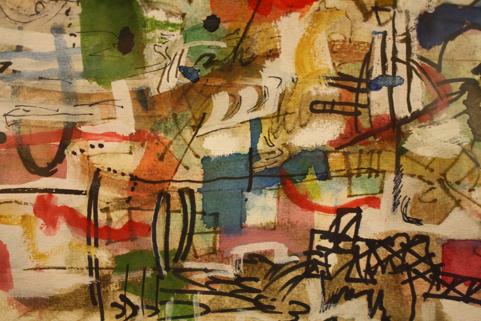
In other works artists use the transparency and the brilliance available in this medium to full effect, creating compositions of gemlike color and dynamic balance. Looking at Alan Crockett's Untitled (2007), one might be looking at a piece of translucent art glass. The medium's greatest beauties are on display, but as they can be only in the hands of a master. In this small but very busy, complex, and layered passage of his painting, Crockett has allowed no bleeding of color or line; each color is brilliant and distinct, each laid down as if he'd had the time a collage artist would have to consider every placement. What a joyously confident display of technique and spontaneity!
I'm sure this show is a treasure trove for art historians or critics interested in the development of the magical medium. For me, the delight is in the discoveries of artists I'll be looking for in the future, and of these and several other wonderful works.
|