Showing posts with label art glass. Show all posts

Monday, September 23, 2013

A Collection of Paperweights

Paul Stankard, 1982.  Lampwork spring beauty with rootball,
roots, and buds.  
On a recent visit to the Boston area, I caught up with an old friend who treated me to a whole afternoon's survey of his paperweight collection. Clarence (so I will call him here) has been buying paperweights since the early 1980s, when he and his wife chose them as a way to organize their trips to antique and flea markets: Here was something particular to look for. 

I can understand why. Paperweights are small, always beautiful, and there is magic in them. The glass worker's skill and the science of optics create exquisite miniature worlds far more brilliant, colorful, and breathtaking than our own. To handle a paperweight is to fulfill one's wishes for both whimsy and order, coexisting in an object that fits in your hand. We can take godlike satisfaction over the unity of a paperweight's system. Yet to experience a fine specimen's disciplined yet dreamy beauty is a profoundly human satisfaction: It's to receive a gratuitous gift of pleasure, however illusory.

In 1993, Clarence advanced swiftly from purchaser to collector once his curiosity led him to the very end of an estate auction held upon the death of an elderly, local eccentric; a person who had filled her house with collection upon collection of disparate objects. Although there were no paper weights among the lots, Clarence "could smell them. In that environment, they just had to be there." 
Half of a paper weight from
Perthshire, Scotland, ca. 1990.


His instinct proved so just that, once the family got to know him, he was invited back to the house many times. Each visit revealed more paperweights. His study in dealers' catalogues helped guide Clarence's purchases and establish fair prices. The long and short of the story is that, after having picked out 200 pieces on his own over the course of a couple years, ultimately, the family offered him the final 170 for a very low price. He accepted the offer. "That was when I began collecting," he says. Now, his knowledge and his collection are both vast, yet every piece he owns is special. Each paper weight has stories—its own history, and the story of Clarence's relationship to it.


1990s Perthshire paper weight, as above,
seen from a different angle
I was fascinated to see some half-paperweights, which Clarence has acquired from manufacturer's representatives who visit the few high-end stores that retail such luxury wares. My photographs show that the design itself is indeed a flat collection of miniature elements, carefully placed on prepared ground, assembled within a round form that holds them in place. The crystal is poured over it, the whole is heated and shaped as it cools. 

The sample shown in these two pictures is a millefiori paper weight: Its design has been composed of sections cut from thin glass canes, each of which is composed from several layers of colored glass. Millefiori means "a thousand flowers," which illusion is created by encasing layer upon layer of colored glass, then stretching them until they are very thin; cooling and cutting them into small sections—like cookies from a roll. This excellent video posted on YouTube by the Discovery and Science Channel illustrates and explains the entire process. 


Clichy, spaced millefiore, 1845-1860.
Clarence's collection ranges across the remarkable variety of paper weights. I was surprised to find that there are paper weights even in the folk art manner, which commemorate weddings and anniversaries with rough designs, or exhibit frit (ground-glass) slogans like "God bless our school," "Rock of Ages," or "Home Sweet Home." 

The focus of this collection is millefiori, though, and once I started looking with Clarence, I found myself exploring a wonderland of variations on a theme.

Where I've come to associate the finest glass with Venice, the most prized paperweights come from three French manufacturers, Clichy, St. Louis, and Baccarat, and from American glass works in New England. To the left is an antique Clichy, Clichy being prized for the vividness of its colors. A scan of the large collection time and again proved this to be true. Anyone with a choice would pick this out of a group for its robust color. Its design is one of many standards. The "spaced millefiori" means that each flower is placed without touching its neighbors.


Baccarat close-pack millefiore, 1849.
In contrast to the spaced presentation is the "close pack" millefiori, such as the Baccarat paper weight to the right. This has so many flowers, so small, and any spaces between them are filled with elements almost incomprehensibly small. Remember that the rounded crystal magnifies the size of the millefiori actually placed on the base. Remember, too, that each of the components of the tiny, colorful flowers is a glass filament, fused to its neighbors. So each millefiore is a rare work of glass art in itself. A paperweight like this is filled not only with beauty, but with hours and hours of the most delicate and painstaking work, some of which produced flawed products that never saw the light of day.

In that Baccarat close-pack, toward the right is a white cane with a black rooster formed inside it; at the top, rolling toward the back, similar form can be seen. These tiny animals are the mark of Baccarat paperweights, as are the years of manufacture, also memorialized on minute canes—in a long cane just below the center, with alternating red and blue marks.


Baccarat spaced millefiore on lace (upset muslin), 1848.
This Baccarat spaced millefiori (left) shows the characteristics clearly. These animal figure canes first appeared in 1846. They were produced after Baccarat's general manager, Jean-Baptiste Toussaint, found his young nephew, Emil Gridel, cutting animal silhouettes from black paper to amuse himself. Toussaint was inspired to borrow the silhouettes and have molds made from them: Thus the "Gridel figures," the tiny animal forms that appear in "classic" Baccarat paperweights in 1846. The classic period for paperweight paperweights is generally considered 1845-1860 for French paperweights and slightly later for New England paperweights. 
Ysart family, made in Scotland,
mid-20th century

Millefiori are also arranged to form symmetrical designs of stars, garlands, and fancy combined elements of many sorts. The Ysart family is credited with the birth of Scottish paperweight making in the 1930s. Originally from Spain, Salvadore Ysart and his family moved first to France and then to Scotland in 1914 at the start of World War I. This weight from Scotland is surely from the hand of an Ysart. Clarence is sure he can tell which family member; but there is no signature, so there is no way of stating it with certainty. I admire its five point-star—surely more difficult and clever than an even number—and its feel of a fine piece of jewelry laid on a velvet cloth.

Lampwork paperweights encase flowers, environments, animals or objects formed from glass (lampwork) in crystal, like the Paul Stankard work that opens this article. A fine lampwork artist's creations will give such an air of reality as to trick the viewer into believing them real: "How did you get those flowers in there?" as if they were inserted into a bottle rather than having had red-hot glass poured over them.


Chris Buzzini, lampwork floral, 1993.
Chris Buzzini's lampwork arrangment of wildflowers is certainly uncannily realistic. If it hints to a novice like me that the flowers aren't real, it's because they are so uniformly fresh, so much more evenly in bloom than I've ever experienced with real plucked flowers. The colors are so saturated that the bouquet gives almost more satisfaction than it would in reality. This is one of the joys of the paperweight as art form: the appeal of a permanently magnified, purified, and clarified reality that we are just a crystal surface away from achieving.

Buzzini has been at work in this medium for years. On a video at his website, he discusses his art while producing one of his paperweights.

Another contemporary master of lampwork is Paul Stankard, whose 1982 spring beauty opened this article. Clarence has collected another, far more complex work by this artist, which shows his interest not in an eternally fresh nature, but in its decay as well. The paperweight has a domed and a flat side, but on each there is a scene, each with equal and compelling visual interest. Not only is the lampwork phenomenal, but this work implies a narrative, which is very unusual among the works I saw.
Paul Stankard, environmental study, flowers and decay
on "sand," 1984. Top.
It's striking in the first place to have a carpet of "sand" to set a realistic stage for the plants. Usually, lampwork floats on a crystal sea; millefiori lie on black grounds or nestle among lace. A representational background is unusual and highlights the fact that the flowers are a little droopy. They even look like they need the support of the ground they lie on. 

But the big surprise comes on the flat side, on which there is usually nothing except a signature and/or a date, and not always either of those. It feels like we are in geological terms literally beneath the scene on top. Or, perhaps, we are a little way down the beach, in a tidal pool: It certainly feels like we are looking into shallow water.


Paul Stankard, environmental study, flowers and decay 
on "sand," 1984. Bottom.
The root ball and root that we saw in the spring beauty (top) are repeated here, but are taken in a mystical direction by forming the elements of a witchy mermaid whose fins and scales are replaced by willowy, waving roots. In her brown and green, wet setting, she is fascinating, both sexy and repellent at once. But she can only grow once her arms and legs take hold. Will she replace the morning glory whose days are numbered?Having looked at hundreds of paperweights with Clarence, I'm ultimately glad that I photographed only these few, under his generous guidance in his professional studio. Each piece is its own world of wonder and delight. Even after looking through a dozen, I knew enough to look deeper and deeper into them, and to see more in each one.

Clarence tells me that though there are many collections of paperweights in the United States, there are three major ones open to the public. One is the Rubeloff Collection at the Art Institute of Chicago. Also in the Midwest in the Bergstrom-Mahler Museum of Glass in Neenah, Wisconsin. Finally, the Corning Museum of Glass, in Corning, New York has a distinguished collection, which was featured when I visited around twenty years ago.

In this blog I don't say much about connoisseurs and scholars. I don't write against connoisseurship as much as I write to reassure those who lack it that art is available to all of us. 

But my afternoon among the paperweights was an excellent reminder of the value and the satisfaction of expertise. For Clarence, his pleasure in sharing it was obvious. For me, I hope it was equally clear how great the pleasure was for me to have that chance to learn and to know.
___________________________________________________________________
With a thousand flowery thanks to Clarence for his patient help with details in the preparation of this article.

Monday, June 24, 2013

In the Muranese Fashion: New Glass from Mattia and Marco Salvadore

Current work by Mattia and Marco Salvardore of
 StudioSalvadore, at the Sherrie Gallerie
 in Columbus, through July 31, 2013.
In March of 2012, I was introduced to the astonishing work of Muranese master glass artist Davide Salvadore at the Sherrie Gallerie in Columbus. This summer, Sherrie Hawk is showing work from his sons, Mattia and Marco, who work cooperatively at their Studio Salvadore in Murano. Murano is the traditional island site of Venetian glass works, where today's techniques have continuously developed since the 16th century.

The Salvadore brothers' sculptures capture color and light, transferring to them the molten look their medium once had, when it emerged super-heated from the kiln. The artists concentrate on a few forms—simple, graceful elliptical shapes ideal for framing the layered currents of color that swim through their depths.

Those colors are, in fact, one of the first things that caught my eye as I looked through the room toward the large front window, the natural source of illumination for all the work. The palettes are fresh and, above all, struck me as young. Young: as in springlike (leaf green, sky blue, buttercup yellow), but also as in hip. 
Mattia and Marco Salvadore, Opera 13. 
Blown and carved glass.


A signature of Studio Salvadore is swathes of color encased in transparent glass with large murrine applied on the surface. Murrine are the slices from canes the glassmaker forms for this purpose. Disks cut from the canes will make beautiful, circular decorations, all alike—like filled cookies cut from a roll. The Salvadores apply murrine at the end of the glassblowing process, so they sit boldly on the surface of the vessel. The small variations in size have to do with distortions consequent on working with high temperature materials.
Detail of murrine on Opera 13

The application of murrine is not the last step of decoration. Once the piece is entirely cool, then its surface is carved. This step is yet another opportunity for the worker to make the slip that would destroy so labor- and technique-intensive a work of art. These pieces are highly vulnerable to error and serendipity at every step of the process. They requires the artist's confident and unerring hand at all stages, from super-heated fluid to rock-like solid. I wonder how many pieces like the ones in this show are attempted for each one realized?

I'll return to my perception of the youthful air about Studio Salvadore's work. Fashionable is the word that actually describes the feeling I have about this body of work. The fact that nearly all of the work is similar in size, shape, and distinctive motif brings to mind an up-to-the-minute, fresh fashion collection presented on the elegant curves of uniform models. The colors and their satiny flourishes within the vessels give the air of draped or folded fabrics. This effect is spectacularly enhanced by the details of carving. In Opera 13, the horizontal surface waves atop the lime green give the effect of a pleated, silken sash. 

Opera 5 is the most translucent piece in the Sherrie show. Its swirling, interlocked patterns of
Mattia and Marco Salvadore, Opera 5. 
Blown and carved glass.
carved surface designs respond to the movement and shapes of the color designs. On top of the simpler areas of pale violet, though, the carving gives the feeling that quilting stitches do on fabric. The effect is not that we necessarily focus on the troughs left where glass has been excised. Rather, their edges define soft spaces in the way that quilting stitches define and gently gather tiny pouches of fabric. I see that this is similar to the effect of stitchery on fine, sheer fabric. Not only does the extra surface detail add the beauty of subtle design, but it piques with the illusion of transparency. Perhaps we could see through this were it not for those marks? There is a seductive element created by the intersection of translucence and the fine shadowy marking of the carved or stitched lines. 


Opera 5 is high fashion in its sensuous, seductive use of color and pattern; design elements subtle and bold; and materials the hand can barely resist caressing. It has the sex appeal that makes you want to get closer, and the attitude of couture that enforces distance as part of its allure.
Mattia and Marco Salvadore, Opera 8. 
Blown and carved glass.

Gazing at this beautiful show, then, from the back of the room, is like enjoying the pages of Italian Vogue, or enjoying a Fashion Week party in Milan, Paris, or New York. It is fresh, beautiful, new, and exciting. A wonderful show of exquisite glass!

I mention a vantage point from the back of the room not only for the view into the dazzling grouping of Studio Salvadore glass, but also because there sit on display three pieces remaining from the elder Salvadore's spring 2012  Sherrie Gallerie show.

At the time, I was disconcerted by Davide Salvadore's show because very little of his work looked like glass. His works tend to have matte surfaces which, while minutely and brilliantly decorated, nevertheless appear to be made of inlaid wood or leather. His forms, too, are unconventional, having the appearances of imagined musical instruments or dreamed "ancient" vessels. If the sons' sculptures are sleek,  young, and stylish, the father's seem almost curmudgeonly in their astonishingly wrought singularity.

Davide Salvadore, detail.
Blown and carved glass.
Mattia and Marco learned their art in their father's studio, Campanol e Salvadore, when they were boys. Both have worked with other masters since, both in Murano and at the famous Pilchuck School in Washington state. It is still clear that their father's influence is deep, being on the surface of the work shown here.

Exquisite glass carving is clearly a shared characteristic. Because the sons are more interested in allowing light to travel through their glass, they use carving almost as another color element, or as an enhancement to the directional flow of color. Because Davide's presentations are nearly always opaque, carving is exterior enhancement. He uses it more architecturally than his sons do.

Both generations apply murrine to the exteriors of their works rather than incorporating it into the hot glass. What different expressions result from the same technique though. The detail from Davide's fantastical instrument shows tightly focused murrine placed in double pairs for an almost classical look. This couldn't be more different from the sons' large, loose, urban tribal tattoos.
Davide Salvadore. Blown and carved
glass.

Sherrie's show of Mattia and Marco Salvadore glass provides a heavenly hour for any person with eyes to see. It is a trip to Paradise. That such pure sensual gratification is generated by so technique-heavy, physically demanding an art form is breathtaking, even as a concept. For the Salvadore brothers to bring us such light and elegant work is most artful indeed.

But their show is enriched for all of us by the three pieces of their father's that remain in the wings. Davide Salvadore's work seems to come from a different planet—the planet perhaps farthest away from youth: Age. The complex uncompromisingness of the elder's work; its depth of concept and design; the visionary quality to his use of materials: All this hearkens to experience with glass and with life too. The strange formality of his work lends a darkness to them that appeals to me. They are not only wonders of process and aesthetics, but repositories of experiences I don't have to know to connect to.

Not that this isn't true for the work from Studio Salvadore. But I am older now. I love beauty, color, youth and fashion. I love especially what I know will continue to sustain me, and I turn to art for this. I embrace especially work that I have to think about before I fall in love with it—the odd or rough, the characteristic, troubling, or off-kilter. Often I find that works with these qualities keep me coming back because they always have more to offer. I may not always "like" them, but I always have a conversation with them about something important. Those conversations may change from month to month, but they don't stop. It doesn't hurt if the works are beautiful, but they don't have to be. They have to keep talking and challenging, though. And they have to bear the deep, indelible mark of their individual maker.

___________________________________________________________
All photography by the author, with thanks to the Sherrie Gallerie.

Saturday, July 14, 2012

"Color Ignited: Glass 1962-2012" at the Toledo Museum of Art

The Toledo Workshops of 1962, led by Harvey Littleton, are credited with initiating the American art glass movement. Still dizzy with wonder from a show of Lino Tagliapietra's work, I couldn't then miss Color Ignited: Glass 1962-2012 at the Toledo Museum of Art, a show mounted in celebration of the pioneering work encouraged by then-Director Otto Wittmann fifty years ago. Venetians were plying centuries-old traditions of high art in their hot shops. Ohio had a long history of glass manufactories: Fostoria, Anchor-Hocking, with Libbey and Owens Corning—as well as Johns Manville fiber glass—in Toledo itself. But as recently as in 1960,  American art glass didn't exist. We must thank curators Jutta-Annette Page and Peter Morrin for putting together a show that's takes us back and speeds us forward.
Glass Workshop, 7 pieces
Courtesy of Toledo Museum of Art, William Shelley. 
Littleton, a ceramic artist, was a native of Corning, New York and wanted to use glass as he used clay, as an artistic material. He organized his first workshop in Toledo to be full of collaborators from many academic institutions and from industry. The workshops produced Marvin Lipofsky who established a glass program at Berkeley, and Dale Chihuly who started a glass program at Rhode Island School of Design, founded the famous Pilchuk School of Glass in Washington state, and has popularized art glass nationally. Into these nascent programs Tagliapietra and a few other Muranese artists were invited as guests, and their vast knowledge of traditions and techniques was like rocket boosters added to the eagerness of artists fresh to the medium. The photograph above shows where the Littleton cadre was starting.


Color Ignited doesn't dwell on the backstory, however, but celebrates the ebullience, the sophistication, and the invention that have sprung so quickly from the Workshops. And while the reflections of the world's great glass cultures are seen throughout the show (not only Muranese, but Scandinavian and Czech), there is ingenuity, technology, humor, and characteristic motives that mark this work as American.


Tom McGlauchlin (American, 1934–2011), “Dessin de Bulle” Vase. 
Glass, blown, cased, flashed, cut, 1978. H. 8 7/8 in. (22.5 cm).
 Toledo Museum of Art. Museum Purchase
 and Gift of Mr. and Mrs. Howard Franklin, 1979.4.
 Photo: Richard Goodbody ©1978 Tom McGlauchlin
Between 1962's beginnings and the perfection of form in this 1979 bottle (right) there would seem to be generations of advancement, especially in the elegantly layered, complex distribution of colors, running from almost pastel blue through raspberry red. The form is classic simplicity, but the internal patterns carry us away. 


Robert Fritz (American, 1920–1986), Vase Form.

 Light olive green glass, blown, applied prunts, 1966.
 H. 7 7/8 in. (20 cm). Toledo Museum of Art.
 Museum Purchase Award, Toledo Glass National, 1966.135.
 Photo: Richard Goodbody ©1966 Robert C. Fritz
Note, though, that the 1966 piece that won the Museum's purchase award in the Toledo Glass National, four years after the seminal workshop, is interesting for form alone: color is the color of the material, and the interest lies in the techniques of blowing and tool-shaping.


The artists' use of color in this show comes unleashed, arresting, wild, or raw. But its use is always one more aspect of a piece that's already stunning for its form, idea, or craftsmanship. Color is the sound of the starter's gun. Toots Zynsky's bowl, City Lights, for instance, is a heart-stopper. It is made of super-tiny glass threads that are fused together so that they do


Toots Zynsky (American, born 1951), City Lights.
Filet de verre (glass threads), fused 
and thermoformed, 1993.
6 3/4 x 13 x 9 in. (17.1 x 33 x 22.9 cm). Private collection, Hoffman-Hall.
Photo: Toots Zynsky ©1993 Toots Zynsky 
 
not melt into one smooth, "glassy" surface, but remain individually visible, each perfectly lined up between its neighbors, presenting to the fingers an inviting, lightly ridged surface. Both hand and eye are drawn irresistibly to a bowl that will fill up with our admiration.


Dan Dailey, Pistachio Lamp. Illuminated Sculpture, 1972.
 Hand blown glass. Gold plated brass.
14”H x 10”W x 10”D ©2011 Dan Dailey
Dan Dailey's Pistachio Lamp strikes me equally as a thing of beauty and a thing of hilarity. When I saw it, the bulb on top was illuminated and shone a very hot red. Dailey uses "opal glass," which was popular in the 1930s, called Vitroline. One of the delights of this lamp is that  when it's turned on, the  light is self-contained, and the red bulb, rather than casting light, glows like a hammered thumb in a  L'il Abner cartoon
Paul Seide (American, born 1949), Radio Light. 
Glass, blown; mercury and argon gas, 1985. 
H. 16 1/2 in. (41.9 cm); W. 16 3/4 in. (42.5 cm). Toledo Museum of Art. 
Gift of Dorothy and George Saxe, 1991.135. 
Photo: Richard Goodbody ©1985 Paul Seide 


An internal light source intensifies the colors of Paul Seide's Radio Lamp too. Seide's lamp is powered by a specially-designed radio transmitter. The glass loops are filled with mercury and argon gas that emit light when excited by radio waves. This, like Dailey's work, takes received glass traditions, handles them with reverence, and introduces them to the technological present. It's the American way.


Glass in a glass box—in a mirrored box, really. With LED lights, and a video monitor. Twilight Powered by Electricity Makes for a Brilliant New Horizon was among several in the show that are conceptual works made with glass. For Andrew Erdos, glass and its properties illustrate his thoughts about reflection, transparency, lightness and darkness, color, invisibility, form and shadow. Yet it felt to me that glass shaped his ideas, which were the real focus of the piece. It was a mixed media work, concepts having the same weight and presence as the physical materials. But glass could never have served such  myriad, complex purposes only twenty years before Erdos made this.

Andrew Erdos (American, born 1985), Twilight Powered by Electricity Makes for a Brilliant New Horizon.

 Mouth-blown glass, sterling silver, video monitor, LED lights, 2012. 62 x 61 x 45 in. (157.4 x 154.9 x 114.3 cm).
 Image courtesy of Claire Oliver Gallery, New York ©2012 Andrew Erdos 

Deborah Horrell (American, born 1953), Infolding II. 
Pâte-de-verre, 2008.
 14 ¾ x 14 ½ x 8 ¾ in. (37.4 x 36.8 x 22.2 cm). 
Collection of Margy and Scott Trumbull. 
Photo: Richard Goodbody. ©2008 Deborah Horrell 
For my own part, my favorites were the pieces in which form, color, concept, and technique were equally balanced and compelling. This probably boils down to taste, spoken in haughty words! But the most astonishing and beautiful to me was a work by Deborah Horrell called Infolding II.  Horrell's technique is called pate de verre ("glass paste"), which is a fusion of crushed glass with coloring agents.  A gallery note said that this process was known in ancient Egypt. It further noted that it is very difficult to make items of any size this way, since pate de verre  is not strong. Horrell's work, at over fourteen inches high and long, is extraordinarily large for this technique.


The vessel has a matte finish, which makes it seem like a ceramic object at first glance. Its color, though, and its ombre gradation from the yellow rim to the melon-green bottom of the cup suggests clear glass—it's like we are looking through the container to the layers of a chilled parfait of tropical ingredients. The rim of the large form does not disguise the crushed glass in the processes, for it is crumbly looking. The colors, though, in combination with the cup shape suggest something icy; the finely broken glass reads like ice crystals that will melt on the tongue.


I also loved BlueRubySpray by Harvey Littleton. This work is dated 1990, almost thirty years after the ceramist assembled friends and colleagues at the Toledo Museum of Art to figure out how artists could work with glass outside of factory settings. Here Littleton has produced colored veins encased in clear glass, which effectively magnifies them. Wherever the viewer stands to look at the piece, she or he sees all the possible angles of the ribbons, displaying more or less of the stripes of color, each revealed in a different way by its particular position. 
The complexity is all in and of the glass and its properties. It changes with the environmental light and the viewer's movements. It also has that other thing I'll admit that I always love in glass: It's shiny! It gleams!

Harvey Littleton (American, born 1922), Blue/Ruby Spray from the Crown Series. 

Colorless and colored barium potash glass, blown, with multiple cased overlays, 1990.
 Largest of the pieces: 17 x 3 7/8 x 13 5/8 in. (43.1 x 9.8 x 34.7 cm). 
Toledo Museum of Art. Partial gift of Ross E. Lucke in memory of Betty S. Lucke, 
by exchange, and partial purchase with funds from the Libbey Endowment, 
Gift of Edward Drummond Libbey, 1992.41A-L. Photo: Tim Thayer ©1990 Harvey K. Littleton 


All photographs in this article are courtesy of the Toledo Museum of Art.

Tuesday, July 10, 2012

Glass Maestro Lino Tagliapietra: The Rainbow Island

Lino Tagliapietra, Venice, detail.
Through the end of August—for absolutely free—anyone can visit the Hawk Galleries at the corner of Main and 4th Streets in Columbus, Ohio and spend as long as they like contemplating unearthly beauty among nearly fifty large works by glass master Lino Tagliapietra. In fact, the gallery sitter I spoke with when I had the enormous space all to myself on a recent Sunday, rued the fact that few people take advantage of this opportunity. "We understand that people aren't coming in to purchase. Who can afford this?" The museum-quality work sells for six figures, but that's not the point. A visit to this Tagliapietra show, L'isola dell'Arcobaleno/ The Rainbow Island, is perfectly described by its title: It's a simple retreat from everything but light, color, rhythm, grace, and joy.


Tagliapietra grew up on the glass-maker's island of Murano, in Venice. He became a glass apprentice at age eleven and a maestro by twenty-one. His mastery of historical techniques of Venetian glassblowing is important not only for his own exquisite and innovative oeuvre, but because he has shared his knowledge so far and wide. Through his innumerable collaborations and teaching, he is almost literally responsible for the burgeoning of art glass worldwide in the late twentieth century. 


Lino Tagliapietra, Poesia, detail
As at the Sherrie Gallerie's show of Murano glass blower Davide Salvadore's work in March, 2012, The Rainbow Island offers the viewer a filmed overview of the artist's life and his process in the studio. We can watch as he blows and shapes some of the very works on view in the next room. There are several YouTube videos that show the master at work with his team, but none are as generous as this film, shot at the Pilchuck Glass School in Washington state. The studio (the "hot shop" with furnaces and torches) is arranged like a teaching theater, as in a medical school. When he and his team complete a piece, the workers and small audience applaud, and we film viewers feel the dissipation of the anxiety we've felt build during the long process. Amazingly, though, through it all, Tagliapietra not only appears relaxed, but he smiles and whistles through the sweat, concentration, and heavy lifting. The hot shop is his sunshine and fresh air, and he is a boy on a lark, at freedom to do as he likes. His happiness clearly suffuses everyone working with him.


Fuji, blown glass, 19 1/4" h x 18 3/4" w x 11 1/2" d
Lino Tagliapietro, Bahia, blown glass
26"h x 10" w x 6-3/4" d
But the show's the thing, to which the video is but an introduction that may intensify appreciation of The Rainbow Island. The work demonstrates such a breadth of form and imagination that it seems to have sprung from the fancy of a benign Hydra.


Tagliapietra uses glass blowing as if he were a scientist exploring the natures of mass and motion, density and lift. If we compare Fuji with Bahia, the one is like a seaweed balloon and the other like a dense, mythic gem, excised from obdurate stone. We can imagine back to the molten state of each form; we see that each has undergone considerable surface carving ("cold work"), but they tell different stories and put us in different moods.


Venice (22 1/4" h x 11 3/4 w  x 3/4" d) foreground, and
Fenice (13" h x 47" w x 4 3/4" d) background
Venice (detail above) and Fenice, the one flat and the other sinuous, couldn't have more dissimilar forms. Yet, put together with the two vessels above we see how "mass" and "density," in Tagliapietra's world, have very little to do with weight. His pieces are all large, and even the ones with the greatest density like Bahia or Venice have spectacular lift. 


Setting aside the plaques, Tagliapietra's works either have as little contact with the ground as possible; or they are filled with lines and patterns so dynamic that they make us chase storms of motion within the glass-cased universe of the artwork. Even the most stable open forms, like cylinders, dance with motion. In the Osaka vase, huge "gestures" run up and around the vessel as if they were painted in momentary bursts of energy. It's as if the size and shape—the mass—is meant to anchor forceful currents that blow through the piece.  


Osaka, blown glass, 22 1/2" h x 11 3/4" w
In several works, Tagliapietra energizes forms with this theatrical, linear gesture. In Poesia,  the base of which I've pictured above, he shoots lines of white, brown, and caramel through clear glass. Of course we know that they are suspended—glass in glass—but it is difficult not to see them anyway as lines in motion, or as the contrails of magnificently agile flight. Poesia, too, is a cylinder, but one experiences the movement itself, not the object, which contains and displays the movement, allowing us to see what would otherwise remain invisible.  

Poesia, detail, looking through the vessel

If it's not to make too fine a distinction, there are other works in which I feel that Tagliapietra has not so much contained a whirlwind in a stable form, but has challenged our perception of motion—either that or it has suspended his viewer in slowed-down "glassblower time." It takes him hours to produce these durable illusions of dynamic spontaneity; he works against probability to capture the essence of motion before his medium sets forever. Like that, he seems able to stay the moment of our viewing, creating the sense of an "extended blink."


Fuji, detail
In this close-up detail from Fuji, above, the thousands of tiny blue canes incorporated into the vessel are evident. They are suspended in the clearest glass, which is unmarred by a single bubble. I experience this differently than I do the the pieces with extended lines: I feel like I am seeing not sea flora in motion, but arrested from motion. The illusion is that I am suspended in a scene where time and motion are stopped to permit me an infinitely long view of otherworldly beauty. As if one gulp of breath will allow me to be under the coral sea forever. "Look as long as you like. Nature will resume when you feel the need to move on."


Lino Tagliapietra, Venice, blown glass. Approx. 11" h x 26" w.
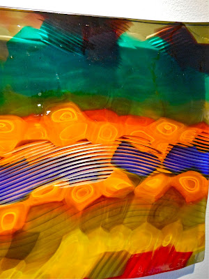
Something like this happens in this almost dizzying plaque, another entitledVenice. Looking at Fuji with its millions of tiny, posed filaments, the eye has every opportunity to slide back and forth between "seeing" movement and "knowing" the scene is static. In this Venice, the area of doubt is focus: Should I rub my eyes back into sharpness, or am I seeing what the artist made? Because we are asking the question, Tagliapietra has stopped us, the viewers, in mid-blink as we evaluate the trustworthiness of our own perception. Yet again, though, it's not our vision, but the thing itself that's blurry. What focus it has, the maestro has given with the interior spirals of orange as well as by the striations that flow across what is, essentially, the landscape.


Plaques tempt us to use the term "two-dimensional" in comparison with Tagliapietra's other work, but of course these are not. In fact, Tagliapietra manages to multiply dimensions in all of his work. The device of using exterior forms to "contain" the energy created by linear elements combines the powers of two and three dimensional works into something beyond both. In this piece, the "flatness" is composed, as in any other piece, of many repetitions of blowing, firing, folding and refinement. Even in these small photographs one can begin to see how deeply into the glass it's possible to look; we know that anything beneath the surface is embedded in the long history of the work's relationship with breath, fire, and tools. The lines (the ones that appear white here because of reflected light) are not produced by deep history, though, but are evidence of the final work because they are incised into the surface. This carving is accomplished once the piece has completely cooled and hardened. The plaque, then, appears both barely focused and sharply chiseled. Its surface can be argued to lay at different levels, depending on where you wish to start, before or after carving. And though we see the work blurred, as though in mid-blink, we are yet mindful of sharp definition made by the precise raking across its surface.


Endeavor, detail
In many works Tagliapietra uses cold work to enhance the colors and designs beneath the surface. Sometimes this enhancement works as prisms do, to sharpen and define the patterns blown into the glass. His Endeavor series takes the form of long, narrow "boats," like racing shells. In a black and white example, the cutting provides the two-colored pattern with a literal skeleton that we can see by looking through and across the shell itself. 


Fenice, detail
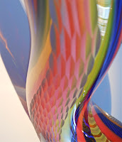
Carving extends Tagliapietra's already extraordinary palettes as well. Fenice, seen undulating in the background of a photograph above, is a serpent of bold, saturated, primary colors. Its surface is cut in lozenges reminiscent of the scales of a snake. As one moves around the form, catching it in different light, the many small surfaces mediate the hot colors into a much broader and subtler palette. The work is transformed by proximity. Different distances bestow different personalities upon it.


Bahia, detail
Finally, in the carving on Bahia (see above), Tagliapietra uses a combination of patterns covering the entire surface of this large piece to do several wonderful things. It increases the amount of reflected light, enhancing the sense that the yellow-gold color is really an internal light source. The cuts laid over the internal movement blurs edges between colors and softens all transitions below the surface, softening the whole form and lending it a glow that reads as a gentle aura. The carving both mirrors and magnifies the internal beauty of the precious object.


The Rainbow Island is an incomparable show. Each of Tagliapietra's works is a triumph of industry, art, imagination, and love. To see these is to breathe the freshest air under the bluest sky, and he made them for our eyes. Dreams come true.


All photographs in this post were taken by the author.