|
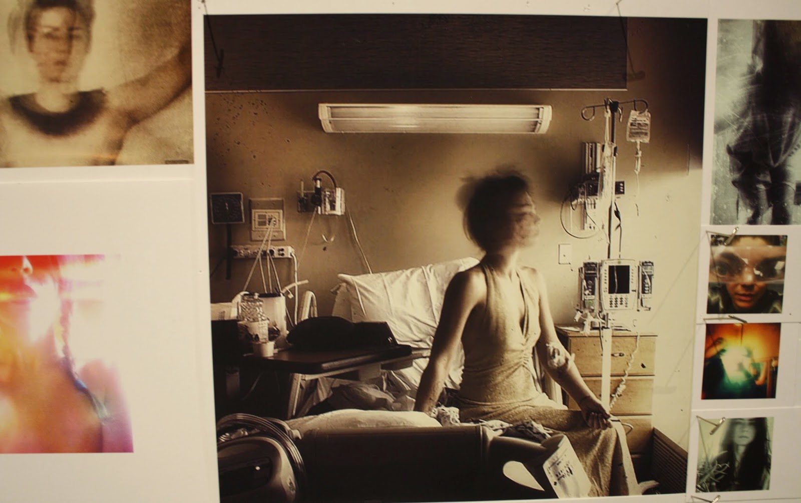
| Charles Atlas, The Waning of Justice, detail, 2015, video installation with sound. Courtesy of Contemporary Art Space. |
This massive work fills two high galleries at CCAD's freshly configured Contemporary Art Space. Atlas presents, edits, combines, and overlays video of several kinds into a work that staggers the viewer one way or the other. One either hastens through the room, shaking head flashing cartoonish question marks; or one pauses with jaw dropped in bafflement. Some will decided to stay and try to answer the rhetorical question, "What the hell is this?"
This is the question, I'll admit at once, that I asked myself when I encountered Atlas's installation. Had I not been accompanied by the curator, Michael Goodson; had I been in a sullen mood, it's easy to imagine myself as the visitor who decides that life is too short and then clears out quickly. Goodson's enthusiasm, based on his deep knowledge of contemporary art and acquaintance with this artist, held me. His excitement assured me that I should linger and think about this: Lucky me! Still, I lack a contemporary curator's acculturated comfort; each work is a new proposition for me, as it is for many gallery-goers. Trusting Goodson's informed eagerness, what was I to make of this?
 |
| Charles Atlas, The Waning of Justice, detail, 2015, video installation with sound. Courtesy of Contemporary Art Space.
Approaching contemporary art, I search for an interpretation, a way to "make sense" of it. I think that I know when to stop rationalizing, for there are works that yield nothing words can explain. Such art transports us through feeling or sensation with minimal appeal to our verbal understanding. Some of the art that affects me the most deeply—that is indeed most meaningful to me—is of this sort.
I think what made The Waning of Justice so disconcerting for me was that the installation is filled with the markers of interpretation: number grids, words related to the projected seascapes, a count-down clock, and, of course, its title. Then, there is the whopping contrast of the final element, the amazingly costumed and be-wigged Lady Bunny gesticulating, shaking, adjusting her wig, completely lacking self-consciousness as she sings disco with spirited instrumental backup. "You Are the One." And how you believe it: She's singing to you.
Atlas produces all these common markers of verbal, rational meaning, but outside of a context that supports intellectual interpretation. They are superimposed on tropical sunsets; numbers line up to float in a vast, darkened space; words are massive but transparent—insubstantial—at the same time. They are juxtaposed with the atmospheric, with the contrast between the fiery red and yellow of the sun setting over the ocean; of the symbolism of the sunset intensified by the clock's running down; by the black void space of the room. The sensations the work delivers are in fact the matter; the words, numbers, grids are secondary to the feeling generated by atmosphere Atlas creates visually. When the clock expires and the sun sets, then Lady Bunny performs in the smaller room, deeply artificial and wondrously positive in her emphatic, multi-costumed performance. It's a change of mood, at the least.

Charles Atlas,The Waning of Justice, detail, 2015, video installation with sound. Featuring Lady Bunny.Courtesy of Contemporary Art Space.
The Waning of Justice makes sense in the way that mood makes sense. The combination of natural beauty, numerical grids on a black background, the ticking clock, and the elegiac mood invoked by the implied relationships between setting suns and all the other elements reminded me of such usual experiences as reading the Sunday Times. Isn't that the way my world feels, the combination of daily countdowns, the anxiety of the all the half-understood numbers that constrain me, my fleeting perceptions of beauty, my sense of a world in decay? While none of the individual aspects of this installation seems to me to have exceptional meaning, the experience affects me as a scaled-up experience of the Zeitgeist. But with hope added in the form of art. Art of the most brazen, self-confident sort, affirming the viewer as well as the artist.
What an amazing artwork. I am glad l that I stayed to think about it. The thought that I put into it reminded me that the rational exists in a world that is not. If I remember it, I can use that relationship to my benefit.
Perhaps this is why people duck through galleries like this one, though. I can appreciate the urge to flee. Yes, it's time-consuming work to think about something as strange-looking as The Waning of Justice. Nearly everyone is put off by what is alien to their experience. But that doesn't make it desirable to shun new experience, especially experience in the safe zones of art. Where better to exercise the mind and imagination, to solve puzzles, to make connections with the minds of artists who experience and respond to the same world we are living in?
America has become a place where people are willing to believe that what we don't recognize is alien and therefore threatening; that it is in opposition to us or harmful to us. This is the national attitude toward other people, other cultural practices, and even toward free speech. Contemporary art provides a route to surprises of joy, new ideas, and enhanced experience of the world we occupy daily. It reminds us how to observe closely, how to defuse our suspiciousness of of the odd or alien, and to come to identify with—and so, to love—what we invest time and attention in.

Nothing external makes us stay or go when it comes to art experiences. We like what we know, but what we know usually defines times and points of view long gone by the time we learn them. Even our ideas of beauty, so static, are nostalgic and can make us regretful of a world in which we have doomed ourselves to ignore beauty's new sources and expressions.
Atlas's The Waning of Justice is, like many frightening new works, art that gives those willing to consider it a receptiveness to expanded ideas of beauty and how to retain them, both in the gallery, reading the market report, regarding nature, and moving through everyday's wildly disparate experiences of meaning, indifference, and absurdity.
|