|
| Pia Fries, one of five panels, Les Aquarelles de Leningrad, 2003, oil paint and facsimile on panel, 31-1/2 x 23-5/8." (Print subject: Red geraniums and butterflies) |
One of the most delectable moments of the current Now-ism show is Fries' five-panel work of paint and collage on wood, "Les Aquarelles de Leningrad," "The Leningrad Watercolors."
Each panel of blonde wood, planed to serene smoothness, has attached to it a print torn in half. (These are plates from an early 19th century book of botanical watercolors.) The halves are positioned in different ways vis-a-vis each other from painting to painting. Their placement sets the stage for extravagant, luscious streams, snakes, ridges and ribbons of oil paint, laid down with the élan of a pastry chef—Fries is sure to have used some of the same techniques and similar tools.
The painting shown to the right includes all the elements that Fries combines in each of the panels: the torn botanical print and mounded paint (not spread), raising the surface high above the board. There are soft, translucent designs directly on the wood that are made by oil paint so thinned that it appears like a stilled flow, as if it were marbled paper, or prepared microscope slides of simple wetlands plant life.
 |
| Pia Fries, one of five panels, Les Aquarelles de Leningrad, 2003, oil paint and facsimile on panel, 31-1/2 x 23-5/8." (Print subject: caterpillar and moths on flowering plant) |
I find it delicious that in the two paintings shown, the expression can strike us as both very abstract and strikingly literal. Above at the right, a stem breaks the print and muscles its way up to end in a crimson flower that pushes beyond the frame. The vitality is enormous, and it is buoyant too, thanks to the vernal green and brilliant yellow that shake off the shades from which the blossom emerges.
So too with the painting to the left, Fries uses her paint to imitate the subject of the print, which shows a caterpillar and moths. She creates her own, the worm ascending just as the one in the collaged picture does.
 |
| Pia Fries, detail from Les Aquarelles de Leningrad |
 |
| Pia Fries, detail from Les Aquarelles de Leningrad |
 |
| Pia Fries, Les Aquarelles de Leningrad, 2003, oil paint and facsimile on panel, five panels, each 31-1/2 x 23-5/8." |
 |
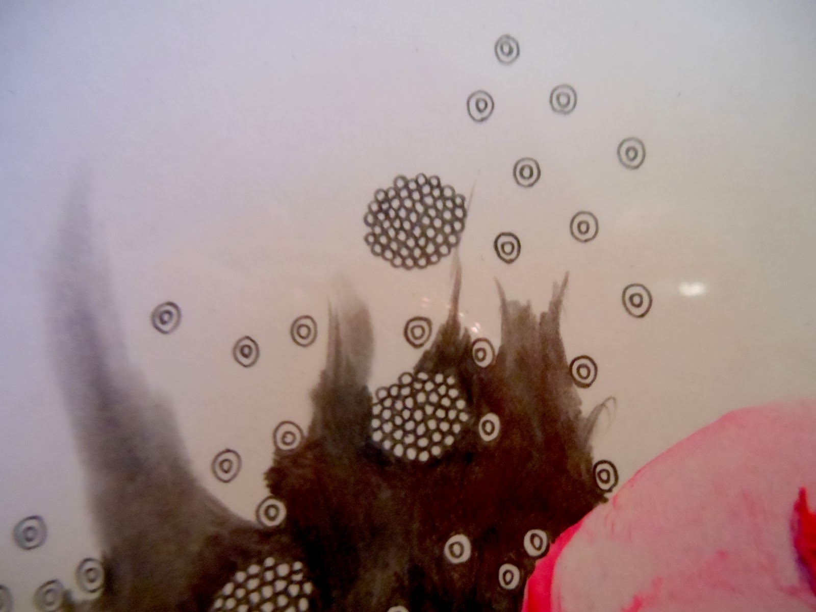
| Pia Fries, detail from Les Aquarelles de Leningrad |
Fries' suite of paintings is so beautiful and so sensual that one can be completely satisfied simply with her bravura mastery of her materials. The power and freedom of her composition and her raw creativity are sources of infinite delight.
But beyond even the powerful appeal to body and eye, Fries' work packs an enormous punch to the understanding of what painting is; of what we mean by artistic representation; and of how we denominate the real and the represented—what's art and what's nature.
In Les Aquarelles de Leningrad, Fries seems to start with the proposition that the printed plates are already two removes from their natural subjects. They aren't watercolors at all: Any freshness of plant or insect—any connection to life that the original paintings may have had is gone by the time they have been translated into prints. The colors and unpredictability of the subjects are long gone. What relationship do these detailed, "accurate" representations of nature bear to their distant, living originals?
 | |
|
Fries, though, uses her brave applications of paint to attempt creation of Reality from art "originals." Starting with the prints that are twice-removed from nature, she takes an approach that is in truth divine. She models organisms that have dimension, movement, and vigor pulsing through them. Her paint creatures/creations are suffused with an uncanny life that does not "capture" growth, movement and natural color, but performs them.
Once created, though, there's no getting around the fact that her beautiful lives have become art. But are they are like the printed watercolors? You can't close the book on these. They are specimens for a natural history museum; they come as close as a human can come to making a living thing.
Is this Dr. Frankenstein? Is this a cloning experiment? I don't think so. It is a phenomenal exploration, though, of raw creativity; a fearless trip to the intersection of "real" and "artistic" or, as many like to say, "false." Fries is close to breaking the sound barrier in her headily original work. How magnificent I find the idea of breaking through two levels of flat representation to make life from oil paint; to evade traditional representation with an aggressive ideal of creativity.
I can't get enough of art at this level: beautiful, masterful with materials and technique, and wildly ambitious in thought.