Monday, October 8, 2012

El Anatsui's "Gravity and Grace" at the Akron Art Museum

El Anatsui, Red Block, 2010. Aluminum and copper wire. Two pieces, each
measuring 200.75  x 131.5." Author photo.
The tour de force show, Gravity and Grace: Monumental Works by El Anatusui, recently closed at the Akron Art Museum, where it had been on display since June. The show travels to the Brooklyn Museum, to open in February 2013. It is infinitely to Akron's credit that they brought this work by the great African artist to the United States and organized the tour in conjunction with Anatsui's New York gallery, Jack Shainman. Akron was the first American museum with the foresight to collect El Anatsui even before he was included among the African artists in the 1990 Venice Biennale, where simultaneously he was discovered and received as a master by the rest of the world.
El Anatsui, Earth's Skin, 2009. Aluminum and copper wire. 177x 394." variable.
Courtesy of the artists and Jack Shainman Gallery, New York. Photo by Joe Levack, courtesy of the Akron Art Museum.
Anatsui was born in Ghana but works in Nigeria, where he keeps a large studio of assistants busy fabricating his monumental works. These are constructed only of liquor caps and copper wire. The works made from these materials began with the serendipitous discovery one day of a sack filled with liquor caps, which he took back to play with in the studio. He now acquires them not by scavenging, but through industrial recycling in partnership with a distillery.


While one can compare Anatsui's metallic draperies to any number of African, Eastern, an Western art forms and materials, they remain unique: astonishing in beauty and bountiful in metaphorical connections. The artist's statements for the the Museum focus on the poignant power of the caps as symbols: Liquor and slaves once were both commercial products exchanged on West African shores. This token of commercial ties between the Americas and Africa is likely to felt as a natural poetry to an African—as deep and simple as the blues—even if North Americans have to process the thought as history and to consult the footnotes for nuance.


 What I find almost heart-stopping about the walls draped with monumental sheets of tiny, linked metal is neither the far that they are created from humble,post-consumer materials, nor that a sobering historical link between peoples and centuries is made in the process of typing together these symbols of dehumanized souls. Both of these points—central aspects of the work—come as afterthoughts to my direct, sensory experience of monumental, glimmering, luxe hanging artworks. Anatsui discusses these in relation to painting, but I find this comparison puzzling and remote.

Anatsui produces this work in flat sheets that are constructed gradually as small units are attached to one another to create ever-larger ones. The completed work is essentially a flexible, two-dimensional sheet with shape defined by its edges, but which has no internal rigidity, like fabric. Since Amemo is not even four-square, it can appear unique with each differently oriented installation, its colors concentrated in ways that create a new work from the same cloth each time.
El Anatsui, Amemo,(Mask of Humankind), 2010. Aluminum and copper wire.
208-5/8 x 161-3/8." Courtesy of the artist and Jack Shainman Gallery, New York.
Photo by Andrew MaAllister, courtesy of Akron Art Museum.


Oni of Ife, Nigeria
Queen Elizabeth II of Great Britain in
coronation robes
Especially since the works are shaped as the installers (performers? tailors? costumers?) hang or dress them, I think it's useful to understand the works are textiles into which rich designs are knitted. They are tapestries, royal robes, even decorated chain mail armor for princes and heroes. Images of robed royalty from several cultures reside comfortably in imagined proximity to Anatsui's metal tapestries. There is a mutual reflection of majesty.


Bouba Abdoulay, Sultan of Rey-Bouba,
Cameroon
18th c. Hawaiian royal cloak
Ancient Japanese armor
Skilled knitters, embroiderers, lace-makers, and weavers employ traditional common languages of stitches. The fineness, inventiveness, and value of their work are measured by their skills with their particular stitches and control over the spaces between them. Sometimes their work is dense; sometimes light and airy; and sometimes the effect depends on the a combination arising from the artist's decisions about how much tension to keep on the thread, how much to twist it, and how to anticipate the final effect as the work is in process.


Basic construction stitch of Gli
Anatsui has similarly developed a vocabulary of folded shapes for the bottle caps. His studio workers spend days simply creating deep caches of each type to serve as the basic "stitches" for the work. They assemble units of these with copper wire, and then make increasingly large units in designs the artist designates. It's comparable to patchwork quilting, an additive process of design.
Construction using both positive and negative
space.

While the viewer's impulse is to marvel at all the caps used in the work, it's also important to notice how Anatsui uses space in the pieces too. Some of the work is as dense as armor and other—the Gli, or Wall, especially—is diaphanous, even though all is assembled from the same material.


Shimmering, transparent Gli
El Anatsui, Gli installed. Author photo.
In Akron, each section of Gli was hung simply, without bunching, like a scrim on a theater set. It's easier to see through these floating walls from a distance than close up, when the eye wants to focus on details of bottle caps that stand out from the fabric's basic, repeated stitch. As I looked through one from a distance, though, toward a massive piece hanging on a the gallery wall, Gli seemed to provide a textured, golden glow that heightened the sensual appeal of the view, making it even more pleasurable to be standing just where I was, satisfied.


In the video on the Akron Art Museum's page about Gravity and Grace, Anatsui notes that the concept of a wall is a human construct; that walls sequester, divide, and deprive people of freedom. As with his comments on the sock-political meaning of liquor bottle caps, I appreciate that this is a meaningful starting point for a conception of walls. But again, I perceive that these particular walls that he has made appear far away in their effect from the metaphors he cites. Because the walls that shimmer in this gallery are so light, penetrable, and radiant, I find thoughts of restriction or prevention the farthest ones from my mind as I view them. These walls dissolve more than they divide.


El Anatsui, Waste Paper Bags, 2004-2010. Aluminum printing
plates, paint, and copper wire. Variable sizes up to 86" high,
between 36" and 54" at base. Author photo.
Gravity and Grace includes earlier bodies of work as well, notable the Waste Paper Bags made between 2004 and 2010 from recycled aluminum printing plates. These are free-standing sculptures of monumental size, assembled from mashed but legible printing plates held together by copper wire. While recognizable in the form of carrying satchels, they have the presence of human figures. To move among them is to await your bus with anxiety in the giants' terminal The induced grief and weariness in me. To look at them is to look into a trash heap of discarded, half-burned, defaced human stories. 


Detail, Waste Paper Bags.
In these carry-alls, people carry around lives of trash. How can one feel beauty or value in a world where ugliness and waste prevail? I think the Waste Paper Bags achieve more eloquently the purported social goals of the work in bottle caps. Messages about the ubiquitousness of trash, of consumerism's ravishment of the environment, of the destructiveness of Western capitalism on rural Africa—these and other issues born of the tensions between Africa and the West appear built into the fabric and final expression of this series.


Last year I reviewed a show of truly surpassing beauty, art of the ancient Ife culture in what is present day Nigeria. Nigeria is the home of some of the most awe-inspiring and spiritual art in the world, the products of brilliant civilizations known mostly to archaeology now. As in many former Western colonies (slave ports before that), cultural identity has to be an extremely embattled question not only in the collective, but in any individual artist's soul. To have such noble local heritage, yet in the present day to live in a country so wounded by its contact with the West—this is a situation we in the United States can try only with the greatest exertions of imagination and humanity to fathom.

El Anatsui, Gravity and Grace, 2010. Aluminum and copper wire. 208-5/8 x 161-3/8." Courtesy of the artist and
Jack Shainman Gallery. New York. Photo by Andrew McAllister, courtesy of Akron Art Museum.
El Anatsui's work in Gravity and Grace addresses in just these modes the appalling divisions that must exist between his part of the world and ours. He demonstrates monumental cultural decisions to be made when reality constitutes a modern inheritance of trash and memories of ancient splendor. Gravity and grace are what he presents in this tremendous show, through a sober, dignified, and luminously humanistic mind, rooted and raised in a very specific soil.
El Anatsui, installation at Akron Art Museum. Aluminum and copper wire.
Author photo.

Tuesday, October 2, 2012

Michael Bigger's Sculpture and the Moving Viewer


Michael Bigger, Sunstruck, 1984
After a month in Minnesota on the grounds of the Anderson Center's large sculpture garden,  I still couldn't get enough of Michael Bigger; I was drawn immediately to his several sculptures there. His work is that wonderful kind of sculpture that arranges itself anew with every change of the viewer's position. After a slow circling of every one of them, I was left thinking that I saw the world differently after Bigger's colorful, kinetic system of curves and angles intervened on my vision. 

Bigger died in 2011 in Minneapolis, where he was an emeritus professor at the Minneapolis College of Art and Design. He had settled there after he undertook architecture studies at Miami University in Ohio and sculpture at the Rhode Island School of Design. He taught at the Atlanta School of Art, the University of Manitoba School of Art, and the Massachusetts College of Art as well as in Texas and Maine before settling in for a long teaching career in Minneapolis and almost a half-century of exhibitions and commissions (Embarcadero Center in San Francisco; Vassar College; Cincinnati Zoo; Oakland Museum of Art, California; and many sites in San Antonio, Texas and in Monterrey, Mexico).


Sunstruck, moving to the right (view 2).


I found Bigger's sculptures irresistible because he hit my simplest visual desires with exact, perfectly executed blows. First, each brilliant work stood out in the natural environment. It virtually screamed, "I'm not nature! I'm that other thing, and I'm not even trying to fit in. Don't pretend you don't see me." It commanded the viewer to come look. 

Sunstruck, all red, sits all by itself on a plot of ground with no adornment of trees or landscaping at all, but it is so arresting and, once the viewer is caught, so absorbing, that it is, literally, its own environment. 

If you first see Sunstruck in the view above, it seems almost like a Chinese character, a bisected parallelogram with two angled, light strokes cutting through it. It's a little unstable; something more triangular in shape would be less unsettling, for the legs seem to be listing to the right, and I'm left wondering if this is dynamic or rickety. 

Moving around it to the right, though, I find a completely new presentation (view 2). Yes, only two of the legs are parallel, but only the short one, to which least is attached, seems to be at right angles to the earth. From this angle, it seems like a still frame from a film of a structure exploding, its components shooting in every direction: Geometry doesn't seem to be the point, but an early-stage demonstration of how structure becomes chaos.
Sunstruck, view 3

By the time I've moved around to stand behind the tallest beam (view 3), I find that the short beam is falling over; and it finally occurs to me that the two thin rods may not be parallel after all. Now I've begun to doubt my senses about the bottom I-beam. Look closely at its intersection with the upright beam: How is it possible for two straight beams to intersect at so narrow an angle, yet leave so much room at the top? How is it possible to look up that bottom beam and see both sides?
Sunstruck, view 4


It seems that Bigger has introduced at least one subtly twisted beam into the heart of Sunstruck (see view 4, center). I must confess that from different viewing angles I have identified different beams as being "the one" that appears to be bowed—or that is bowed. 


Is the central, horizontal
beam curved?
Whatever one sees, or thinks one sees; however many times one returns, looks again, or revises judgment of former perceptions: the sculpture is a terrific success. Bigger has made something big and substantial and declarative that eludes every effort to be described or pinned down. Set out as plainly as possible on a bare plot of earth, it forces the viewer to become a wasp, swooping and attacking from every side, investigating, doubting, and trying to find the place where the pulse—the answer—is next to the skin. It's food forever, and I think that I was around it just long enough to get started. All the big beams seem truncated to me, and the redness aggressive, making the curving roof almost a satire of shelter. It's a big-time game, a place for the mind and senses to play at something I can't imagine getting enough of. 


Michael Bigger, Cat's Cradle, 1985
In writing about Bigger's sculpture, I praise it especially for the pleasure I take in its irreducibility, in the fact that it can't be captured in one view or described in any simple way. I'm very aware that the first photo I choose to introduce a work with will bear the weight of "defining" three-dimensional art that can be approached from any direction. So I will follow this first image of Cat's Cradle with several more, hoping to leave my readers with a more dynamic or complicated idea of the work. Maybe this is an idea available only when one writes about sculptors who are not world-famous. I was extremely aware that sculptures become defined for us by photographers when I wrote about David Smith. For those of us who never see sculptures in person, we know them only by one or two famous, documented views. We essentially know them as two-dimensional images.


Cat's Cradle, view 2
Cat's Cradle seems to have a more forthright task than Sunstruck—it seems to be a tour de force of balance and poise—but while it is less playful, it is more breathtaking for its confident mastery. Bigger appears to have successfully set out to accomplish opposites simultaneously. At the simplest level, he has made a heavy, horizontal work with massive plates balanced on the lithe, curved, dancing black stems, the only parts anchored in the ground. Lines lift planes. Yet, if you come at the work from another direction (view 2), it's like a box that's being broken down—all flat surfaces at angles to one another, with strings still coming detached. One facade disguises the rest of the sculpture from view. Now Cat's Cradle is about surface slabs, not the strength of line.


View 3
Because of the great size of the red slabs and the generous, broad swathes cut by the arcing black lines, there is sense of great space and of simplicity about this sculpture,the opposite of fussy in the materials used, their size, and their proportions to one another. The balancing act is brave and dramatic: There's something fundamentally manly about the work. Yet simultaneously, Bigger offers calligraphic grace to the viewer who moves to inspect the sculpture close up (views 3, 4). It's not a matter of scrutinizing red paint, but all of the windows and the the dynamic passages he's created. Where the whole appears immense and like an engineering feat of balance; close up, it's modern and rushing and graceful, with busy knots of motion and lines sending the eye off the runway into...well, into places you'll know when you arrive.
Cat's Cradle, view 4

A piece from 2000, La Centinela (The Sentinel) is a departure (of fifteen years at the least) from Sunstruck and Cat's Cradle. It is smaller, and it is nestled into a grove of dramatically tall locust and pine trees, skirted by young river birch, in September turning golden and shedding their bark in singular mops of papery curls. 
Michael Bigger, La Centinela, 2000

By his own avowal, Bigger was most interested in the physical presence of sculpture—he thought of himself as a builder rather than as a storyteller. La Centinela nevertheless calls to my mind a scene at least, of a sentinel tower rising over the moonlit roofs of a hillside town. It's not a picture I can literally describe or point to, but something the variety and relative weights of the forms bring to mind for me. I find the compactness of the whole, anchored on the embracing circular form, closed at the top by the crossing of the swooping lines very secure. Yet the sentinel rises and the swooping lines that complete the sense of safety continue to provide a connection with the sky beyond; to give a sense that the brilliant yellow is connected with sky—with moon glow or with the sun.
La Centinela, view 2

View 3
The size and the shapes, cut and plied from sheets, lacks the industrial swagger of sculpture fashioned from beams. There's an excellent match between size, shape, and material that adds to the comfort of this piece. It's brilliant yellow color, too, illuminates the shady grove in which the work is so well sited. Were La Centinela located like its fellows, out in the open, it could be blinding in yellow, and the color might actually reduce our sense of its size and impact were it . As it is, its color, its tower, and its thrusting curves all call attention to and use the shade and the great height of the lovely grove that surrounds it. 


View 4
The shady setting delivers complex shadows that complicate and soften our views of the sculpture as well (views 3 and 4). The unmitigated sunshine that falls on Cat's Cradle and Sunstruck are part of the geometry of the works, reflecting, highlighting, and incorporating themselves into Bigger's very designs. In La Centinela, the shadows are filtered through the trees and rest lightly on the surface, calming the color and decorating the surfaces with filigree. While some of the trees are evergreen, others are not, so I imagine that there is a seasonal sequence of surface design that adds to the pleasure for the habitual passerby.


Bigger's Monterrey Express is shown in the Starr Review post of September 17, 2012.

Sunday, September 23, 2012

Sun Wanling, Traditional Chinese Painter


In his official photograph, Sun Wanling’s face is serene and noble, with deep brown eyes, and a well-cut chin and nose. His long black hair swept back from his brow, dressed in a traditional Chinese shirt with an embroidered Mandarin collar and frog closings, he fits Western hopes for the Chinese man who will greet them as they stumble from the tour bus.


Sun Wanling, September 2012
It’s a very amusing photo—almost unrecognizable to anyone who has met and worked with Wanling (his familiar name; Sun is the family name) at the Anderson Center artists' colony in Red Wing Minnesota this month. His face is infinitely mobile within the range of wryness and laughter; his whippet thin body moves between Tai Chi and break dance with the élan of a comedian. He is never without his camera, the dance partner whom he dips, bows and twirls in an endless ballet scored by shutter and zoom lens.

Sun Wanling is a traditional Chinese painter, trained specifically in brush painting of animals and plants. At first, I found it difficult to believe that a man so constantly in motion, so loose and amenable at the drop of a hat to any American experience, could be a master of this venerable art form. In many museums I’ve stood breathless among these exquisite, enchanting jewels of natural observation. They are slow and careful, I think, made without revision, with complete focus, in a state of mind that must be like grace.


Potter at Red Wing Pottery forming pots at Sun
Wanling's request
Red Wing is home to several potteries, being located in an area of fine clays. I accompanied Wanling one day to the famous Red Wing Pottery, whose owner, Scott Gillmer, had invited him to paint pots. Wanling brought sketches of Chinese forms, which a potter set out to produce for painting at a later date, so Wanling took up for decoration several small vessels in the pottery’s traditional German heritage shapes. For him, this was an interesting opportunity, to work with ceramic forms novel to him.


With Scott Gillmer, owner of
Red Wing Pottery
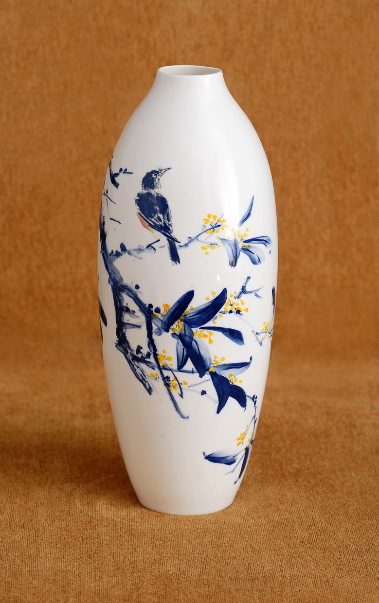
Sun Wanling, Chinese vase completed
in China
There were several limitations for him, the greatest of which was that the only color available was blue. He always uses red for the stamp with which he signs his work, but he shrugged this off and went to work. He simply took up a pot, examined it all around, then dipped one of his three brushes in a plate of colored slip and he painted. He worked swiftly and surely, as if the designs poured from his hand, as when one releases sugar in a steady flow from one's filled palm. His eyes were focused on his work, and his face was immobile until he finished, when he broke into victorious smiles and stood back for Scott, the potter, and me to see his work. Suddenly, he was the maestro; he was the beaming school child; he was happy with his work, his whole body transformed. 

The unfired pots showed the traces of blue slip only faintly, but Sun Wanling's fresh designs were nevertheless clear and animated and miraculous to all of us. Though the pots were very small by his standards, he adapted well and his imagination shone. On a bowl with an oscillating pattern raked into its rim, Wanling painted diving fish, thereby turning the rim into ocean waves with playful fish swimming beneath.


Fish beneath the waves.


Sun Wanling, Chinese vessel, painted
in China
 At Shandong Polytechnic University in Jinan, where he is Director of the Chinese Painting and Calligraphy Institute, Sun Wanling is also a member of the Purple Sand Institute. Purple sand (pounded from a multicolored mineral) is the basis for extremely prized clay used for pots and caddies that yield perfectly brewed tea. Where he paints on porcelain, he carves purple sand with the same finesse that he paints, but with tools and a medium even less forgiving. His purple sand vessels command high prices all over Asia.


Sun Wanling, purple sand tea caddy with painted carving


One day Sun Wanling and his most hospitable and enthusiastic stateside hostess, Yanmei Jiang, sat down with me to discuss the specifics of his work in the context of traditional Chinese painting. Wanling had brought gifts of his catalogues as well as many digital images, so it was a tremendous learning opportunity for me.

Since his work is primarily ink on paper, I asked if Sun Wanling distinguished between drawing and painting, as we in the West do. This question resulted in a history lesson in Chinese painting and its two streams, one of which is a realistic, full-color painting tradition more like ours, which aspires to recreate reality and is related to a scientific world view. The brush tradition departed from that in the seventh or eighth century, the first having come to be associated with the official and royal worlds. Brush painting, using only ink, aspires to reveal the soul, and became a communication of the literati. Wang Wei, the famous poet of the Tang Dynasty (618-907), is considered the father of brush painting. In tribute to Wang Wei, Su Dongpo, a statesman and poet during the Song Dynasty (960-1279), declared, “There’s poetry in painting, and painting in poetry.” This is the goal to which traditional painters have aspired since.
Poetry of a high order: Unity of nature painting and calligraphy


In brush painting, you will always see calligraphy, one of painting’s four essential elements: the painting, the artist’s seal, the poem, and calligraphy. How, I wondered, do I distinguish the calligraphy from the poem itself? In response, Wanling pointed me back to Su Dongpo: “There’s poetry in the painting, and painting in the poetry,” is to be taken literally: The entire image, with all its elements, is the poem. There is nothing that limits poetry to language, although when there is verbal poetry, the words are the painter’s, produced as spontaneously as the images. But in every painting, the artist is the poet: there isn’t a distinction between the roles.

When I had watched Sun Wanling at Red Wing Stoneware, I was very impressed by the naturalism and personality of each animal that he painted. As we looked through images of his paintings, this observation was reinforced over and over. No two birds of the same species looked alike and each radiated personality. Nothing appeared stock; every iteration was fresh and alive, as if the bird, the duck, the fish were a beloved pet, lovingly observed just at the instant. There is an inventory of plants and animals the traditional artist paints, each with symbolic association. How, after twenty years as an artist with twenty years of prior training, can he continue to animate every single one? This alone seems like an astonishing display of his heart and skill.


But before dinner one day during our first week, the other three of us had to hunt for Wanling to be sure he came to eat. We found him outside among the giant oaks with computer paper and ballpoint pen, completely absorbed in filling sheets with sketches of leaping squirrels. The drawings were amusing and fresh, but accurate too—just like the squirrels I’ve seen in his work. He has also, during his month here, taken literally thousands of photographs of nature—not only of the squirrels, but all kinds of birds, including the many bald eagles that live along the neighboring Mississippi River. His momentary awareness of nature is hawk-like; no animal movement, no rustle of the grasses, no beauty of sunset or September’s changing colors escapes his eye or camera. It is from years of exquisitely trained observation that the twinkle of curiosity comes to the eye of Sun Wanling’s bluebird.

Against this absorbing naturalism, the traditional painter places his flora and fauna in the least Western of landscape perspectives. The extended forms of long or tall and narrow papers allow the painter multiple focal points without regard for literal distances or measurements; the relationships of feeling and symbols are what count. The attenuated papers also reflect an aesthetic that permeates a cultural worldview of which fine art is only one aspect. Horizontal paintings allow for a long, swooping arc to enter from the top right and cross toward the right, where it always stops, blocked by vertical lines of calligraphy or other design elements. As we looked through several images in which this was borne out, Wanling sprang from his chair to execute Tai Chi movements that were exactly the same, the comprehensive, circular spanning of the arm, brought to the center of the body and arrested. “The circle!” he told me, smiling.
"Tai Chi." Circle-based composition using the bamboo branch.

As we discussed the paintings I had chosen for their appeal to me, or for questions they raised, Sun Wanling began each specific discussion with a diagram of the composition’s central thrusts—of branches, grasses, the directions of a fish’s glide, the inclination of bird or dragonfly wings. Composition is clearly primary—the viewer feels it at once—but after years of training it must become part of the poetic instinct. Sun Wanling paints horizontal papers as long as extended dining tables, but explained that earlier poets who made monumental paintings worked with their paper scrolled, painting only a small patch at a time. Yet they were able to execute grand and graceful compositions.


I love the painting to the left, of the fishes swimming by the bank of some body of water. Sun Wanling explained that in this style of painting, sky, air, and water are represented by no more than blank paper; nor are horizons represented. So the ambiguity that I feel about the placement of the fish is quite natural in a tradition in which perspectives aren't fixed, as they are for Westerners. 

What's more, what Sun Wanling has painted—and this he burst upon me to the greatest delight of both—is a mere fragment of a landscape that encompasses the whole world. He took my pen and showed me the house on the land above the river with its ground that sloped down to this rock. We saw the village on the other side of the river and the mountains behind. And it didn't take all that long for our imaginations to complete the circle and stop before our hearts and eyes, in Red Wing, Minnesota, where we could see ourselves in the painting too. 
Point well made! Viewers: You are in this picture. It is a fragment of the world we all inhabit; our eyes, imaginations, and responses are part of what completes the circle. 

A traditional Chinese painter, Wanling told me, has four treasures in his studio. He has his brushes, his ink, his paper, and his ink stone on which he grinds his colors. Of himself, the most important thing he brings is his calmness. Sun Wanling achieves this by grinding ink on his stone. He grinds it very slowly, in a circular motion. He told me that it, “puts his heart in a peaceful state.” 

The vivid spontaneity and life of Sun Wanling’s painting come from the source of all artistic life, through deep discipline so profoundly integrated into his heart and mind that they can be commanded in an instant. Sun Wanling is the camera’s snap, and the bird, and the brushstroke; he is the still, integrated embodiment of ancient tradition, and the diving squirrel that always gets the nut.